Having attended the Pasadena Showcase House Tour for many decades, I was particularly impressed with how well the committee managed to preserve the integrity of the period while updating this beautiful 1927 Spanish Colonial to a modern family home. Like many people, I try to relate what I see in the design world to my own surroundings or those of clients. This year’s home was a shining example of staying true to the period.
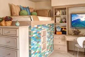
Two bedrooms stood out as far more modern and current than any of the other rooms, but then there are always exceptions. The young boy’s room had built-in features that had to stay in the room, creating a challenge for the designers. Original to this room were built-in shelves and a desk as well as a high “captains bed” in dark wood. Breaking the purist’s rule of never painting wood, the designers did just that, relieving the small room of its heavy and somewhat cramped feeling.
Using a paint to resemble a lime washed oak, or the weathered look of driftwood, brightened the room without sacrificing any of its former charm. Using a sand- colored grass-cloth on several walls, the room’s northern light was enhanced. Using the calming blues and greens of the ocean in accents added much needed color to this youthful bedroom.
What you can take away from this room is the use of color in the proper balance; it was certainly impactful, interesting and colorful, yet not overpowering. I try to convey this need for balance to my more color phobic clients; in reality, most people like color but are unsure how use it to create rooms they can enjoy.
Another light challenged room was the dining room. Fortunately, the current owners put restrictions on what could and could not be done; for instance the original doors and coffered ceilings were to remain. In the dining room, the dark and heavy coffered ceiling was a design challenge to lighten and brighten the room without losing its original aspects. The designer had a custom dining table made with antiqued, mirrored top; and the finish had a silver leaf treatment, with chairs to match. Mirrors above the sideboard helped reflect light from the windows as did the silver chandelier. The walls sported a light, warm cream color that enhanced the Spanish style of the home.
The designer did introduce several modern touches in fabrics and objects‘d art, totally impractical for family living, but they helped reflect the light and add an updated feel; it was totally a “designer touch”.
If you find your rooms too dark, but wish to maintain certain aspects of natural woods, you can achieve that goal with light reflecting elements and color. Do not be afraid to “shake it up” a bit; your country home can still sport a bit of the modern world in light fixtures, rugs and art.


