Downsizing and A New Lease on Life

I have been working with a designer friend and her long-time friend and client who is downsizing. We needed to decide what to keep and what to sell or give to charity; this was no easy task, since the client was downsizing was from a 5,000 square foot home down to a home measuring just under 2,000 square foot country cottage built in the late 1930’s. The house had been maintained nicely, and some improvements had been made, but paint was the first order of business. 

We also had to determine which pieces of furniture were the most important to the client, and then determine what actually would fit. In their present condition, the pieces to be moved were not going to suit the new cottage surroundings. We determined that painting and stripping of dark, shiny finishes would have to occur in order to make the furniture fit into the French Country Cottage theme on which the client had decided.

At this point, I thought my work was done, but not so fast, I discovered. There was a round oak table with a heavily grained surface that needed to be painted to add a little elegance. There also was a corner cabinet with a shiny and somewhat more modern look that needed some work. Once we got into the house, a neighbor donated a tiered pie crust table painted in a Shabby Chic type finish, but it was a bit too busy for our plans. Additionally, two perfectly sized, upholstered side chairs appeared, we were thrilled with the lines. Off to the Pacific Design Center we went for fabrics, looking for the perfect covering for the chairs and a pair of settees that found their way to the little cottage by way of the same sharp-eyed neighbor, again the perfect scale for the scale of the room.

Once we chose the fabrics, we embarked on a search and rescue mission downtown to find some additional pieces that would suit the clients needs. The client found a dainty bench with an upholstered seat, a wee bit dowdy, but perfect for a space in the living room just outside of the dining room. I added it to my painting projects, now up to four pieces.

As with all design projects, this one was a journey and a fun one for the three of us, especially for me, a new friend. We will continue working with the client, and soon we will be deciding on artwork; there is no shortage of pieces to choose from, the client is a very talented artist.

It has been especially rewarding to be able to use many favorite pieces that have strong sentimental meaning to the client. We hung her grandfather’s antique mirror in the dining room; it looks like it was meant to be in the room, and its guilt frame ties into the chandelier and new shades with the gold lining— a perfect compliment. We have more to do to bring this little cottage up to date; but as I mentioned, it is a journey, so we are enjoying the ride.

Oak table painted a Dark Engine Gray 

Oak table painted a Dark Engine Gray


Less Shabby More Chic Tiered Table 

Less Shabby More Chic Tiered Table


Second Hand Store Bench 

Second Hand Store Bench


Art is in the Eye of the Beholder

Art, like beauty, is in the eye of the beholder. In the design mind, anything can be art; it just needs to suit the viewer. During my visits to clients’ homes, I have come across some of the most interesting and colorful artwork. The colors and subject matter are what bring rooms to life and identify a room or home as unique to the homeowner. Sadly, too many clients are a bit reluctant to embrace their artwork, and I am speaking mainly about paintings here. They often want to make excuses and say it doesn’t have to be in this room or used at all, if I think it’s not the right a particular room.  

What I love is embracing a client’s art work, because it is personal or has special memories attached and truly expresses the occupants’ unique individuality. Additionally, artwork is a great jumping off spot for color selection in the room.

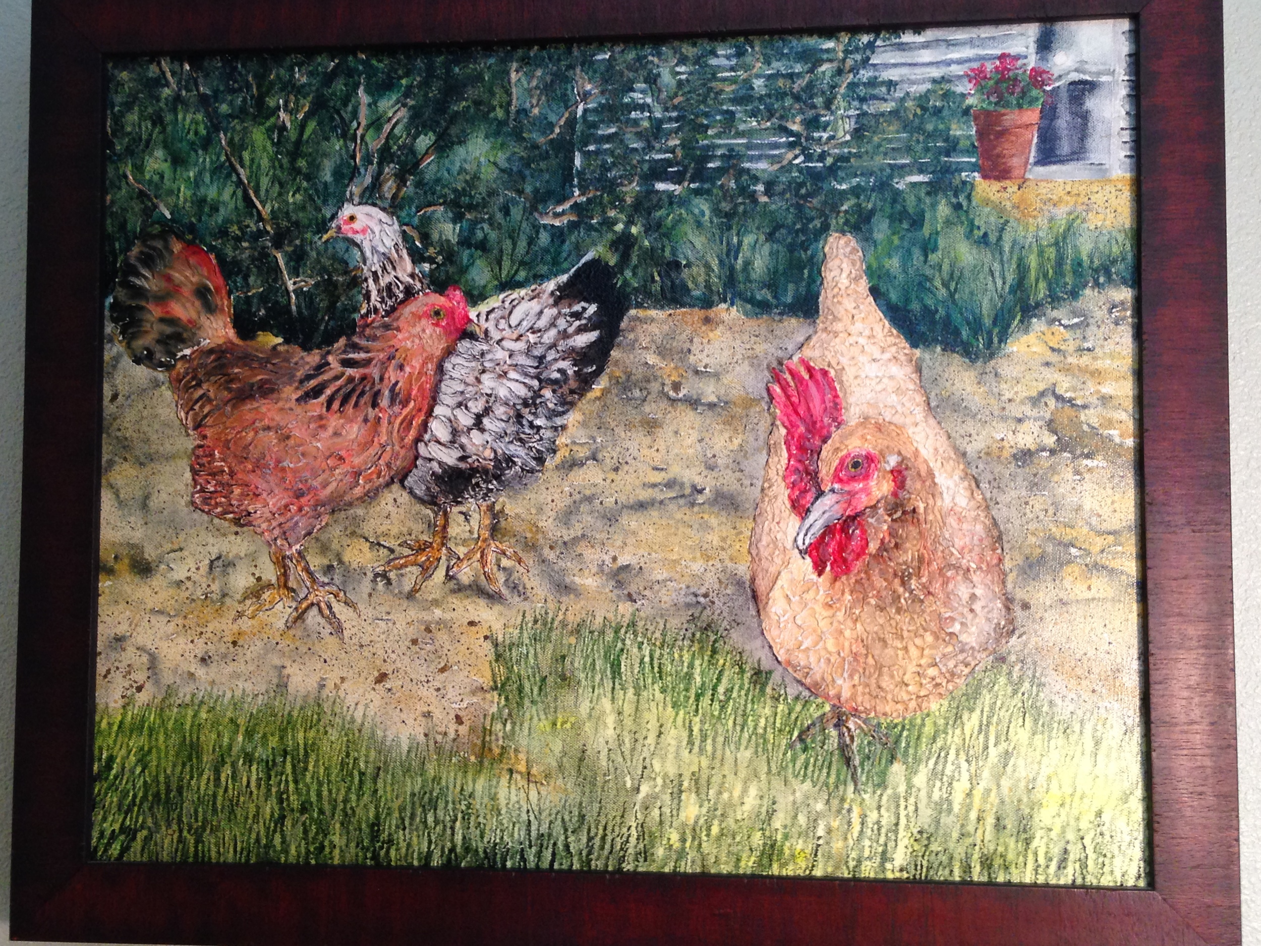
Art can be displayed in any room and I especially, like it to be a surprise. It is easy to see why the painting of chickens shown here would make a great one for the kitchen, but the kitchen in this house really does not have wall space to spare or give the picture its due. The client had it at the end of a dark hall, and felt badly that it was not in a more prominent place because of its importance to the couple. 

We were exploring the newly painted bedroom that has given the couple such a sense of peace and tranquility, when they asked about a bright, colorful painting they had hung on the wall. Was it appropriate? I told them I thought it was great; they both loved it and it was full of color and energy, contained in a relatively small space. It is not the focal point, but a point of interest in a sea of cool, calm colors and furnishings. The couple had added a taller dresser since I had been there last and loved the storage the dresser provides; however, it displaced a painting that had been the color inspiration for the room. I suggested we put the painting that had such special meaning to them above the taller dresser, as it had stronger colors than the previous picture-- which we moved to another room and it made a beautiful vignette. 

The painting that has such special meaning, pictured here, is of three lovely ladies, that a friend painted shortly before the birds left this world: from left to right, Aunt Bea, Grace, lovely in classic black and white and finally, Topaz in the foreground. These birds were great layers of heavenly eggs and are fondly remembered by my clients.

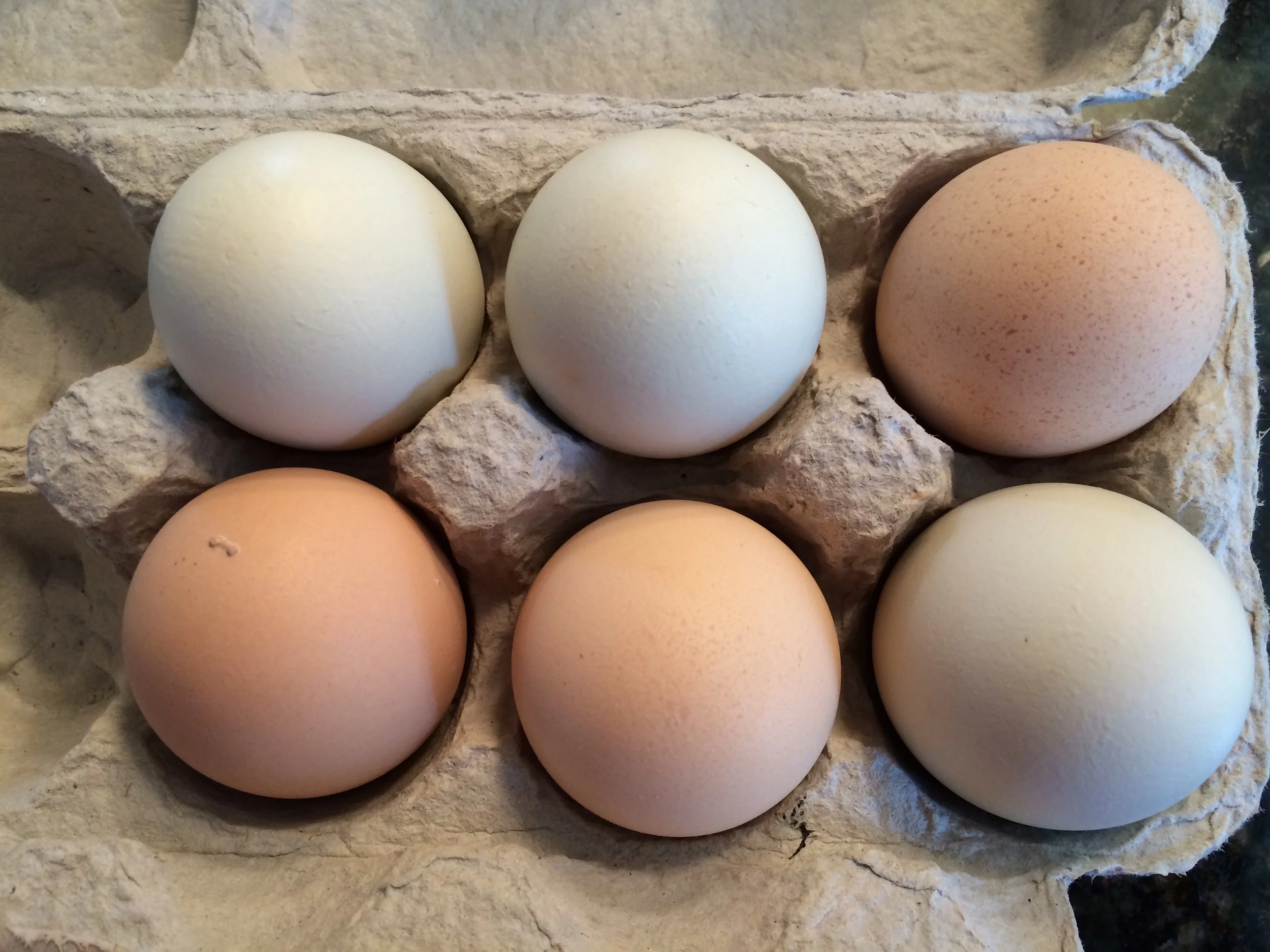
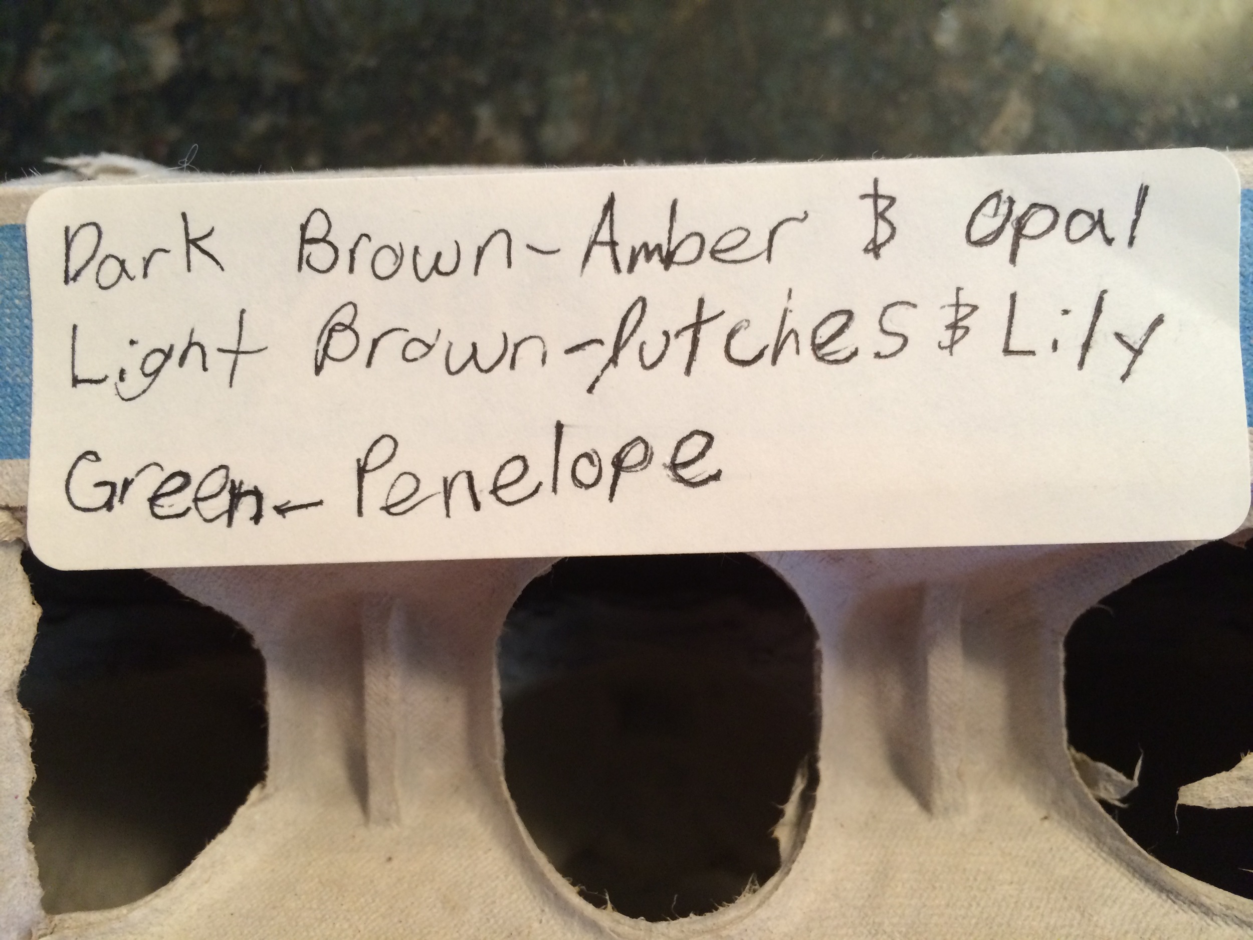
One of the perks of my job is meeting so many diverse clients, with such great talents, like raising chickens, growing great fruits including my favorite boysenberries, and sharing their their bounty with me. The granddaughter of the client who shared these beauties likes to make labels for the eggs, giving credit to the current laying birds. My thanks to these wonderful people for sharing with me, not only their art, but tasty treats as well.


The Senses and Design


We are fortunate when we can enjoy a combination of positive effects on several of our senses at the same time. In the world of design, our senses of sight and touch offer pleasures, but our sense of smell is a likely third; it is oh so satisfying when flowers and greenery produce color, scent and texture all at once.

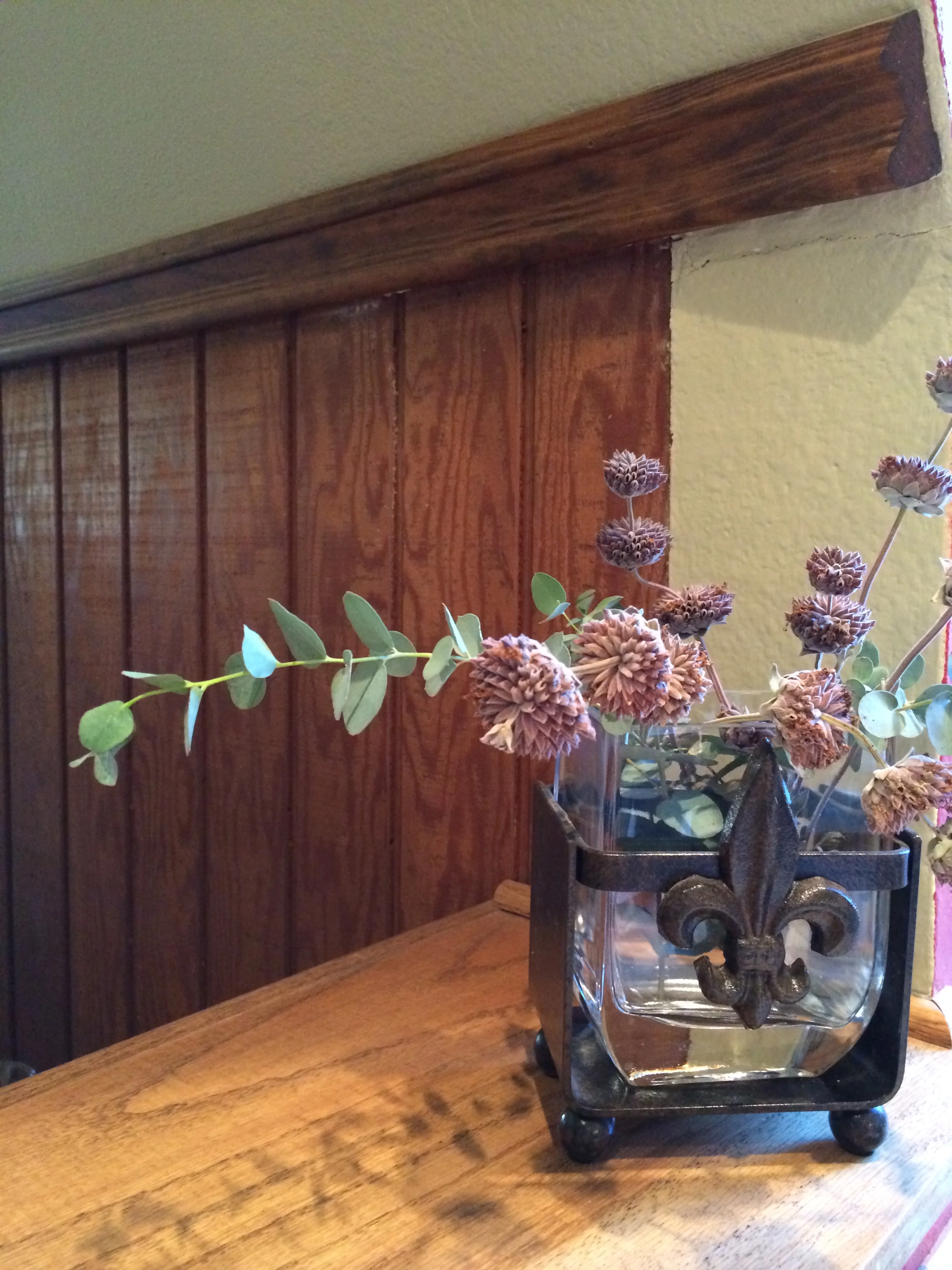
Bringing the outdoors in is a goal for most of us living in a temperate climate. While I am not a landscaper, I do know what I love to see and smell and Salvia Clevelandi, Winifred Gilman is a favorite for my eyes. I love it in the garden near an open window or door, so I can take in its lovely scent whenever a breeze comes up.

I like to make good use of plants in decor by using the real thing, whenever possible. Even dried plants can give off a pleasant fragrance in dried arrangements, or tied in a bundle and hung in a closet or shower. I like to use eucalyptus branches in these areas as well, especially hung in a shower; the steamy atmosphere helps bring their sweet, fresh scent into the surrounding areas-- for me, truly heaven sent.

Even a particularly lovely piece of furniture that needs protection from water spillage can be enhanced with a dry arrangement of local native or succulents as a centerpiece. One should never water a succulent on a table top; it should always be watered sparingly and on a surface that can be easily wiped up. Once the water has settled in the container, there is no danger of leaching moisture onto the surface of the furniture. An arrangement can sit for quite a long time, and infrequent watering will make a happy situation for both plant and table top.

Lavender is another favorite, both in the garden and in the house. These plants do well in our dry climate and are a favorite to dry and use as a sachet for drawers. Let me mention rosemary as well, which adds another sense, the sense of taste. Rosemary’s flavor adds to many savory dishes. Growing theses plants makes it easy enough to snip off small branches to bring into the house frequently, to add to an arrangement of roses or to use all by themselves. 

One of the great characteristics of these plants is their structure. They offer so many opportunities to display them creatively. They look lovely against a plain wall, or one enjoy the shadows they cast in the evenings. In addition, they bring fragrance to the room and the soul. With their color, scent, texture and taste, they have the makings of a long lasting and beautiful arrangement.

 
IMG_2145.JPG
 

Sleepy Bear Cabinet Grows Up


Over the decades, useful and once treasured furniture pieces often get pushed aside for newer pieces, much like toys in the toy box. These pieces are associated with fond memories, and those memories make them hard to easily cast off; so we often find space for them in a garage or attic. The furniture piece in a garage can hold all sorts of things and so becomes useful, but mostly forgotten, in its new home. Small houses are always in want of more storage, and re-thinking the possibilities for an old piece of furniture can yield a better use for rediscovered items.  

Here is where this story begins--again. The cabinet lived in the garage, gathering dust, while storing gardening tools, seed packets, and a few moving blankets, along with some outdoor decor items. Adding more square footage to a master bedroom afforded more wall space to accommodate the cabinet inside to store more grown up things than when both the girl and the cabinet were young. Gone are the onesies, diapers, shirts and shorts and a few little dresses and caps; now the cabinet stores travel supplies and extra bathroom supplies; and a few shelves added will once again store shirts and shorts and possibly a sun cap or two.

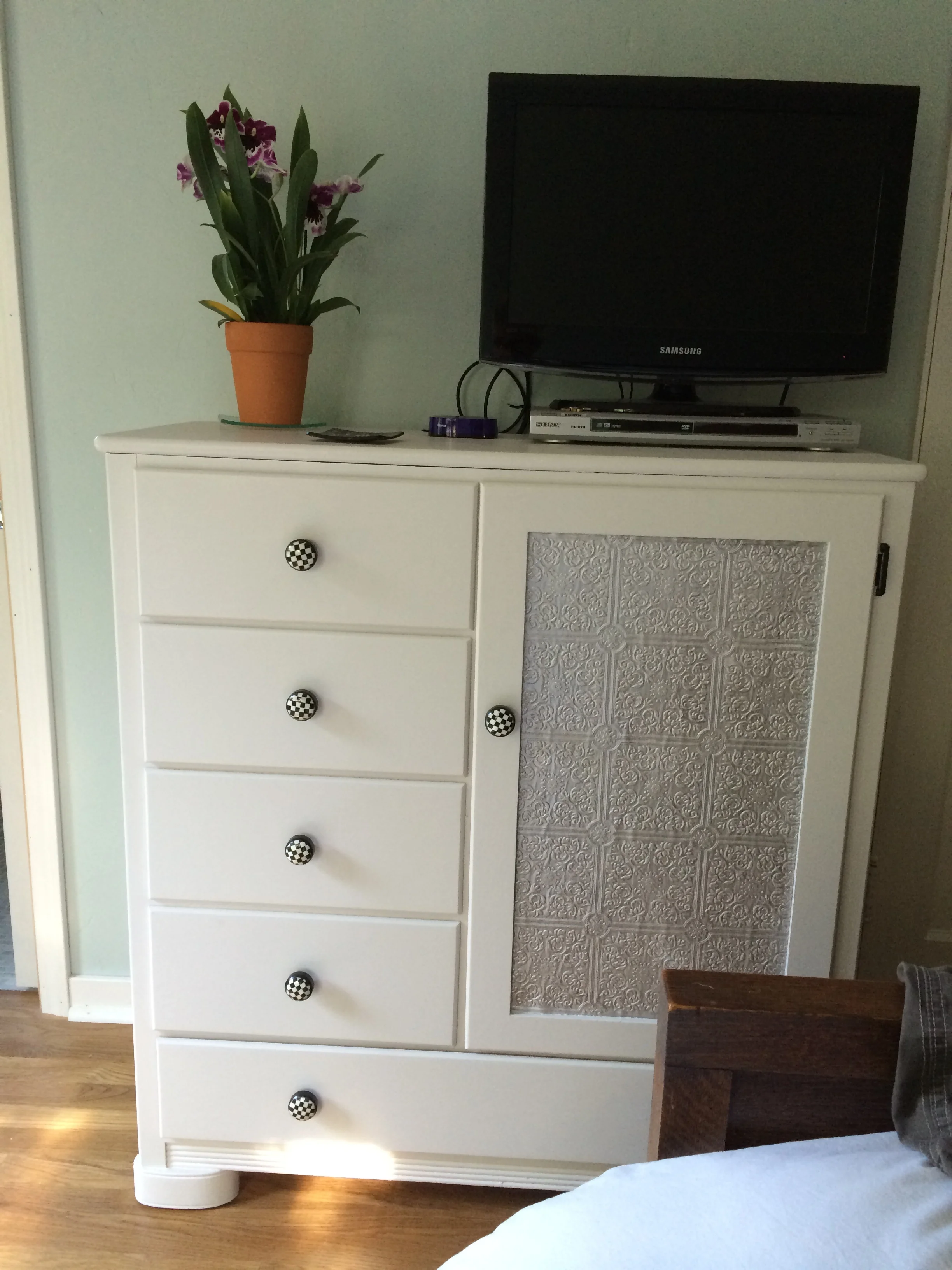
The cabinet needed a good cleaning. Then We removed the screws that held the massive handles, meant for small, chubby hands. We filled the holes with a wood filler so we could select more modern drawer pulls without having to match the spacing of the old holes. We lightly sanded the piece, then primed and painted it a neutral color. We found fun drawer pulls at Anthropology, for a more sophisticated look.

The harder decision was what to do with the fuzzy, sleepy bear decal on the cabinet. At first, we thought we could cut out the panel and insert a glass panel with either a sanded glass or another decorative style of glass. The problem was that whatever is stored inside will show to some degree through the glass. Next, we remembered antiquing old mirrors long ago, and thought that might be a good solution, to reflect some light, while obscuring the contents of the cabinet; however today’s mirrors are constructed of better grades of silver or reflective material than days of old; today’s mirrors do not degrade nearly as easily as they used to, so we scrapped that plan. Next, we used some Anaglypta or embossed wallpaper, which is paintable and adds texture and interest to an otherwise pretty plain surface. This type of wall covering was first used in Victorian homes by inventor Fredric Walton, who patented linoleum floor covering in 1860.

Today’s embossed wall coverings are much softer and easier to work with and will not harden nearly as hard as they used to in olden days. Once we cut the piece and glued in place, it was painted a light gray paint and added a silver glaze to achieve an antique look.

Now the piece has an entirely new and fresh look and will serve for many decades to come. Happy memories now live inside while serving a modern girl with modern needs.

 
Sleepy Bear Before 

Sleepy Bear Before


Sleepy Bear All Grown Up

Sleepy Bear All Grown Up

A Great Estate Sale Find


You just never know where you will find the next great thing! Tag sales, garage and yard sales, flea markets and sometimes the side of the road can be the most unlikely places you will find just what you are looking for, albeit not as recognizable in its current form as you imagine. Maybe you are looking for a particular object and maybe you are just looking at interesting things, but when you stumble upon something that is out of the ordinary you need to take advantage of the moment.

Recently, while shopping at the monthly Estate Sale I like to frequent and, after a quick pass through, a second tour landed me at this old carpenters work bench. When my client found me, she noted that she too had looked at this same item. It is a bit low for a typical kitchen cart or island, but when you are vertically challenged as many are, it is nearly perfect. My client has been looking at kitchen carts on-line as well as checking out new carts in trendy shops around town, but nothing really hit the spot until we pondered this old work bench. Just imagine the history that this piece might tell if it could.

Under the books on the shelf below the top, is a hinged box used to store small tools. It is a perfect spot for little used, but necessary serving pieces. These pieces tend to take up valuable space inside cabinets and make preparation a challenge
when you have to unload half a cabinet to get to the piece you need. With those items off the valuable shelf space, everything is easier.  

The bench’s surface area is the perfect size for an additional work space for chopping vegetables or mixing a batch of cookies, it is the perfect height for a small stool and rolling out a pie crust while standing. Of course, no food is placed on top of the table without a cutting board or some protective surface for cutting raw foods. Good sanitation demands care. However, there are no worries about putting a glass on top that may sweat or a bottle of wine that may stain a nicer countertop. 

A piece such as this is great in a vintage house, but it would also fit in a more modern kitchen as a useful accent piece to add warmth and a sense of history-- a nice change from the stark, utilitarian look. 

We have considered adding a couple of inches to its height by adding casters, but so far the piece suits the needs of the cook; the taller cook can use the other surfaces in the kitchen. The bench has found a new and unexpected use in this vintage kitchen; a perfect compliment to the two cooks that can now work happily in unison.

 
Old Work Bench 

Old Work Bench


Working Kitchen Bench 
Working Kitchen Bench


Thank You, Julia Child

 
Peg Board with Chalk Board Paint 

Peg Board with Chalk Board Paint


Pots and Pans within Easy Reach

Pots and Pans within Easy Reach


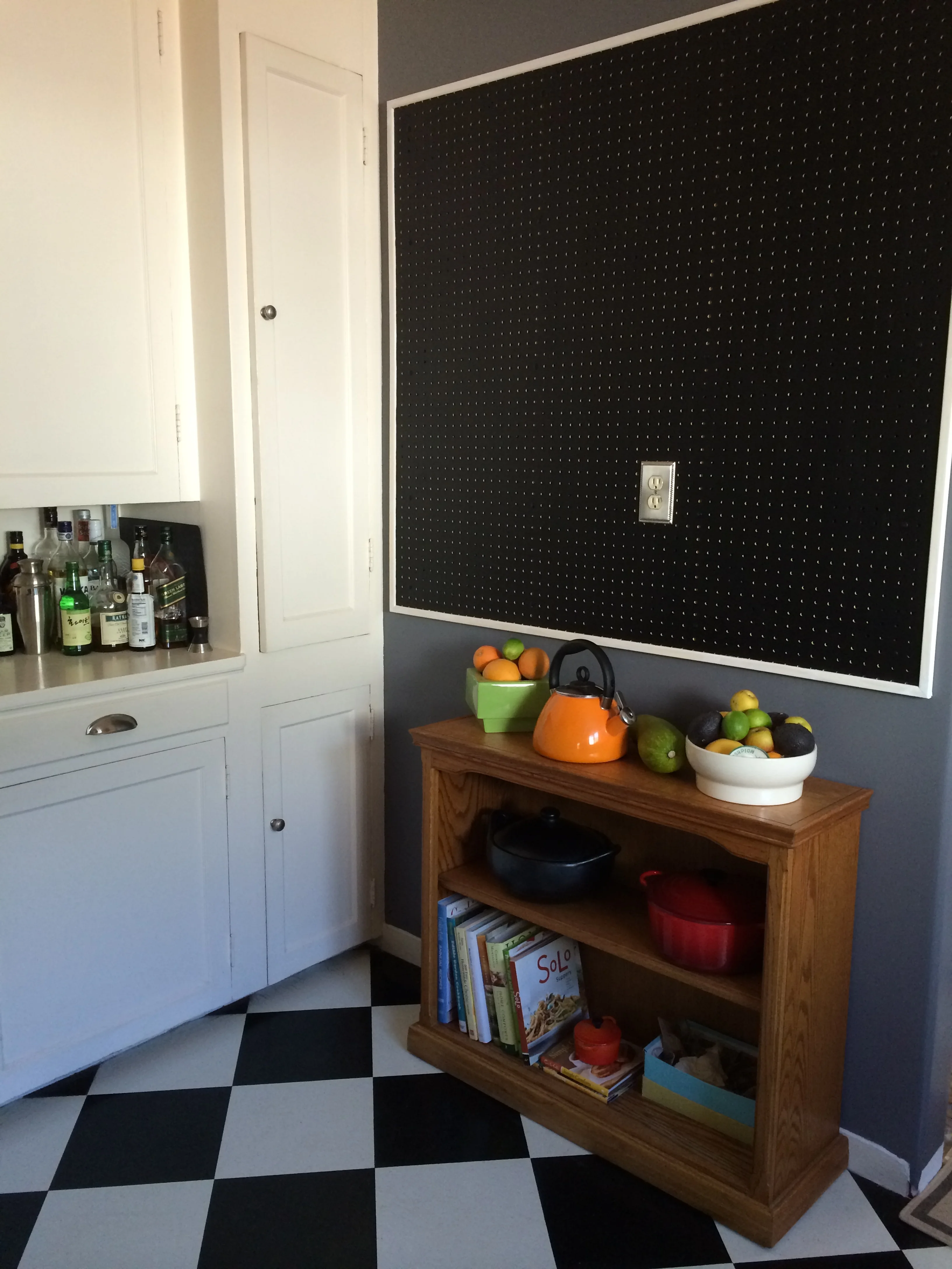
I am not certain that Julia Child was the first person to think of peg board in the kitchen, but it certainly became a popular idea as seen in the recent movie, Julie and Julia and was the inspiration for this vintage kitchen. My client’s kitchen probably was a very satisfactory work space in 1930, with an ice box taking up some space and cold storage near the buffet. However, in today’s kitchen the refrigerator was a huge obstacle to get around and made an otherwise comfortable workspace for two or three people, a one person kitchen.

The answer was to move the refrigerator around the corner and into what had been a small pantry in the laundry room. This answer required the partial removal of a wall that separated the kitchen from the laundry room as well as the removal of the pantry walls in the service area. By removing about 18 inches of wall space behind the refrigerator along with the header above the door that lead to the laundry room, and adding a full glass patio door in the laundry area, the kitchen became a light filled, open and more modern work space. The refrigerator was rotated 45 degrees and moved into the expanded laundry room.

Moving of the refrigerator has been a long-standing plan for my client, and now that it has been accomplished, the floor space seems to have doubled, as three people can comfortably work in the space.

Storage was still an issue for this small kitchen, and that is where Julia Child’s idea to hang her most often used pots and pans on a peg board comes into play. My client had a contractor remove walls and extend the laundry room and add the full glass door, but the peg board was a fairly simple task to tackle with a drill, and some furring strips to allow space for hooks behind the peg board. While Julia’s kitchen peg board was the iconic aqua of the 1950‘s, today’s kitchen enjoys a practical application of blackboard paint; the plan is to outline the pots and pans, as Julia did, with a chalk pen. My client plans to experiment with pots and pans for a little while to make sure everything hangs in the most convenient place. One the two cooks has the reach of a typical six footer and the other, who falls far short of that lofty reach. The addition of trim around the peg board was a finishing touch, purely for aesthetics.

My client plans to add an additional work station below the peg board, but for now a narrow bookcase serves as a place holder as well as attractive storage for cook books and some bulky pots that have no place in the already packed cabinets. This is a clear case of using something you already have, in a new way. It is often beneficial to think outside of conventional uses for furniture pieces; bookcases can go almost anywhere, they are great storage units.

New Uses for Old China Cabinets

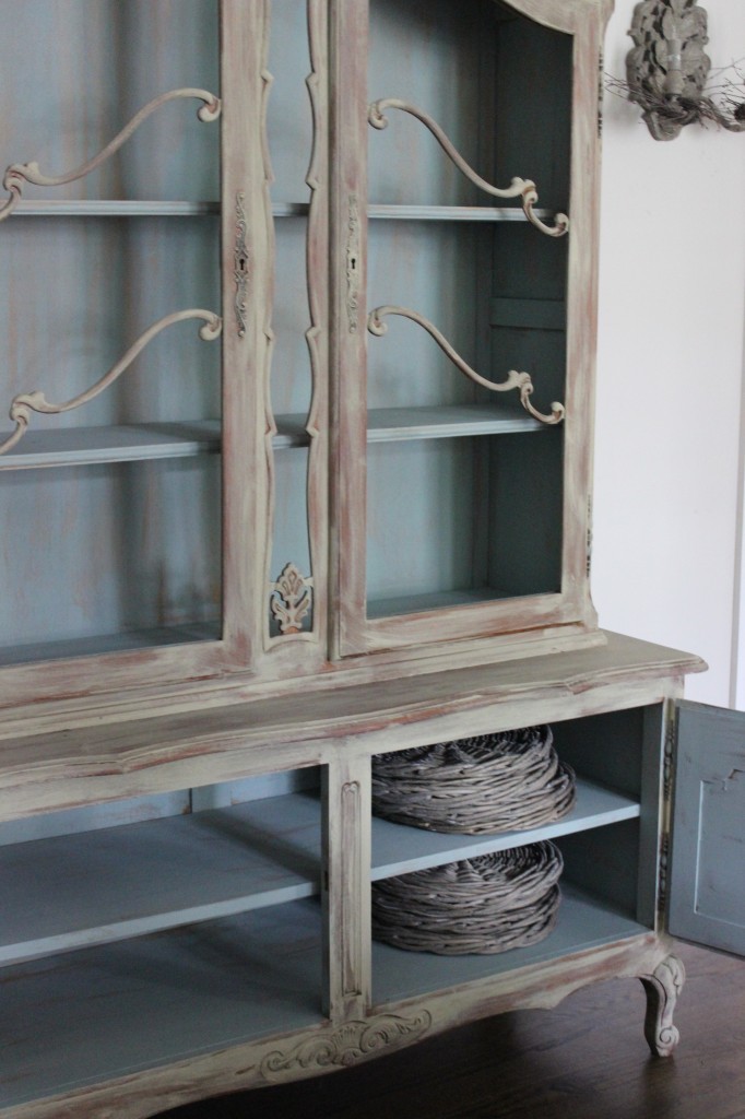
China cabinets have been a subject in my column before, I know, but this topic has a new twist.  Most china cabinets new and old come in two pieces; that is, the top or glass portion is usually a bit narrower than its base and secured by screws and possibly a bracket to hold it all together as one piece.  Years ago, I had a friend ask me what she could do with a piece she had inherited from her mother, a piece she really didn’t want, or need, but “Mother wanted me to have it”; so the need to keep and use it was strong.

My immediate idea was to take the top off (storing it until a use could be found for it) and to just use the base as a buffet, which is what my friend did.  The buffet sits in the dining room with the matching table, and the room is no longer overwhelmed with too much furniture.  I had suggested that if they had space in a bathroom, a metal base frame could be made for the glass portion and the piece could be painted and used to store pretty towels and toiletries.   The base being open, would not overpower a small room.  However the home really did not have space for.  Oftentimes, an older home ( 60 years or more) might accommodate such a piece.

Now, this friend is refurbishing a home that is from the turn of the last century, and I got to thinking about the upper cabinet piece that  hopefully being stored.  The piece might be a perfect solution to furnishing a century-old home, in either the kitchen or bathroom.

In the kitchen, it could easily sit on a counter top, making it look somewhat built-in, painted to match the base cabinet.  This situation would not have been out of the ordinary in those days, as pioneer folks really did use what they had or could find in a neighboring farmhouse.  Mix and match became a design trend; but back in the day, it was simply a way to make ends meet.  It’s funny, how somethings come full circle.

Alternately, this upper cabinet piece could be a great linen cabinet upstairs in the bathroom or hallway near the bath.  Again, it could be placed on top of an old dresser and secured to the dresser with brackets, or fastened to the wall as a permanent piece.   Depending on the decor sensibilities of the room, the pieces can be painted a fun color to enhance the bathroom, as an accent piece or painted to blend into the walls.  Bright colored towels can provide the accent color.  

If the glass has broken in the storage or transportation, a mesh or chicken wire can replace the glass.  Painted a silver, gold or black to match the other fixtures in the bathroom or kitchen to give it a true “farmhouse” feel, along with new handles or cabinet pulls.

Of course, both pieces could be re-united and painted and placed in the old farmhouse and given new life in a new space with a outlook for another hundred years.

There is usually a solution, if you can keep an open mind and are not in too much of a hurry for the finish line.   Remember that decorating is a journey; have fun along the way.

Tile to the Top

Whether you are remodeling or building from scratch, tile in the bathrooms and kitchen is a good choice.  While solid surface countertops still reign superior in most homeowner’s minds, the backsplash is another thing entirely.  Tile and stone pieces are a great option.  Stone pieces and mosaic tiles are usually mounted on a mesh backing, making installation much easier than was the decades ago fashion of placing the pieces one piece at a time.

In showers, more often than not, I am seeing tile or mosaic stone being used from floor to ceiling for a continuous look.  This process eliminates peeling paint in very moist environments.  It is also a cleaner look from a design aspect.  Allowing tile to reach the ceiling, gives you some more options for adding a design element, such as running subway tile in a vertical pattern, or alternating colors into vertical bands to give the room a greater appearance of height.  Running several contrasting  horizontal bands is another design option.  In small spaces use less contrast, but enough to add interest in what might be a dull and uninteresting space.

In kitchens, where you use tile as a backsplash behind a cooktop, you can create again a greater sense of height and you can highlight a fancy hood vent.  If you have a sink that does not overlook a window, adding an attractive tile with open shelves will feel less closed in than having cabinets above the sink.  This area can become a focal point for displaying some of your favorite decorative pieces or most-often used dishes and bowls; if they are colorful or unusual, they are not only useful, but pretty additions to the kitchen decor. 

Open shelving in kitchens over a counter-to-ceiling wall of interesting tile can add special interest while allowing for storage and display options.  In an eating area, where the kids sit, might be a great place to store materials that they can access easily, especially in a space-saving banquet area.

There are so many choices when it comes to wall tile.  Stone, glass, porcelain, and ceramic tiles are available in smooth, metallic, clear, solid and tumbled finishes.  I like to remind clients to consider the relationship between the counter and the backsplash choices, which need to be coordinated in both color and patterns.  Too often, clients choose a speckled countertop that may have a lot of color contrast, which they love, but then choose an equally busy backsplash over the counters; and are not usually very happy with the finished look.  It is best to choose one or the other to be the big splash of design or color contrast which is not to say you cannot have a dash of contrast in both places; but you need to use some restraint in one place or another.

The Open Space Living Concept

One of the most sought after living styles today is the open space concept with the  living room, dining room, and kitchen prep area all in one large room.  With today’s lifestyles, this concept makes a lot of sense.  Compare it with days gone by, where the cook was confined to the kitchen and the guests and family were elsewhere in the home.  Formal dining rooms are not the norm for today’s more casual dining; they are nice if you have a very large home with staff doing the cooking and serving, but this arrangement is not so common today.

The beginning of the open space concept may have begun with a pass-through from the kitchen to the dining room.   The pass-through may have been revolutionary in its day, but it is a bit too closed in for today’s living.  

One of the first things most people have to decide when considering the removal of an upper wall, is the cabinetry on that wall and where to store what is in those  cabinets.  The same is true when considering removal of floating cabinets over an island or peninsula.  It may be wise to open the cabinets, evaluate what is stored in them and determine where else the items can be stored.  You may even find a lot of things you considered “lost” because they were unseen and not easily accessible.  The things you still need and use, albeit less frequently, can be stored in other cabinets. This exercise forces you to really access the items need to be in your home; so making careful choices is important.

If you happen to have such a pass-through and wonder how to modernize it or truly open the space, there are few things you need to consider.  First, you will want your kitchen to be attractive and uncluttered enough to be on constant display.  You will want your cabinetry to coordinate with the rooms to which it is open, i.e. family room, dining room.  

If your cabinets are old, outdated or shabby, painting will be the easiest fix.  You can consider removing some of the door fronts and keeping some open cabinetry on upper cabinets for some of your pretty or frequently used utensils.  The most important thing to keep in mind with open shelves, is the view you will present to the rest of the room.

Another consideration is the lighting that will be visible from the living spaces into the kitchen area.  A new, attractive light fixture might be a nice accent to add to the kitchen.  Color will be another consideration; you will want the two or three combined spaces to be cohesive.  The rooms need not be the same color, but they should coordinate; consider a bolder value of the same color from room to room or a graduated value of color among the three rooms.  Color too will give an open concept a subtle room division.

The pass-through kitchen will require some amount of DIY skill, or you can hire a contractor.  You will need to determine if the wall separating the kitchen and other rooms is load-bearing before you swing the sledge hammer.  There may be electrical wires or plumbing pipes in the walls, so go slowly and check in the attic or have someone who is skilled in construction help you determine these issues.  Oftentimes, a post or pillar will be necessary to hold up the end of a load-bearing wall.

When you have cabinets on the kitchen side of the pass through wall, you will want the cabinets to remain for storage, so a half wall will be your division between the rooms, still giving you a visual open space.  A half wall may give you an opportunity to have a console on the living room side of the half wall, to be used for games or if it is a dining space, a buffet server for parties.

Removing the entire wall between the kitchen and adjoining room may be more ambitious than the average DIYer can manage, and there are more things to consider.  For instance, you will have flooring issues to deal with, as the removal of a wall will leave a two-by-four or two-by-six space where the wall once was.  Leaving a partial wall would not necessarily require new flooring or patching.  The ceilings in both renovations will need to be addressed, but dry wall is more easily applied than flooring with the necessary matching.  

Removing cabinets above an island and peninsula can be among the most liberating and enjoyable renovations one can undertake.

Easter Egg Garden

When I was a child, the markets sold cottage cheese in cartons decorated for Easter, and my family bought the cheese in these cartons.  We eagerly consumed the cheese  so we could use the cartons for little Easter Baskets to play with until the big day and the fancy baskets arrived Easter morning.  We would fill them with cotton and sprinkle bird seed on top and water them; soon we had our own little grass gardens in which the Easter Bunny left a brightly colored egg.  

On a smaller scale, we would take an egg shell and press cotton balls into the largest half, again sprinkle either bird seed or grass seed in the cotton soil and water it.  We would tend our egg gardens daily and report the progress of the seeds that would sprout.  It was a fascinating lesson for us as small children to be able to watch germination on a daily basis.

There is still time to begin a small garden of grass before Easter, if you start right away.  Naturally, you can use any small basket or vessel that is water tight, fill it with soil or cotton and sprinkle either grass seed or bird seed on top and water.  There is no need to bury the seeds; they will sprout sitting on top of the cotton or soil.  Place the egg or basket garden near a window and keep the soil moist; then watch the seeds grow before your eyes.  Once you have a healthy egg or basket of greens, you can add them to your centerpiece along with some decorated eggs or candy eggs. 

You also can place each half of an egg shell garden into an egg cup and place one at each setting on your holiday table as a party favor.  Add a toothpick with a small card along with each guest’s name, and you will have a clever place card sitting in a field of greens.  An entire centerpiece could be fashioned from eggs, grasses, baskets and your imagination.  A few spring candles added to the mix will help illuminate your table.

What I love about this tradition is how simple it is and how it helps connect children to the growing process, albeit in its most simple form.  It is also one of the least messy projects you can do with very young children.  Who knows, it may inspire little gardeners; and you will benefit from their enthusiasm for years to come.

Easter Egg Garden.jpeg

Design Reality vs TV Design

The design craze brought on by ever-present TV shows sparks some reality checks in my everyday business.  It is all well and good to see a room come together in under thirty minutes, given commercial breaks, but quite another when living through any type home redesign.  I do believe that most people are sophisticated enough to realize this difference, but somewhere in the back of many minds is the hope that a redesign can actually happen as seen on TV.

A dash of reality must come into play at some point with any design.  I try to remind clients that the project should be considered a journey, with changes along the way. When clients select a designer to help pull together, their home or a room--even in a small way--sometimes they must adapt to new circumstances.   As a designer it is my job to listen and help point out all sides of a design choice; what is good for someone else is not necessarily a good choice for the client, even though he or she might love the look.

I find TV shows and magazines are great jumping off places for clients, allowing me to see in what direction they are leaning, and to what colors or styles they are drawn.

There are good choices and better choices;  I like to give my clients the options as I see them and know that ultimately, the choice belongs to the clientFor instance, hallways often lend themselves to artwork.   Hallways usually are just long pedestrian pathways with little interest; so why not add some color or artwork.  With proper lighting, a hallway can become a small gallery.  Unfortunately, not all hallways are created equal; some are small with plenty of doors to break up the space; and others are so wide they seem like another room.  

A narrow hallway can be tricky.  It may not be wide enough to enjoy art work, or there may be utilities such as a thermostat stuck on the wall, leaving little agreeable space for artwork.  Recently, I had to deal with a hallway in which the client had placed a series of small, framed pictures; they were interestingly spaced, but people could not appreciate them unless they had their back against the opposing wall.   The pictures were not really noticed unless people came out of the hall bath, which hardly did the pictures credit.

My solution to this problem was to make a tight group of the six pictures at the end of the hall.  The wall is actually the end of the guest room closet, when the door is open; it is what you see at the end of the hall, as you pass by or enter.  The color on the wall is interesting and draws the eye toward it and now the picture grouping is an additional draw.

It would be a mistake to not take advantage of lesser walls; they too can be focal points, as in this case, an example of living with a design choice and then changing it after some consideration.

In many situations, where living with an arrangement for a short time is preferable to making expensive purchases without knowing if the set up is conducive to one’s lifestyle.  The client and I also visited some earlier choices for room uses and discovered that in reality, the client will be more likely to use a given room in a way other than originally planned.  The experience of living in a home is a good thing that helps sort out what is important.  

Suitable Window Coverings


Every window should have an opportunity to become its best self.  Windows add light and ventilation and sometimes a great view, but not always.  That said, you need to determine how your windows will function best for your room and your needs.

First assess where the window is in the room; is it on the north, south, east or west wall?  Then, you can move on to what effects north, south, east or west light and ventilation will have on your room.  For instance, if you have a view, you will want to capitalize on it-- nothing trumps a view.  If your view is to the south or west, you will have sun issues that need to be addressed to protect your furnishings and floors; consider tinting so you can enjoy the view.

With a view window, you may want to consider no window coverings at all which will work if you do not have a privacy issue or need thermal protection; tinting will also help with thermal conditions.  In the case of a view without the need for privacy measures, I usually recommend nothing at all, or “dummy panels”, non-functioning drapery panels that add color, design and interest to a room to enhance the view outside and the decor of the room inside.

If you have a window without a view or an unpleasant view, I usually look outside to see what can be done to alter the view.  A block wall is decidedly uninteresting until you plant a clinging vine on it, flowering or not.  However, beware that non-flowering vines usually are deciduous, turning red in the fall and dropping their leaves in winter, leaving a skeleton of branches on the wall.  If planting will not work, I suggest covering the glass with a semi-opaque film, then adding pretty drapes or blinds.  You want the light, but can avoid the assault of an unpleasant view.

Odd shaped windows are a challenge and usually require custom coverings; those can be expensive.  Again, consider the above solutions if they apply.   Custom is sometimes the only way to go, but it does not have to be expensive.  Sometimes, off- the-rack drapes can be adapted easily with the help of a seamstress or your own sewing talents.  There are plenty of good, off-the-rack options; you just need to think outside of the box.  Add some trim, on the leading edge of the panel, or top or bottom, to add length, width, or interest.

Shutters are usually an added bonus, adding value when selling your home.  However, they are expensive and view limiting.  To take advantage of the view, you will want to have the widest possible louvers, or open the shutters during certain times of the day; but you will have to make sure the blinds will not interfere your furnishings.

Always, think of how you will use the room and its location before investing in expensive window treatments.  Sometimes the easiest solution is the best.  Consider a room divider screen as a window treatment,  allowing ventilation; the design options are unlimited.

Templates Make Planning Easier

Pictures of Templates Are Coming


Whether you are adding a new room or doing a room remodel, or re-working a room into a different function, templates can help you both visualize the changes and determine exactly what your new space can accommodate.

For years, I have used templates to get a feel for the space I’m working with, and find that many clients feel more comfortable once they can “stand in the space” they expect to have once the walls are up or down.

Templates can be made from large pieces of cardboard.  You can find the cardboard at many grocery stores, as well as large discount stores where patrons often unpack boxes too large for their vehicles, and leave the boxes behind.  Of course, you can always purchase large pieces of cardboard wherever they sell boxes, but free is better.  With with a little tape and a box cutter, you are in business-- a good way to recycle.

Once you have your cardboard flattened out and taped together to match the exact size of your available space (be sure to accommodate the depth of walls, studs and plumbing needs), you are ready to imagine how to arrange any fixtures, such as sinks, showers, toilets, cabinets and appliances or that special piece of furniture you have been saving for, like a pool table.

I like to chalk off where the door openings and windows are or will be.  You can then add whatever fixtures your space requires.  It is a good idea to have a list of sizes you will have to work with; for instance most kitchen cabinet bases are typically 24 inches deep with about an inch overhang; bathroom cabinets are a little more shallow at 21-22 inches deep.  Depending on the type of toilet you choose, you will have plumbing to account for, so be sure to take careful measurements before you begin plotting your space.  I like to use chalk for marking for marking fixtures as well, as it is easy to erase and easier to see than a pencil line.  You can use butcher paper to cut out your fixtures and cabinets and then simply shift them around on top of the cardboard, as needed.

You can take this exercise one step further, depending on your ability to visualize 3D space: take more cardboard and “build” your cabinets and other fixtures up to the height you wish, and lay butcher paper over the top to give you a real sense of space these pieces require.  This exercise is a good idea if you have a very large space to deal with; smaller ones will be fairly easy to see with just chalk lines.

If you are working with a contractor, he or she will be able to guide you regarding plumbing issues as well as electrical restrictions with which you have to cope.  It is always a good idea to orient your cardboard template in the north, south, east and west positions of the actual space, which will give you a good idea of what kind of light you will have once the extension or build-out is complete.  Removing walls usually affords you more light from an adjoining room, which is always nice.  I like to “borrow” light from wherever I can, and that might mean adding a narrow, glass, fixed window at the ceiling level, to add light to an otherwise dark room.  This technique is not something that every space can benefit from, but sometimes, it is a good solution.

Change is a New Start

Every New Year brings an opportunity to make changes in our personal and professional lives.  We may make our goals public or keep them private, but we all make them to some degree or another.  Traditionally January is a month of new promises, often in personal improvement which may include gaining some ground on the organizational front.  Decorating is more fun when you can see the results and enjoy them, and that fun usually begins with rethinking your needs and goals.

Even experienced decorators and designers need to revisit their own spaces; what once worked well, may not function as well now as it once did; everything changes.  I try to keep my thinking in a more mobile state than a lot of people do; in other words, even when a task is done, it is not permanent, there is always room to change.

This is a good time to reassess a room in your home that has worked well enough until now, but might function better.  Remember, the hallmark of good design is form follows function.  A table, desk or chair that has been in another place in the home, might be more interesting, functional and attractive elsewhere; give it a try.  

desk.jpg

Do not be afraid to rethink the use of a piece of furniture.  Reupholstery, painting and cutting down are all ways to re-use a piece of furniture that has been hanging around the house-- too good to toss out or give away, but not quite living up to its potential.  Old trunks can become coffee tables and end tables; old fashioned tea carts make great drink trollies.  Don’t be afraid to use something from another era that can add character and interest to a room, can give the room a sense of history or at least a story.  The same is true about artwork; move it from room to room and see if it doesn’t give another space a lift.

One of my biggest problem pieces is a large roll top desk, a nice piece, but too large for the small office it currently occupies.  It is not really old, or lacking in character, but it is a difficult piece to pass along to someone else who might have the same space problems.  What to do?  My first suggestion-- if you cannot use it in another part of the house-- is to donate it.  I don’t mean just turn it over to a consignment store or thrift shop.

Check out restaurants; they often need to create an entry or waiting area before patrons enter the dining area.  A large desks with character can function well in a restaurant, holding menus, pens, flashlights, or items that may have been left behind by patrons.  Churches are another place where these large pieces could find a good home.  Think outside the usual channels to find a good home for a piece that is still quite functional, but not for you.

Small changes can make a big difference.  I always recommend starting projects that will end in success, so start small.  In the weeks to come, I plan on sharing the transformation of a child’s small wardrobe into a more adult storage piece.  Give your home a little boost for the new year and change something for a new look, even if it just a small change.

Make a Eucalyptus Tree for the Winter Season

Every year, I see so many clever and creative Christmas decor ideas that embrace traditional styles as well as traditional with a twist.  While I love new ideas in the world of decor, I am traditional at heart.  Here is a tutorial on a completely original design I created more than 30 years ago: a lighted tree with natural eucalyptus leaves, and topped with your favorite tiny tree topper.

While this is on the easy, it is tough on your fingers, so you may want to use a thimble.  

You will need:  

Styrofoam cone (white or green)

Short string of 25-50 small electric lights (white or green wires)

Hair pins, not bobbie pins ( find them in beauty supply shops)

Eucalyptus branches

Thimble

Scissors or garden clippers

Small beads, either multi-colored, red or white or natural seeds from your garden

Tree topper, a small bird, angel, bow, or star, whatever you wish.

First, open your short (25) string of lights and begin winding at the bottom of the cone, securing them with the hair pins.  Continue winding them fairly close together until you reach the top of your cone, leaving one light near the top of your tree.  You should have a length of cord at the bottom to plug into an electric outlet when you are finished.  It is always a good idea to test the string of lights to make sure they are in working order.

Once your lights are secure, begin cutting (using garden clippers or strong scissors) the eucalyptus branches into short stems; I use the two leaves on opposite sides of the stem securing the stem by pushing a hairpin into the cone.  You can use a glue gun instead of hair pins.  Use the larger leaves on the bottom of the cone and gradually smaller ones the smaller ones as you go up the cone to the top of your tree.

This is a fairly long process, and this is where you may want to have a thimble to help push the pins into the cone.  As you get near the top of the cone, the pins will be too long to go straight in, so angle them downward, so they don’t stick out of the sides of the cone.  You will soon see how the leaves fit around the lights, covering the cords and filling in the cone.  You will want the leaves to be close together for a full look.

Once you are satisfied with the density of the tree, you may begin using your beads, pods or tiny decorations to adorn the tree; this is a very subjective process, so place them as you wish, again using the hairpins.

Your tree topper is the last piece to add, so use your hairpin to secure it.  Find a table top, or corner for your lighted creation and enjoy the fruits of your labor and the season.

This tree creation can be a winter fixture, by using natural seeds or just white beads, or red, like you see in nature.  I keep mine up through January, or throughout winter to brighten the gloomy days of winter.


The Search Continues


The build-out for my current client is not limited to a new bathroom, but also a seven- foot extension of the master bedroom.  Having the additional space in the bedroom allows for a cabinet on the other side of the bed for some much needed storage and surface space.

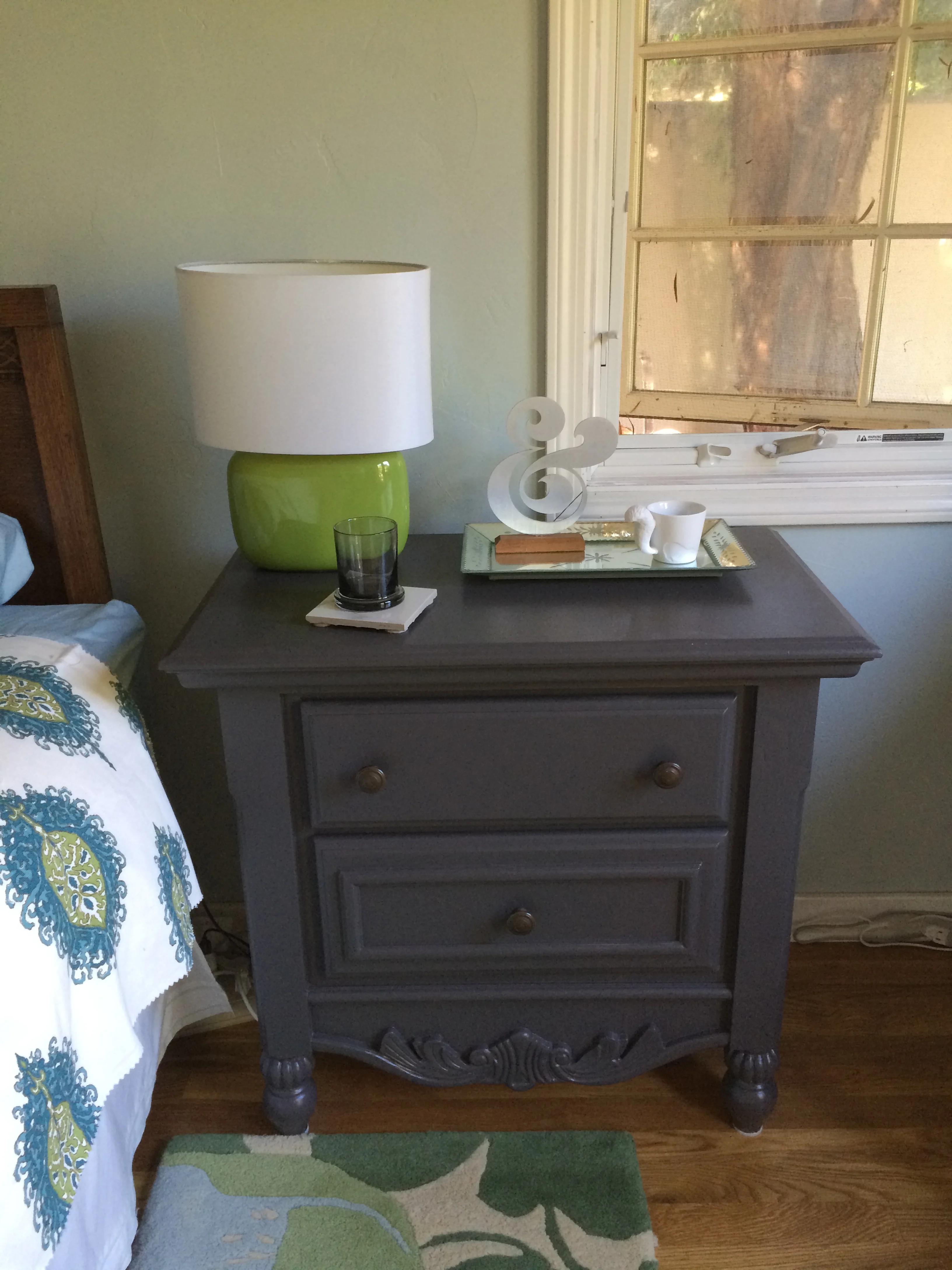
The need for this furniture piece took us back to the Rose Bowl in search of a hefty bedside cabinet.  Not wanting a matched pair made the search both easy and more difficult as sellers are less likely to break up a set; although it is always a good idea to ask, you might get lucky.

This time we planned to paint the surface so we were less concerned with the species of wood and its condition.  I am always surprised to see “shabby chic” still popular, but it does not alter our goal for a painted surface.  

IMG_1720.JPG

The piece we settled on had some pretty feminine applique details that I mistakenly thought would be simple to pry off with a putty knife.  Apparently, a century ago, the glues they used were pretty strong; in addition,  the appliques were secured with tiny brass pins.  We needed to resort to heavier tools than we found in the pink tool box; we needed a man’s tools for this job!  The appliques came off but not always cleanly; some of the oak splintered off leaving more to sand off with an electric sander.

My client chose this piece  because of its size and storage capabilities and because of the secret compartment!  When making choices from flea markets, one needs to be certain the piece will fit the space and needs; it is wise to be careful, and always carry a tape measure since such pieces are not returnable.  Getting the furniture from the stall to one’s vehicle is the task of the buyer.  We were not well prepared for this part; the oak was much heavier than we anticipated, and we were without a strong guy to carry the for us.

We struggled carrying the awkward piece through the crowds, having to stop and rest periodically.  At one point, we had the great good fortune to stop in front of a stall where the kind owner offered to loan us her homemade dolly if we would leave a driver license.  She apologized for needing to keep something of value as she had been burned by people in the past not respecting her generosity.  My eternal thanks to this wonderfully kind woman.

To make a simple portable dolly requires on a couple of 2x4’s nailed to form a platform and covered with a remnant piece of carpet.  Four heavy duty casters attached with some screws to the underside, and one is in business. 

Finding the Perfect Vanity

Grimy Find

Grimy Find

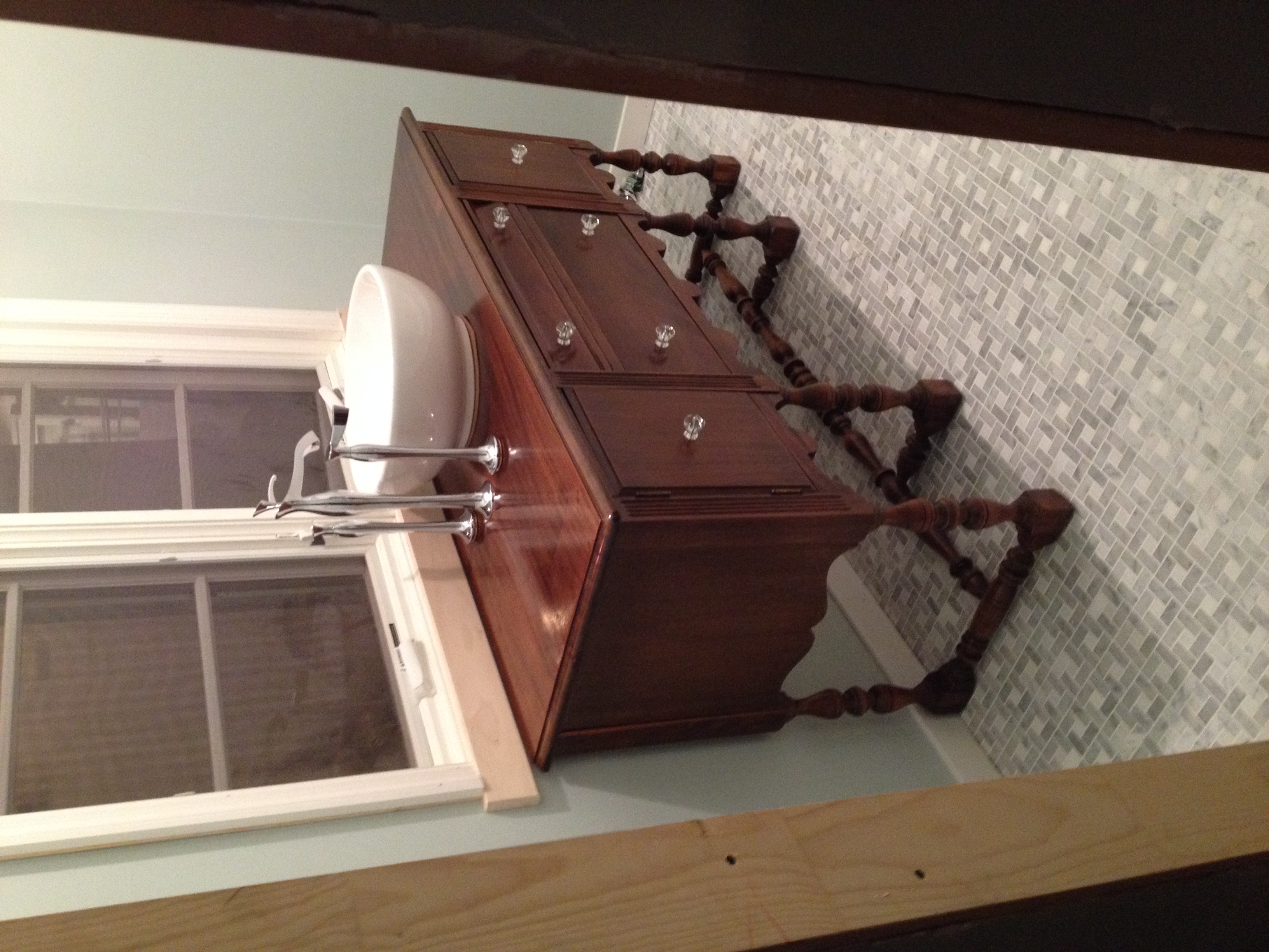
The search for the perfect bathroom vanity set my client and me on a journey to the flea markets at Pasadena City Collage and  the Rose Bowl, into Orange County’s antiques streets and up to Main Street in Ventura.  Along the way, we were able to fine tune exactly what was needed to fit the space available and satisfy my client’s aesthetic sensibilities.   Keeping an open mind helps you find something and adapt it to your needs as opposed to having something custom built and incurring the additional cost.

It is important not to become discouraged when you head out on your search, because what you have in your mind’s eye is not likely to be found in the world of existing products.  My client had established the hard surface finishes, which are stone and tile; so she was looking for some warmth in natural wood for her vanity-- that is, not a painted piece.  Of course, a found, usable vanity could be stripped and refinished if otherwise worthy. 

We didn’t have any success at our first weekend out, which is not unusual.  However, when we hit the Rose Bowl, we were amazed to find a great, aesthetically pleasing dresser at the first stall we saw.  We especially liked its large, round mirror; usually mirrors attached to dressers are oval.  Even the color was perfect, had she wanted a painted piece.  The design added to its feminine appeal.  We assessed the piece with a practical eye: how much work it would take to add a vessel sink and the necessary plumbing, and how much drawer space would need to be sacrificed.  The vendor took our cell numbers and we moved on. 

Rennovation In Process

Rennovation In Process

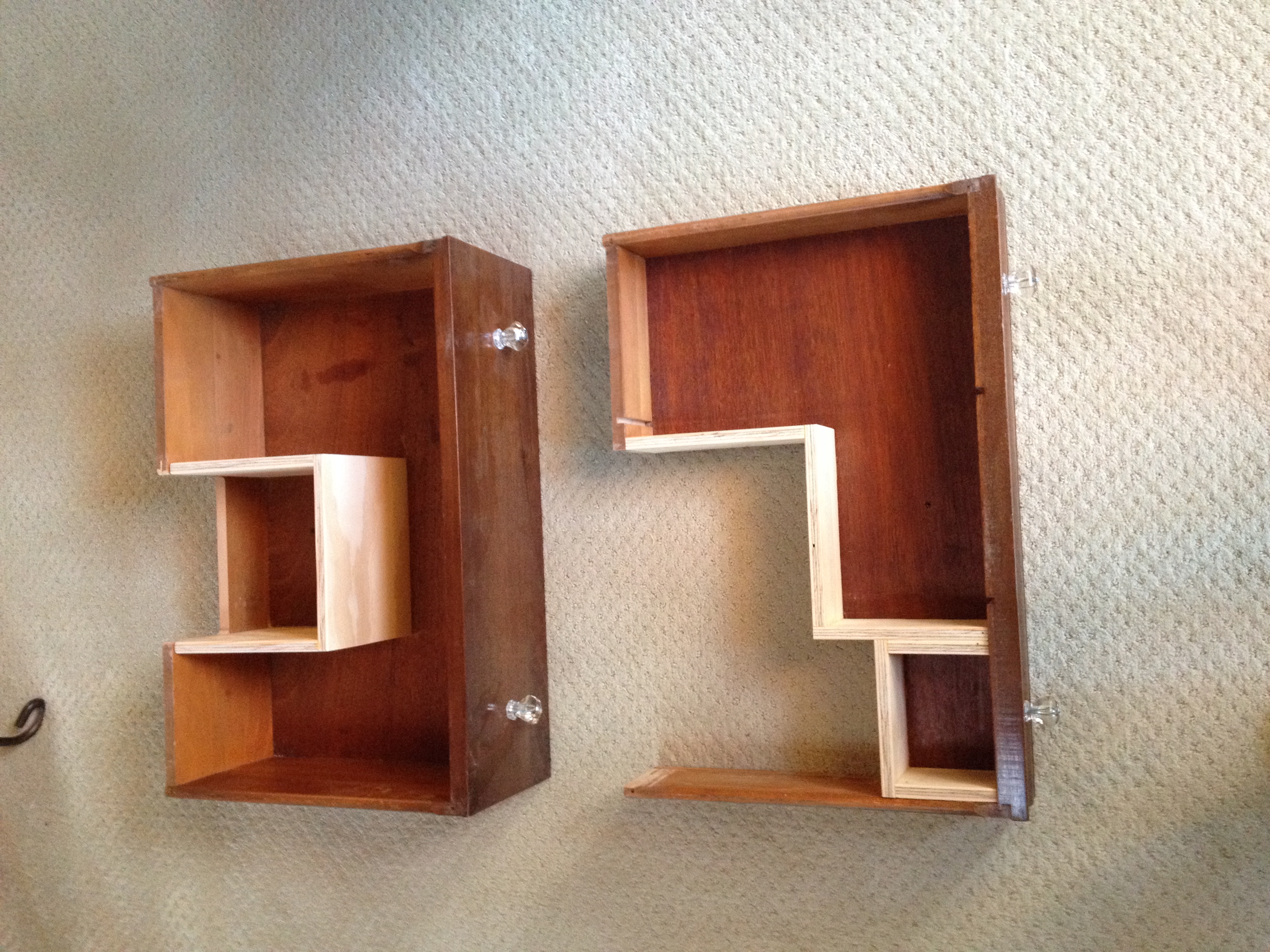
Our second find determined that a dining room server or sideboard might be a better choice.  We determined the central top drawer might be sacrificed for plumbing,  but the side cabinets would be perfect for keeping curling irons and a hair dryer for easy access.   We especially liked the turned legs of the piece adding to the feminine quality.  Unfortunately, detail work lost over the years needed to be replaced by a furniture restorer, ultimately adding to the cost.  The last problem was that the piece was painted; beautiful mahogany wood, but the missing detail work was key, so we moved on.

Our last option at this site was a pretty Bird’s Eye Maple dresser.  We loved the wood, but the piece was pretty plain and the top was damaged, so more work or a stone top would need to be added, increasing the cost.

The search continued the following week into Orange County.  Because we had little time and had honed in on what we wanted, we looked at a more limited number of pieces;  we found only one piece to seriously consider, but it was costly, and  reviewing our “option” pieces, we passed on it.

The next day we headed up north to Ventura, and BINGO!  We found the perfect server piece.  A previous owner had cut the legs down, so it was low enough to accommodate a vessel sink and, we didn’t have the anxiety of doing it ourselves.  It is  narrow in depth, which suits the available space nicely, and was not painted.  It did have decades of old stain and no doubt a variety of oils and grime on the surface, but that just means it needed to be stripped.  

The stripping down part was going to be messy and time consuming, but the price was negotiable, and that made it very appealing.  Unfortunately, the most effective stripping agents have been eliminated by the EPA over the past several decades, so the process is more lengthy.  If you do not do it yourself, stripping can be very expensive.

Completed Vanity

Completed Vanity

In the end, the search process was fun and, as usual, educational, as we fine tuned what would work best.  The stripping continues, but we are convinced that the search was successful, and it will become the perfect vanity.