Sneak Peek

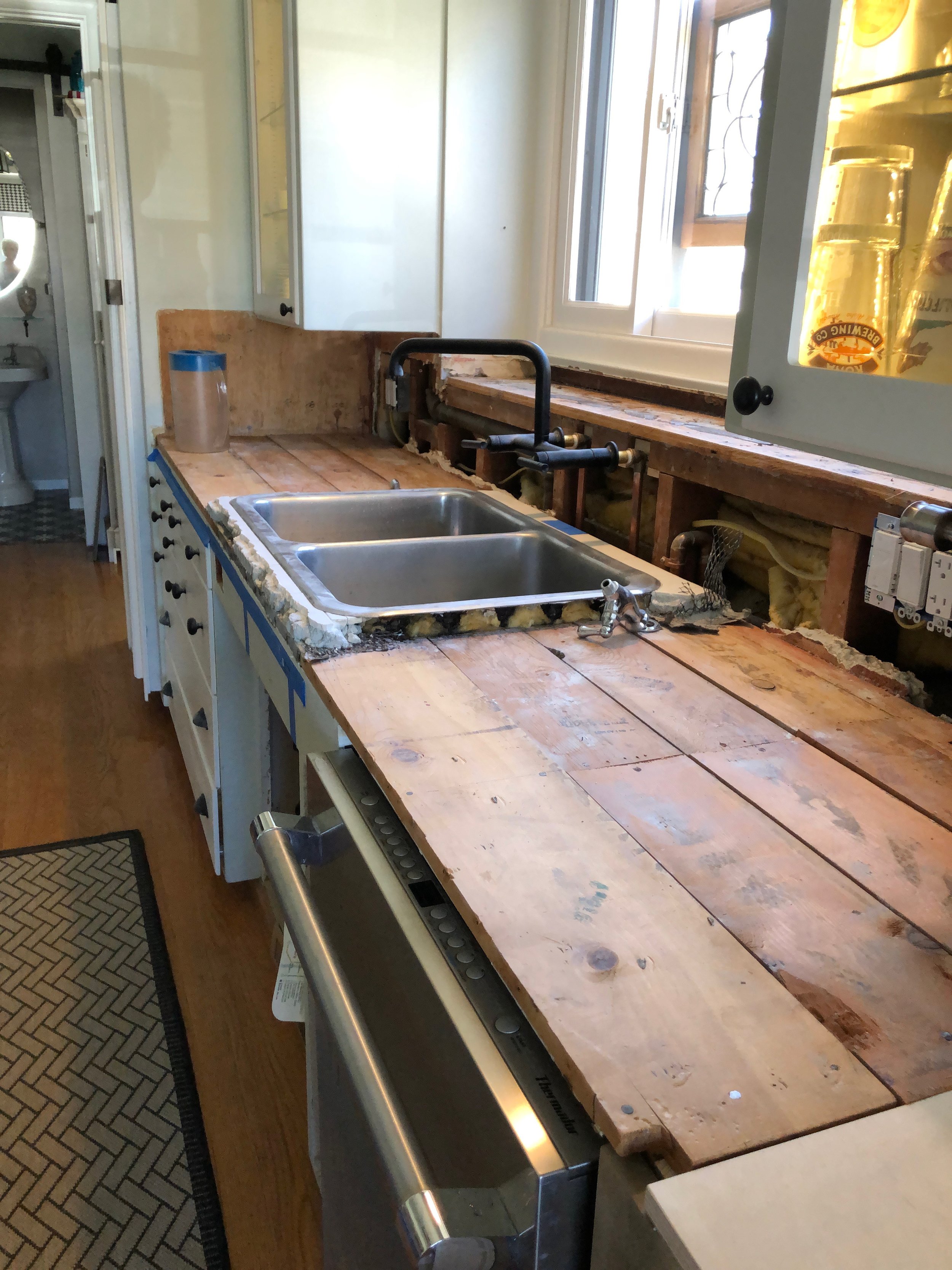
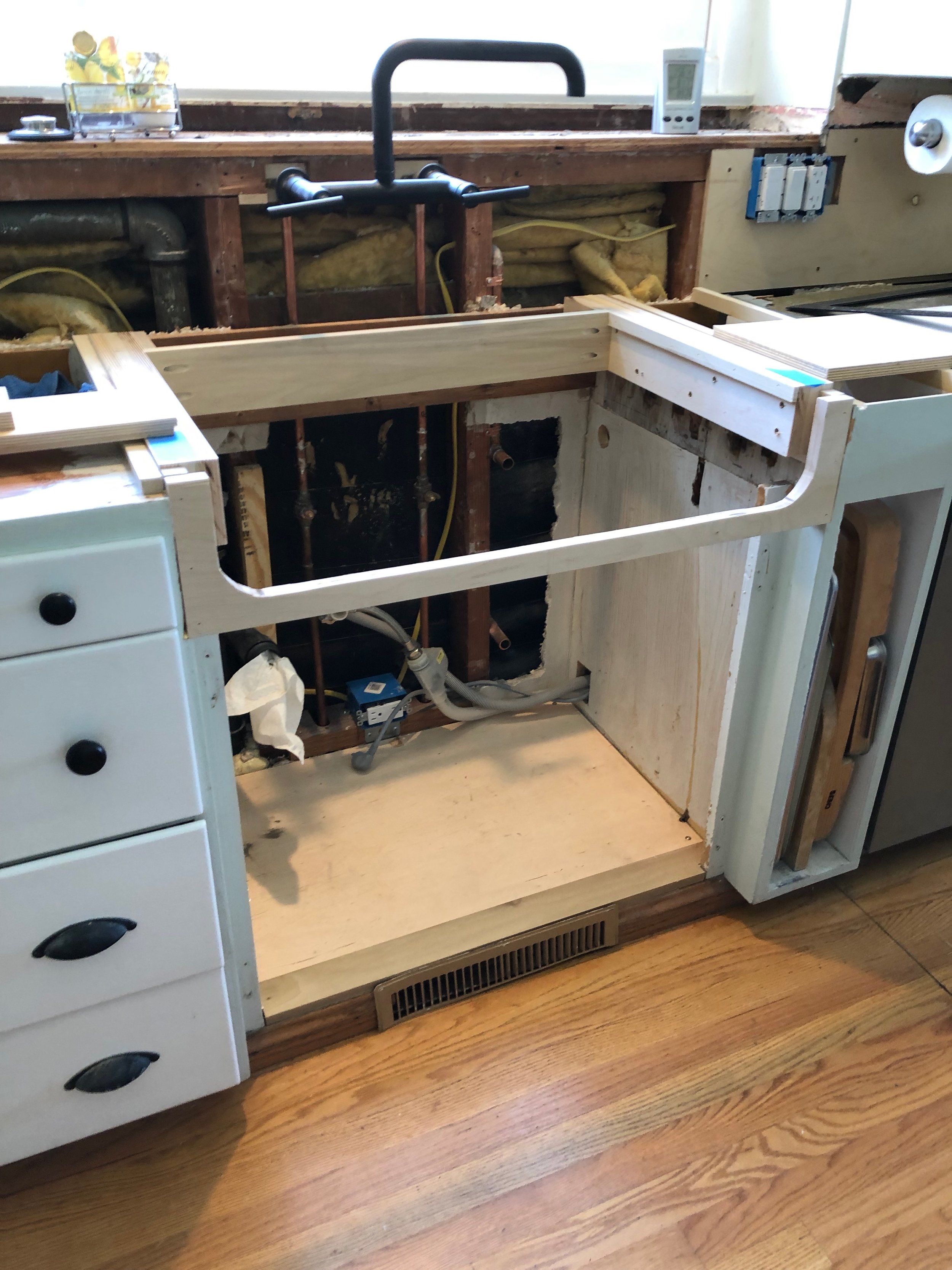
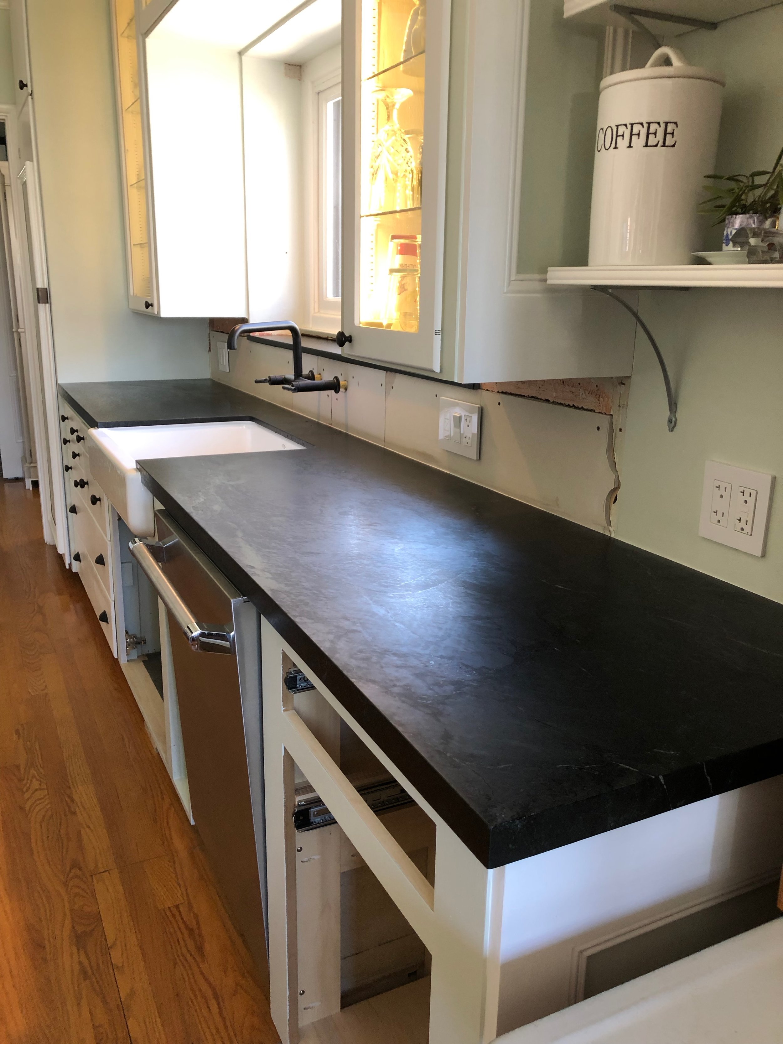
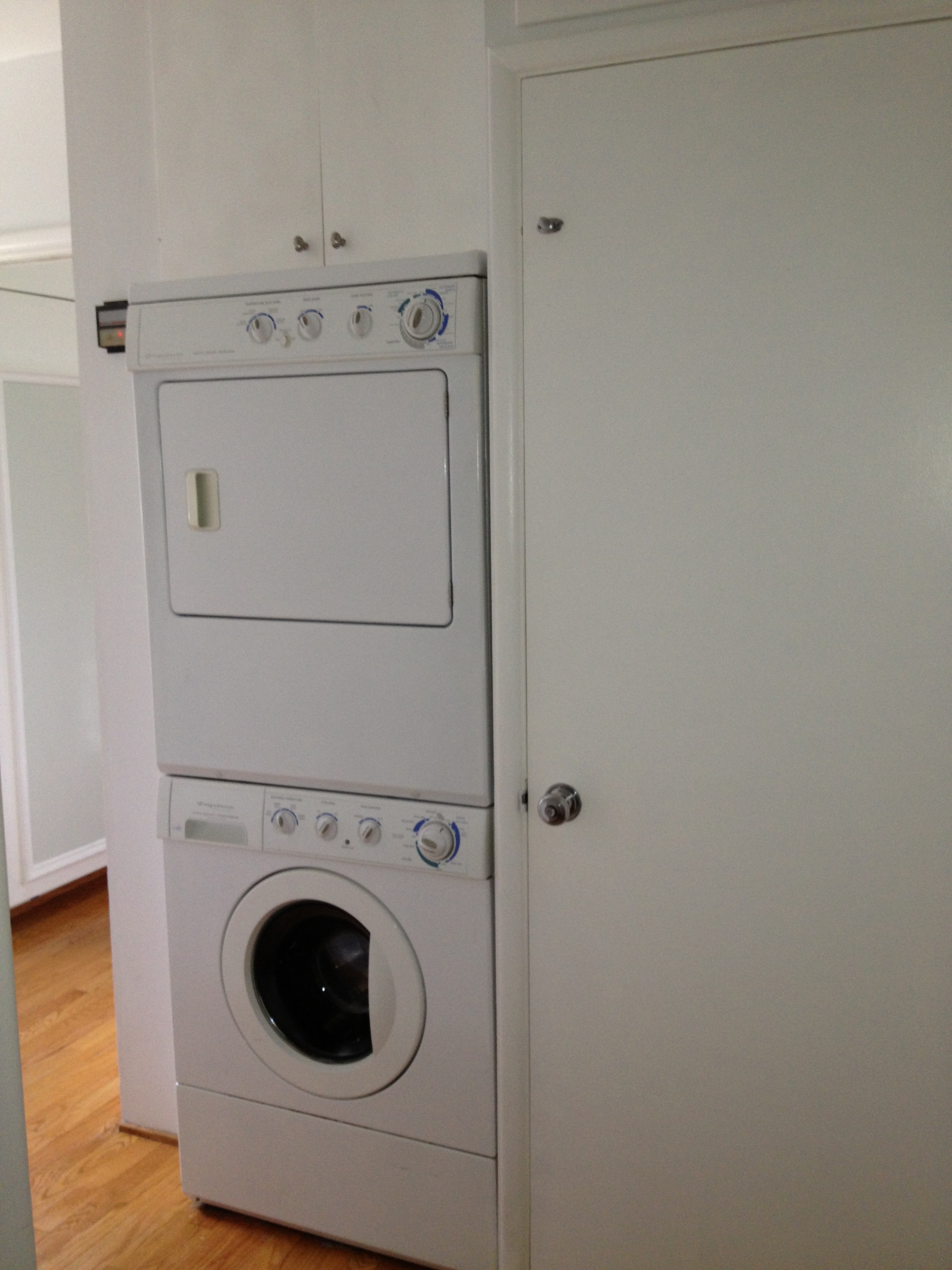
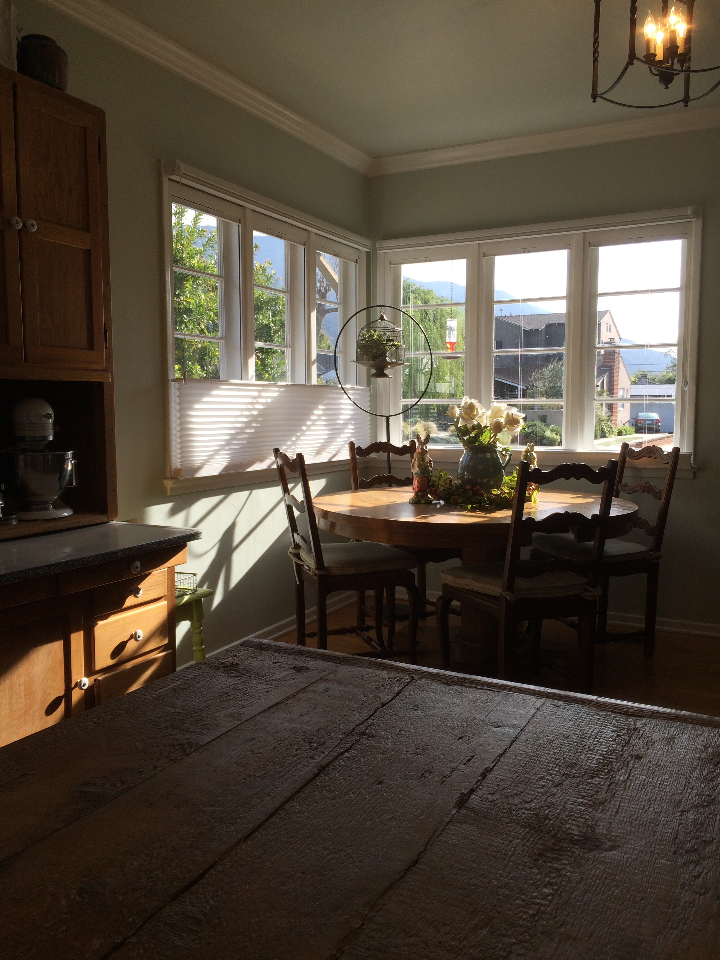
Here is a sneak peek of things to come in my blog.  Having completed the near complete gut-job of removing my daughter's kitchen, leaving most of the walls and floor, the rest removed, I will share a few pictures.

A $5 piece of wood found in a bin at Rockler's.  With a bit of routing for the edges and to prepare a space for Rare Earth Magnets, a handy knife holder has become one of the most useful additions to the "new" kitchen.

A $5 piece of wood found in a bin at Rockler's.  With a bit of routing for the edges and to prepare a space for Rare Earth Magnets, a handy knife holder has become one of the most useful additions to the "new" kitchen.

The wood for the shelves was chosen for its "character", since the underside of the upper shelves would be visible, we chose the most distinctive side to face down.

The wood for the shelves was chosen for its "character", since the underside of the upper shelves would be visible, we chose the most distinctive side to face down.

With the absence of a real lighting expert, we had to rely on what we had and who was available.

With the absence of a real lighting expert, we had to rely on what we had and who was available.

Hazel Nut proved to be willing to help at every opportunity.

Hazel Nut proved to be willing to help at every opportunity.

Mail Delivery

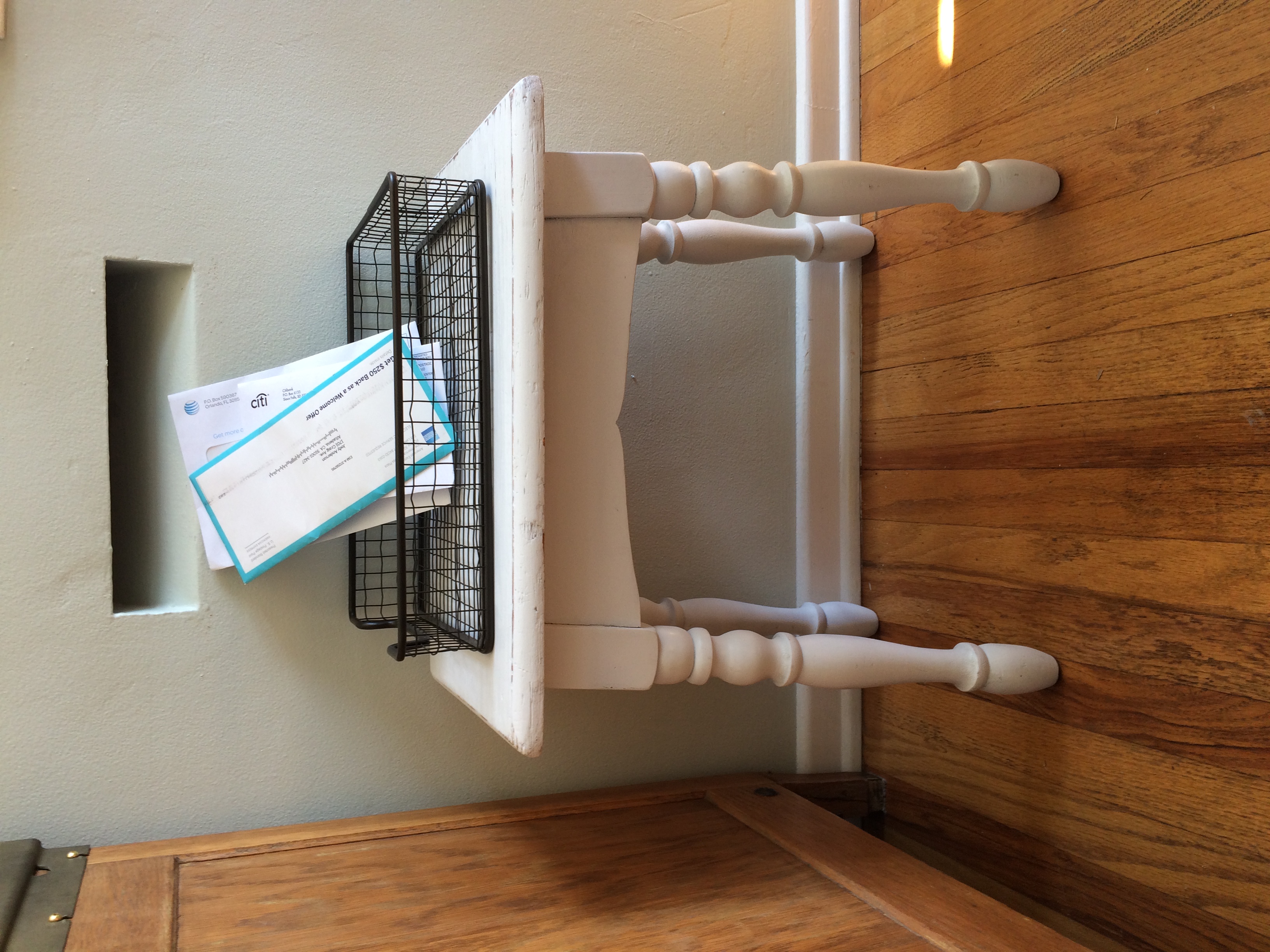
I remember mail slots in the wall from my earliest years.  Oh how I longed for a modern mail box.  Now, I find the nostalgia comforting and quaint.  This little mail slot in our wall is one of the reasons I fell in love with this house— several years ago.  As I waited for the chance to move into the little house on the other side of the mountain, I envisioned different pieces of furniture I had to catch the mail, but after I moved in, I realized that most were not right for the space; I have had to make many similar adjustments.  

Not to be deterred, my first solution was simply an unpacked box sitting under the mail slot, with a basket to catch the mail.  Soon after the boxes were unpacked and out of the house, I moved a small, square table I had into position and replaced the box.  However, it was a bit bulky and interfered with one of the chairs at the table.  

With a bit more time on my hands now, I decided a small stool or short bench would probably suffice.  My daughter and I took off exploring shops around town.  I was in no hurry, so I could be choosy.  I knew I did not want anything fancy, and something more in keeping with the period was what I had in mind.  With a lot of wood used in this room— with the hardwood floors, round oak table and chairs and the hoosier cabinet— I was feeling like something painted would be my best option.

I found a small white stool with turned legs. The stool is not too fussy, and it is the perfect size.  The price was right, too, less than twenty bucks; now that was a bargain.  I liked it right away, and the size suited the space, as I predicted; but the white color was a bit too sweet for my taste.  I painted it a bright apple green; and for now, it is just right.  However, I have a feeling that very soon, it will be painted black and be more in keeping with a long bench I have in the room, and the black china cabinet. 

The black keeps the soft blue-green walls with white trim from being too cottage like. While I like the cottage look, I need a little black to keep it more grounded.

We enjoy having this little bit of nostalgia as a reminder of times gone by.  Another discovery, is a little post office inside a local pharmacy; it will never take the place of our beloved Acton Post Office and all the wonderful people that we got to know over the years, but it is as close to a community post office as we will see again, I think.

Refinishing with Stain

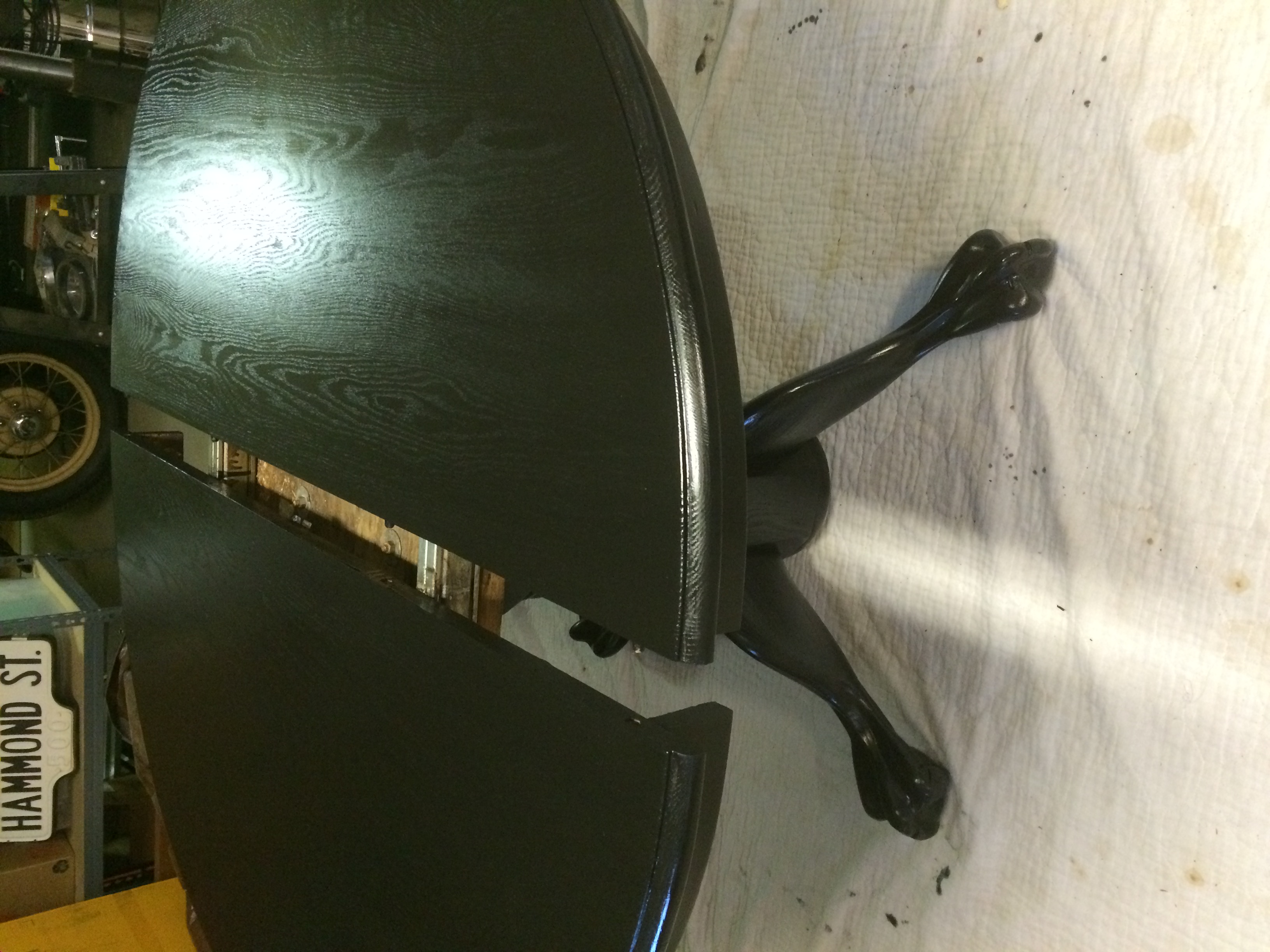
My current project is another round oak table.  My clients were impressed with the painted oak table that I did several months ago and talked with me about changing their oak table.  This family’s style is not country, but the eat in kitchen table was pure country, and completely incongruent with the style of the rest of the house.  The table’s condition was another source of frustration: its stained top was chipping, and there were bare spots, and bubbles left the surface anything but smooth.  We had talked over the years about what to do with the table, and replacing it was considered;  but the table had sentimental value, since it had been the table my client had grown up with from childhood, and she wanted to hang onto it for that reason. 

While the clients both liked the painted oak table, that was the inspiration for their table; we discussed the durability of a painted surface verses a stained surface. Staining was the most practical application for the heavy use this table receives on a daily basis.  A family of five can dish out a lot of wear and tear.  These clients’ have different circumstances from the client with the with the painted oak table, so staining was the right option.  

A stained oak table is what they had, again way too country for this modern family.  Since the black painted table was the inspiration for changing their country oak to something more modern, we talked about staining the table black or ebony.  Oak, stained or painted black gives it a decidedly more modern look.  

I checked out the stains offered and bought a name brand I have used for years in an ebony color.  Once I stripped, sanded, and washed the table, it was ready for the ebony stain.  Fortunately, I stained the leaf first.  The stain went on black and solid, but once the requisite time passed, when I wiped off the excess stain, I was disappointed to see the color was hardly what I had hoped for.  The brown color of the wood was still quite evident, while the more open grain of the oak absorbed the stain nicely, giving me the blackness I wanted.  I followed directions and allowed the stain to dry, and applied a couple of more coats of stain, not getting anywhere near the color I expected.  Additionally, I knew the wood would not accept any more stain, since the more open black grain was “weeping” out bubbles of stain.  

This process took days to work through, and resulting in more research.  I have been painting and staining furniture since I was a teenager, and I have used a variety of stains and paints; but times change—and so do products.  In California, many of the products of my youth are no longer available here.  I decided to do some online research and tried some home-grown ideas, like soaking steel wool in plain white vinegar; the color of the vinegar does not change, but there is a chemical reaction that affects the tannin in wood, and that will make it black or dark gray—not quite black enough for my goal, but interesting just the same.

I went to a salvage yard in downtown Los Angeles and talked with a man there who showed me what he uses, another familiar name brand stain I have used in the past.   After testing this new stain on the underside of the leaf, I was delighted to see the results would be perfect!  This brand was much more viscous; after only one coat, I knew would give the result I sought. 

After stripping off what I could of the first failed attempt to stain the leaf, I sanded and washed the surface.  I applied the new stain to the base as well as the leaf.  I saved the top for last, wanting to do all my experimenting on the base and leaf.

I used an oil based finish of the same brand that I felt would be the best under the circumstances; however the weather turned and drying times took days to get to the point I could lay the first coat of finish.  Having to wait at least 4 hours between coats means that it will take another day at least to finish this project. 

Once there are sufficient coats of finish, this table will serve the family well for many years, giving them the modern look they want, while preserving the sentimental value of the old oak table of my client’s youth

Let Lighting Be Interesting

Kitchen Colander as a Light Fixture

Kitchen Colander as a Light Fixture

Fluted Funnel Cake Pan

Fluted Funnel Cake Pan


Lighting is a necessity, but there is no reason it can’t be beautiful or unusual or interesting, depending on the setting. Here are some interesting and economical lighting applications.

First, in our case, was a long search for suitable, interesting and practical lighting for the recent expansion of my client’s laundry/service porch in the little house in Pasadena. One of the problems we had to overcome was the long pathway from the backyard and garage through the service porch, anticipating the carrying of ladders or other utility objects through the space; and the height of any type of lighting other than recessed, had to be considered. The original light in the service porch was a typical bulb covered by a glass globe of the 1930s, which hung down about six to eight inches from the ceiling. With the new addition, the contractor installed a recessed light, so the inner workings of the two ceiling lights were quite different. This was not a problem for an electrician or a handy husband.  

The proper adaptations for the “find” of the day a few months ago at the Rose Bowl, were two old, and a bit rusted, fluted funnel cake pans. These old pans would be a nod to the age of the house in the new space, so it would not feel so brand new. The cake pans cost three dollars apiece, and we were notably thrilled with the idea and cost. Unknown to us until just recently, the very same idea at the HD Buttercup showroom on the west side of Los Angeles. The price was significantly more—to the tune of $175 each! While we were a bit disappointed to find “our” idea used, we were delighted in the “savings”.

The light above the kitchen sink was constructed out of a an ordinary kitchen colander, cute, easy and not particularly original, but it feels right in the space.

The next special find, came from an estate sale, where we located three large chess pieces; of the three my daughter wanted the knight, so handsome with his curly mane; next was the king who was particularly handsome, and we decided he would stand tall on a fireplace mantle or hearth. The third and final piece was the rook. I immediately identified him as a perfect lamp base. I knew my clever husband would have no problem drilling a hole in the top and out the side to run a cord, but it was up to me to find all the various pieces—and I did. The lamp is the best of all three pieces, starting off as the most plain and unassuming, it has taken its place of honor on the night stand, no pun intended.

A light can be fashioned out of practically any vessel or container, depending on how much light is needed. The pendant lighting in the back yard has been a terrific hit and so practical, since the shades do not have to be brought in in inclement weather. The next outdoor project will be to cover some very modest and uninteresting jelly jar lights on the exterior of the house. The plan is to fashion covers over the jelly jars to mask their utility and add some interest with more of the punched tin that was used in the outdoor pendant lighting over the patio. While we searched for something suitable, we settled on the modest jelly jars so we could satisfy the city and get a final inspection completed. We knew we could always change them, and they were less than ten dollars each. Adding the covers will disguise them sufficiently and add to the outdoor theme.

Kitchen Storage: Old Ways Work Well Today

Plantation House on Kauai 

Plantation House on Kauai


Recently, we visited one of our favorite old haunts on the island of Kauai, the Grove House, established by George Wilcox, one of the first sugar plantations in Hawaii. I am always amazed at the generous proportions of the home and how seamlessly the additions to the home were incorporated.

The ceilings are tall and the verandas are generous, allowing the doors and windows to be open to the trade winds while the interiors are cool and dry, protected from the frequent rains that keep the island so lush and green.

Many of the necessities of farm life in the mid-1860’s were incorporated into the home, and are still in use today. The kitchen, while modest by today’s standards, is efficient and serviceable. They still use the old wood burning stove, which keeps the kitchen quite warm, even in the summers! The kitchen has a composting bin, which is air-cooled to the outside, which keeps unpleasant odors from accumulating. It is handy to remove the waste to the outside compost pile. While composting is making a comeback today, having outside access might be a good thing, but probably less practical in today’s kitchen.

Dishtowels air dry under the sink while hanging on dowels that slide out for easy access. This is a convenience that continues today in many forms, proving that some old ideas are well worth preserving.

I have always loved the pots and pan storage ideas employed at Grove Farm, not that they are unique to this home, as many homes of the era made good use of the space. The practical storage of platters and cutting boards, separated by thin vertical panels makes perfect sense no matter what century you are living.

Several years ago, when we replaced our builder wall oven, for an under-the-counter oven, wide enough for just about anything, we had to deal with the old oven cavity. It was no problem for me with handy hubby willing to take on the task. I had been wanting to get cookie sheets, platters and other awkward sized cooking pieces out of dark, hidden cabinets and up where I could reach them easily. The solution was to add the vertical dividers to separate cutting boards, platters and cookie sheets.  

Above the newly acquired storage, I had more space, and handy hubby added a horizontal shelf, high enough to allow for storage underneath for more frequently used items. On the added shelf, I store all the long boxes for parchment paper, aluminum foil and plastic wrap. These are easy enough for the vertically challenged to reach, as long as you don’t push them too far back when returning them to the shelf; however I do keep a collapsable step stool between the cabinet and refrigerator just for retrieval purposes. On the uppermost shelf, which not not many can reach, I keep the lesser used kitchen items.

To make the best use of your space, you must first determine how you want your space to serve you, then break down what can be added or deleted to serve your purpose. Having a handy hubby around, admittedly is one of my most prized gifts; but you will find lots of folks willing to take on the task for a reasonable fee. I think finding the space is the most challenging problem; but if you have a space that isn’t working well, think about how it can better serve you and go from there.


The Senses and Design


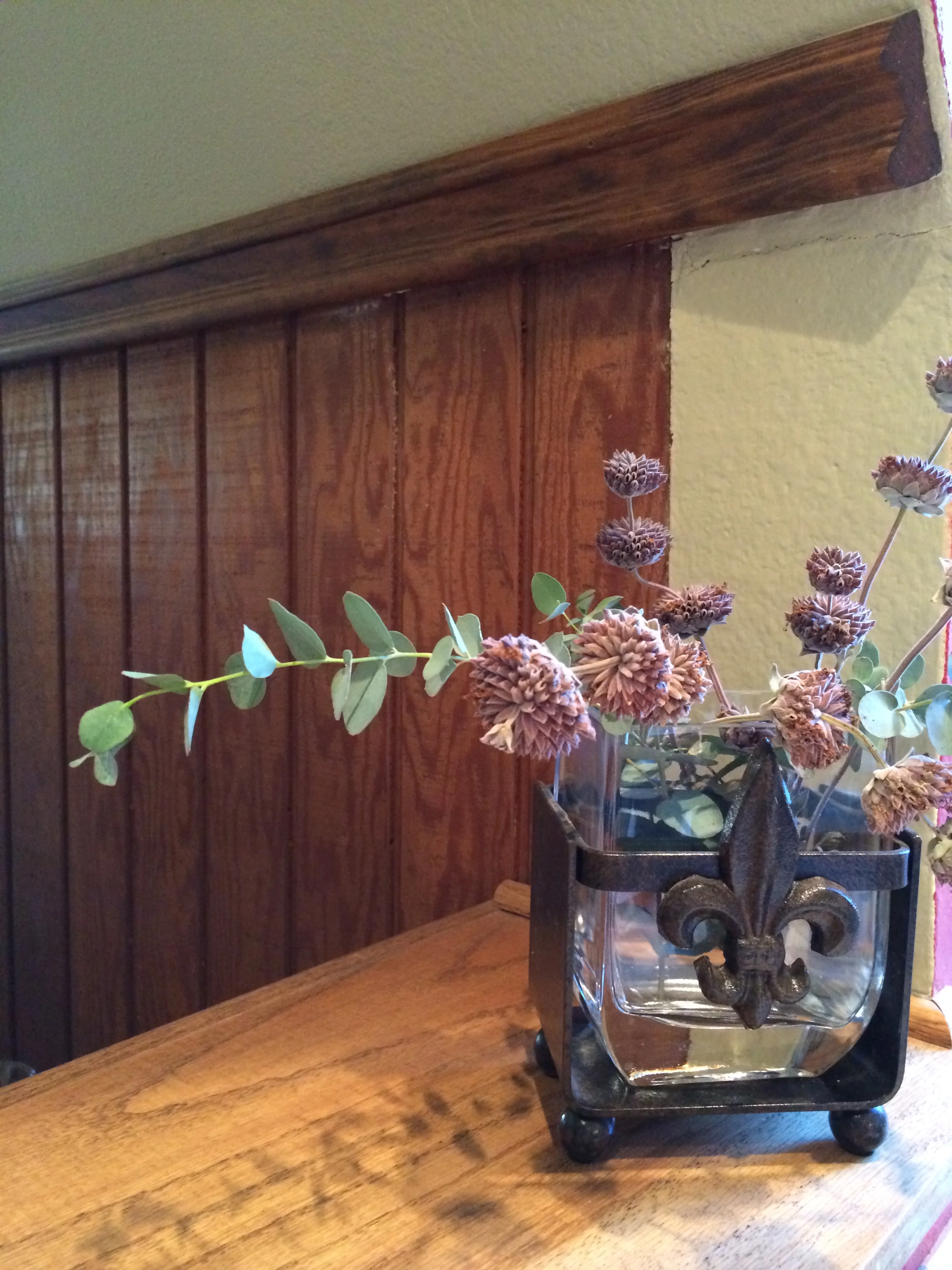
We are fortunate when we can enjoy a combination of positive effects on several of our senses at the same time. In the world of design, our senses of sight and touch offer pleasures, but our sense of smell is a likely third; it is oh so satisfying when flowers and greenery produce color, scent and texture all at once.

Bringing the outdoors in is a goal for most of us living in a temperate climate. While I am not a landscaper, I do know what I love to see and smell and Salvia Clevelandi, Winifred Gilman is a favorite for my eyes. I love it in the garden near an open window or door, so I can take in its lovely scent whenever a breeze comes up.

I like to make good use of plants in decor by using the real thing, whenever possible. Even dried plants can give off a pleasant fragrance in dried arrangements, or tied in a bundle and hung in a closet or shower. I like to use eucalyptus branches in these areas as well, especially hung in a shower; the steamy atmosphere helps bring their sweet, fresh scent into the surrounding areas-- for me, truly heaven sent.

Even a particularly lovely piece of furniture that needs protection from water spillage can be enhanced with a dry arrangement of local native or succulents as a centerpiece. One should never water a succulent on a table top; it should always be watered sparingly and on a surface that can be easily wiped up. Once the water has settled in the container, there is no danger of leaching moisture onto the surface of the furniture. An arrangement can sit for quite a long time, and infrequent watering will make a happy situation for both plant and table top.

Lavender is another favorite, both in the garden and in the house. These plants do well in our dry climate and are a favorite to dry and use as a sachet for drawers. Let me mention rosemary as well, which adds another sense, the sense of taste. Rosemary’s flavor adds to many savory dishes. Growing theses plants makes it easy enough to snip off small branches to bring into the house frequently, to add to an arrangement of roses or to use all by themselves. 

One of the great characteristics of these plants is their structure. They offer so many opportunities to display them creatively. They look lovely against a plain wall, or one enjoy the shadows they cast in the evenings. In addition, they bring fragrance to the room and the soul. With their color, scent, texture and taste, they have the makings of a long lasting and beautiful arrangement.

 
IMG_2145.JPG
 

A Great Estate Sale Find


You just never know where you will find the next great thing! Tag sales, garage and yard sales, flea markets and sometimes the side of the road can be the most unlikely places you will find just what you are looking for, albeit not as recognizable in its current form as you imagine. Maybe you are looking for a particular object and maybe you are just looking at interesting things, but when you stumble upon something that is out of the ordinary you need to take advantage of the moment.

Recently, while shopping at the monthly Estate Sale I like to frequent and, after a quick pass through, a second tour landed me at this old carpenters work bench. When my client found me, she noted that she too had looked at this same item. It is a bit low for a typical kitchen cart or island, but when you are vertically challenged as many are, it is nearly perfect. My client has been looking at kitchen carts on-line as well as checking out new carts in trendy shops around town, but nothing really hit the spot until we pondered this old work bench. Just imagine the history that this piece might tell if it could.

Under the books on the shelf below the top, is a hinged box used to store small tools. It is a perfect spot for little used, but necessary serving pieces. These pieces tend to take up valuable space inside cabinets and make preparation a challenge
when you have to unload half a cabinet to get to the piece you need. With those items off the valuable shelf space, everything is easier.  

The bench’s surface area is the perfect size for an additional work space for chopping vegetables or mixing a batch of cookies, it is the perfect height for a small stool and rolling out a pie crust while standing. Of course, no food is placed on top of the table without a cutting board or some protective surface for cutting raw foods. Good sanitation demands care. However, there are no worries about putting a glass on top that may sweat or a bottle of wine that may stain a nicer countertop. 

A piece such as this is great in a vintage house, but it would also fit in a more modern kitchen as a useful accent piece to add warmth and a sense of history-- a nice change from the stark, utilitarian look. 

We have considered adding a couple of inches to its height by adding casters, but so far the piece suits the needs of the cook; the taller cook can use the other surfaces in the kitchen. The bench has found a new and unexpected use in this vintage kitchen; a perfect compliment to the two cooks that can now work happily in unison.

 
Old Work Bench 

Old Work Bench


Working Kitchen Bench 

Working Kitchen Bench


Thank You, Julia Child

 
Peg Board with Chalk Board Paint 

Peg Board with Chalk Board Paint


Pots and Pans within Easy Reach

Pots and Pans within Easy Reach


I am not certain that Julia Child was the first person to think of peg board in the kitchen, but it certainly became a popular idea as seen in the recent movie, Julie and Julia and was the inspiration for this vintage kitchen. My client’s kitchen probably was a very satisfactory work space in 1930, with an ice box taking up some space and cold storage near the buffet. However, in today’s kitchen the refrigerator was a huge obstacle to get around and made an otherwise comfortable workspace for two or three people, a one person kitchen.

The answer was to move the refrigerator around the corner and into what had been a small pantry in the laundry room. This answer required the partial removal of a wall that separated the kitchen from the laundry room as well as the removal of the pantry walls in the service area. By removing about 18 inches of wall space behind the refrigerator along with the header above the door that lead to the laundry room, and adding a full glass patio door in the laundry area, the kitchen became a light filled, open and more modern work space. The refrigerator was rotated 45 degrees and moved into the expanded laundry room.

Moving of the refrigerator has been a long-standing plan for my client, and now that it has been accomplished, the floor space seems to have doubled, as three people can comfortably work in the space.

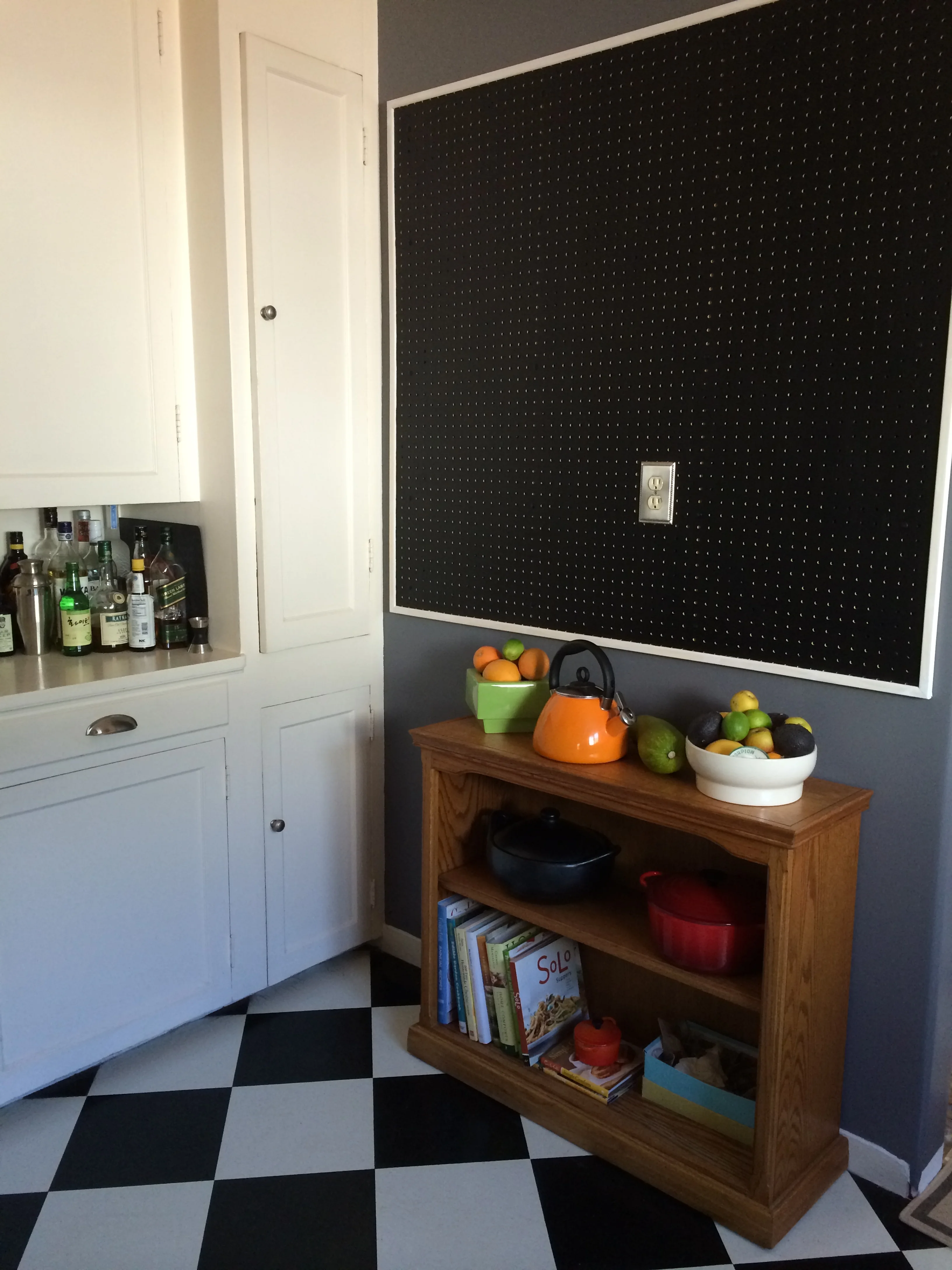
Storage was still an issue for this small kitchen, and that is where Julia Child’s idea to hang her most often used pots and pans on a peg board comes into play. My client had a contractor remove walls and extend the laundry room and add the full glass door, but the peg board was a fairly simple task to tackle with a drill, and some furring strips to allow space for hooks behind the peg board. While Julia’s kitchen peg board was the iconic aqua of the 1950‘s, today’s kitchen enjoys a practical application of blackboard paint; the plan is to outline the pots and pans, as Julia did, with a chalk pen. My client plans to experiment with pots and pans for a little while to make sure everything hangs in the most convenient place. One the two cooks has the reach of a typical six footer and the other, who falls far short of that lofty reach. The addition of trim around the peg board was a finishing touch, purely for aesthetics.

My client plans to add an additional work station below the peg board, but for now a narrow bookcase serves as a place holder as well as attractive storage for cook books and some bulky pots that have no place in the already packed cabinets. This is a clear case of using something you already have, in a new way. It is often beneficial to think outside of conventional uses for furniture pieces; bookcases can go almost anywhere, they are great storage units.

New Uses for Old China Cabinets

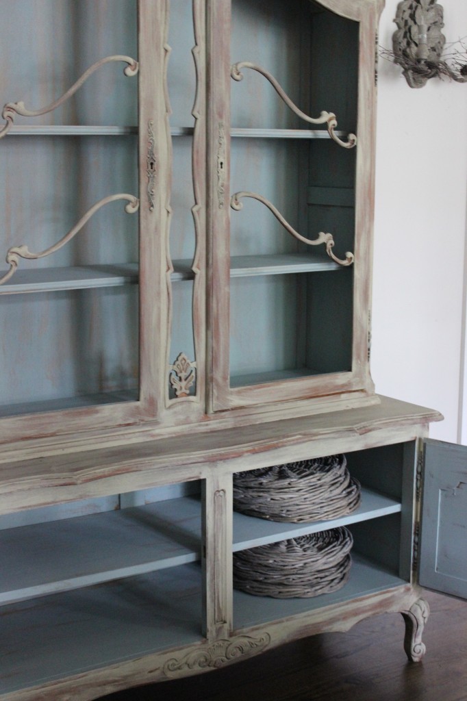
China cabinets have been a subject in my column before, I know, but this topic has a new twist.  Most china cabinets new and old come in two pieces; that is, the top or glass portion is usually a bit narrower than its base and secured by screws and possibly a bracket to hold it all together as one piece.  Years ago, I had a friend ask me what she could do with a piece she had inherited from her mother, a piece she really didn’t want, or need, but “Mother wanted me to have it”; so the need to keep and use it was strong.

My immediate idea was to take the top off (storing it until a use could be found for it) and to just use the base as a buffet, which is what my friend did.  The buffet sits in the dining room with the matching table, and the room is no longer overwhelmed with too much furniture.  I had suggested that if they had space in a bathroom, a metal base frame could be made for the glass portion and the piece could be painted and used to store pretty towels and toiletries.   The base being open, would not overpower a small room.  However the home really did not have space for.  Oftentimes, an older home ( 60 years or more) might accommodate such a piece.

Now, this friend is refurbishing a home that is from the turn of the last century, and I got to thinking about the upper cabinet piece that  hopefully being stored.  The piece might be a perfect solution to furnishing a century-old home, in either the kitchen or bathroom.

In the kitchen, it could easily sit on a counter top, making it look somewhat built-in, painted to match the base cabinet.  This situation would not have been out of the ordinary in those days, as pioneer folks really did use what they had or could find in a neighboring farmhouse.  Mix and match became a design trend; but back in the day, it was simply a way to make ends meet.  It’s funny, how somethings come full circle.

Alternately, this upper cabinet piece could be a great linen cabinet upstairs in the bathroom or hallway near the bath.  Again, it could be placed on top of an old dresser and secured to the dresser with brackets, or fastened to the wall as a permanent piece.   Depending on the decor sensibilities of the room, the pieces can be painted a fun color to enhance the bathroom, as an accent piece or painted to blend into the walls.  Bright colored towels can provide the accent color.  

If the glass has broken in the storage or transportation, a mesh or chicken wire can replace the glass.  Painted a silver, gold or black to match the other fixtures in the bathroom or kitchen to give it a true “farmhouse” feel, along with new handles or cabinet pulls.

Of course, both pieces could be re-united and painted and placed in the old farmhouse and given new life in a new space with a outlook for another hundred years.

There is usually a solution, if you can keep an open mind and are not in too much of a hurry for the finish line.   Remember that decorating is a journey; have fun along the way.

Tile to the Top

Whether you are remodeling or building from scratch, tile in the bathrooms and kitchen is a good choice.  While solid surface countertops still reign superior in most homeowner’s minds, the backsplash is another thing entirely.  Tile and stone pieces are a great option.  Stone pieces and mosaic tiles are usually mounted on a mesh backing, making installation much easier than was the decades ago fashion of placing the pieces one piece at a time.

In showers, more often than not, I am seeing tile or mosaic stone being used from floor to ceiling for a continuous look.  This process eliminates peeling paint in very moist environments.  It is also a cleaner look from a design aspect.  Allowing tile to reach the ceiling, gives you some more options for adding a design element, such as running subway tile in a vertical pattern, or alternating colors into vertical bands to give the room a greater appearance of height.  Running several contrasting  horizontal bands is another design option.  In small spaces use less contrast, but enough to add interest in what might be a dull and uninteresting space.

In kitchens, where you use tile as a backsplash behind a cooktop, you can create again a greater sense of height and you can highlight a fancy hood vent.  If you have a sink that does not overlook a window, adding an attractive tile with open shelves will feel less closed in than having cabinets above the sink.  This area can become a focal point for displaying some of your favorite decorative pieces or most-often used dishes and bowls; if they are colorful or unusual, they are not only useful, but pretty additions to the kitchen decor. 

Open shelving in kitchens over a counter-to-ceiling wall of interesting tile can add special interest while allowing for storage and display options.  In an eating area, where the kids sit, might be a great place to store materials that they can access easily, especially in a space-saving banquet area.

There are so many choices when it comes to wall tile.  Stone, glass, porcelain, and ceramic tiles are available in smooth, metallic, clear, solid and tumbled finishes.  I like to remind clients to consider the relationship between the counter and the backsplash choices, which need to be coordinated in both color and patterns.  Too often, clients choose a speckled countertop that may have a lot of color contrast, which they love, but then choose an equally busy backsplash over the counters; and are not usually very happy with the finished look.  It is best to choose one or the other to be the big splash of design or color contrast which is not to say you cannot have a dash of contrast in both places; but you need to use some restraint in one place or another.

The Open Space Living Concept

One of the most sought after living styles today is the open space concept with the  living room, dining room, and kitchen prep area all in one large room.  With today’s lifestyles, this concept makes a lot of sense.  Compare it with days gone by, where the cook was confined to the kitchen and the guests and family were elsewhere in the home.  Formal dining rooms are not the norm for today’s more casual dining; they are nice if you have a very large home with staff doing the cooking and serving, but this arrangement is not so common today.

The beginning of the open space concept may have begun with a pass-through from the kitchen to the dining room.   The pass-through may have been revolutionary in its day, but it is a bit too closed in for today’s living.  

One of the first things most people have to decide when considering the removal of an upper wall, is the cabinetry on that wall and where to store what is in those  cabinets.  The same is true when considering removal of floating cabinets over an island or peninsula.  It may be wise to open the cabinets, evaluate what is stored in them and determine where else the items can be stored.  You may even find a lot of things you considered “lost” because they were unseen and not easily accessible.  The things you still need and use, albeit less frequently, can be stored in other cabinets. This exercise forces you to really access the items need to be in your home; so making careful choices is important.

If you happen to have such a pass-through and wonder how to modernize it or truly open the space, there are few things you need to consider.  First, you will want your kitchen to be attractive and uncluttered enough to be on constant display.  You will want your cabinetry to coordinate with the rooms to which it is open, i.e. family room, dining room.  

If your cabinets are old, outdated or shabby, painting will be the easiest fix.  You can consider removing some of the door fronts and keeping some open cabinetry on upper cabinets for some of your pretty or frequently used utensils.  The most important thing to keep in mind with open shelves, is the view you will present to the rest of the room.

Another consideration is the lighting that will be visible from the living spaces into the kitchen area.  A new, attractive light fixture might be a nice accent to add to the kitchen.  Color will be another consideration; you will want the two or three combined spaces to be cohesive.  The rooms need not be the same color, but they should coordinate; consider a bolder value of the same color from room to room or a graduated value of color among the three rooms.  Color too will give an open concept a subtle room division.

The pass-through kitchen will require some amount of DIY skill, or you can hire a contractor.  You will need to determine if the wall separating the kitchen and other rooms is load-bearing before you swing the sledge hammer.  There may be electrical wires or plumbing pipes in the walls, so go slowly and check in the attic or have someone who is skilled in construction help you determine these issues.  Oftentimes, a post or pillar will be necessary to hold up the end of a load-bearing wall.

When you have cabinets on the kitchen side of the pass through wall, you will want the cabinets to remain for storage, so a half wall will be your division between the rooms, still giving you a visual open space.  A half wall may give you an opportunity to have a console on the living room side of the half wall, to be used for games or if it is a dining space, a buffet server for parties.

Removing the entire wall between the kitchen and adjoining room may be more ambitious than the average DIYer can manage, and there are more things to consider.  For instance, you will have flooring issues to deal with, as the removal of a wall will leave a two-by-four or two-by-six space where the wall once was.  Leaving a partial wall would not necessarily require new flooring or patching.  The ceilings in both renovations will need to be addressed, but dry wall is more easily applied than flooring with the necessary matching.  

Removing cabinets above an island and peninsula can be among the most liberating and enjoyable renovations one can undertake.

Got Tile?

Do-it-yourself or DIY folks are rarely at a loss with what to do with left-overs from a recent, or not so recent, remodel project.  For example, there are so many uses for a piece or two or three left over tile, and the following ideas are suitable for the most basic skills for nearly all ages.

Clearly the easiest of all to do is place a 12”X12” tile on top of a simple garden pot stand you will find at the local home center.  Easy, nothing to it, and this little side table will serve you well for an afternoon cup of tea or an evening glass of wine while enjoying a lovely summer evening.

Another use for a tile is a simple trivet that requires a little cutting of 1/4-inch plywood, some molding, four wooden drawer pulls for feet, and a bit of wood glue.  A trivet is a great way to showcase a special tile you may have collected on a vacation or while prowling through a salvage yard or second hand store.  You may want to use a left over piece of tile or stone from a counter top or floor job.

If you do not have any tiles at hand, simply go to a home center and purchase one or more pieces to make as many trivets as you wish.  You can create a large trivet using four tiles and placing them on a larger piece of plywood.  Tiles that make a pattern when placed with the four pieces intersecting to make a pattern and will make an especially great trivet for larger casserole dishes.

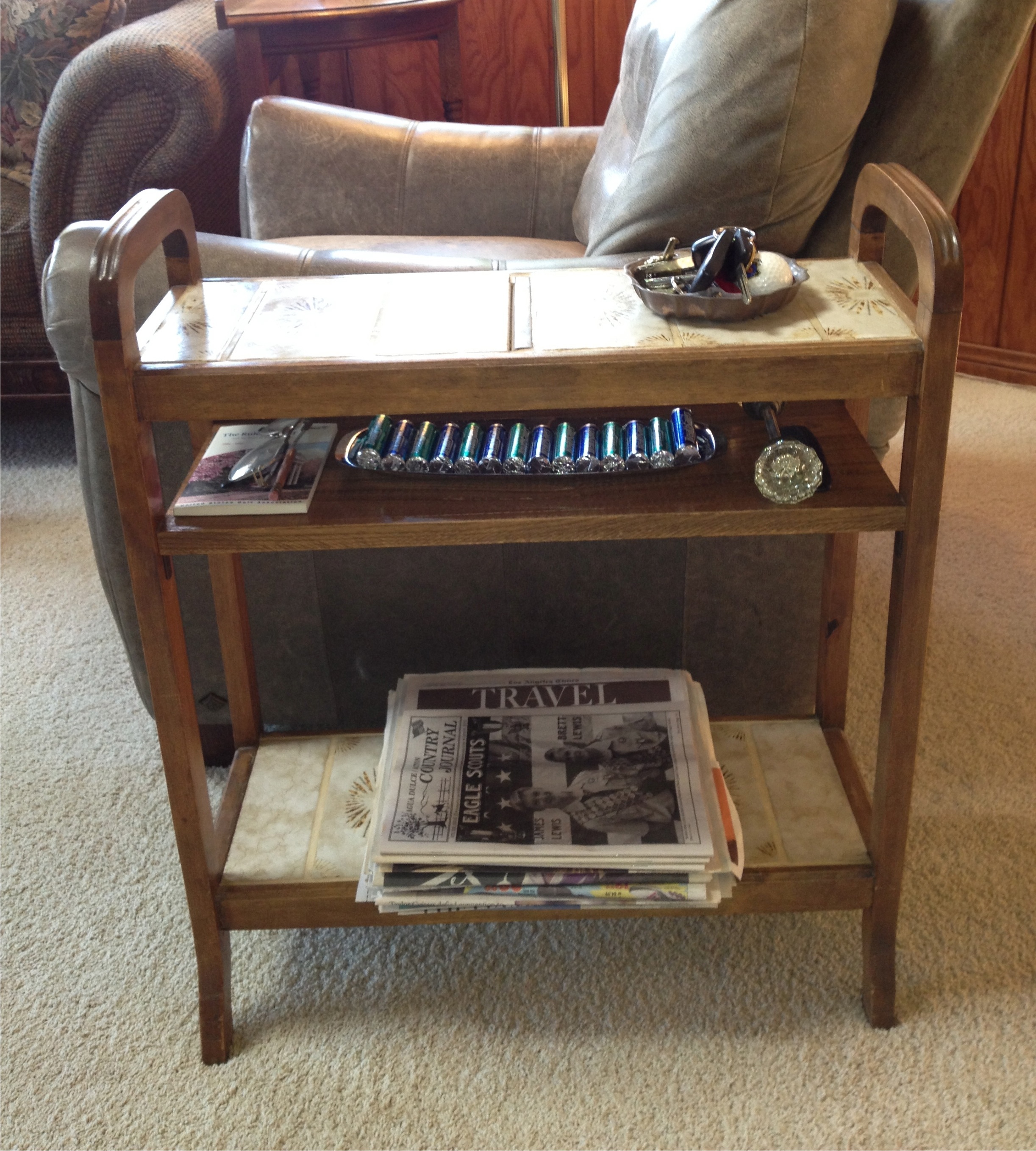
The following idea is a bit more complicated.  I used an old umbrella stand with very rusted tin plates on which the end of the umbrellas once rested; it was important for its size.  This piece became an end table for my crocheting many decades ago; my basket of yarn sat on the bottom shelf created by covering the openings where the tin plates were with a thin piece of plywood and covered with tiles.  The mid-shelf was created by using a couple of L-brackets and a cabinet grade piece of oak finished to match the rest of the wood frame; this shelf held any number of needed items.

The top shelf was created by placing a plywood base over the original holes for the umbrellas and affixing matching tiles to form a top shelf for glasses and a beverage.  Today this same end table sits beside a chair in the family room and is the dropping off place for my husband’s keys and other things he needs to pick up on his way out of the house.

The bottom shelf is a good place to store newspapers until they get recycled or used for painting projects in our household.  Again, that mid-shelf can hold just about anything that might be needed on the way out the door.

 A friend of ours tiled the top of some inexpensive bedside tables for the guest room,making them nearly damage proof; guests can leave a glass of water and not worry about leaving a ring on the surface.  These are just a few ideas; there are a many more just waiting for you to think of them.