Several weeks ago, I got a call from a client, asking for help with a kitchen; they were buying a “new” to them house, and could only afford to paint the kitchen cabinets for starters. A real estate picture of the kitchen was sent showing the kitchen. I could only see a glaring odd bank of cabinets hanging on the wall, “what were they thinking”, I wondered. When I met my client at the house, I asked if she’d consider removing the odd bank of cabinets and we could replace them with open shelving; to sweeten the idea, I suggested she would then be able to display her favorite ceramics from Ireland. Fortunately, she loved the idea and it was agreed that the cabinets could come down. The odd bank of cabinets consisted of a pair of wall hung cabinets and one corner cabinet hung awkwardly over the peninsula. This corner cabinet cut off a view of the backyard and closed off much needed light into an already the dark kitchen.
We decided on a two color combination for the cabinets and some hardware for a more updated look. This would go a long way to brightening up the dark, dated kitchen with its brick ceramic countertops and nondescript floor tiles; both will change as the budget allows.
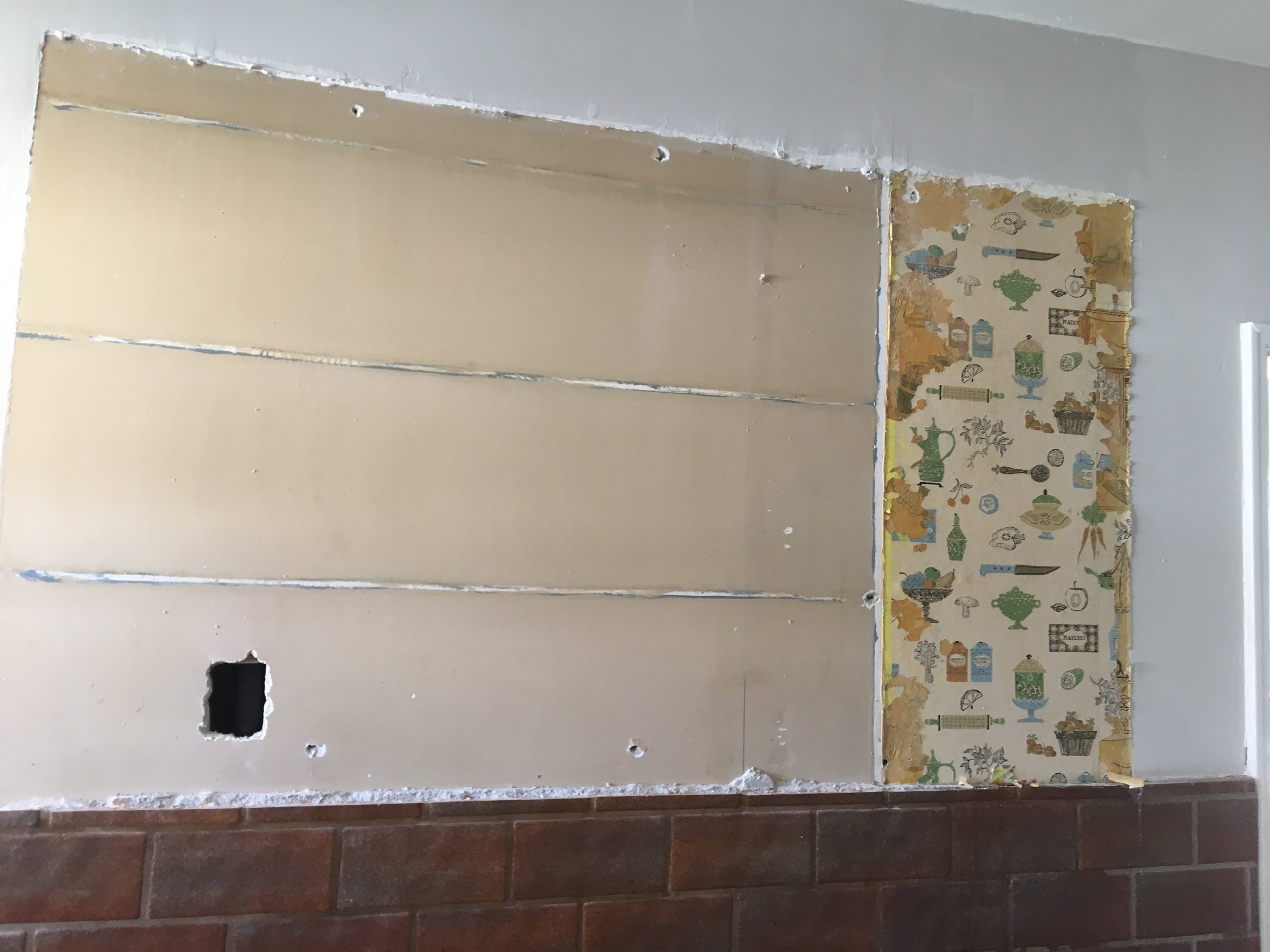
Once the cabinets were down I found four layers of wallpaper! Fortunately, only behind one of the cabinets. The top layer consisted of only a small tab of the former paper, the next layer appeared to be from 1970 in all its bright yellow and orange daisy, vinyl patterned glory. Once that was stripped off, the next layer revealed was something from the 1950s I believe, cute for its time. But wait, there was more; I stripped off each layer as carefully as possible to capture the history of this kitchen which was new in the 1940s. The last layer was a paper that could have been from the 1930s, as patterns did not change as rapidly as they do today. It was a sweet depiction of a victorian kitchen with an old wood burning stove, large farm table laden with baked goods including cupcakes, cookies, cake, bread and all the while the mother is mixing up more batter; a dog rested in a box near the stove, nursing her puppies. A kitty sleeps nearby, and it appears that granny is sitting at the table (her spectacles are on the table near an open cookbook) but only her skirt is shown. The paper is like a time capsule of early victorian life and it must have seemed like an appropriate walk down memory lane for the homeowner of the late 1940s.
I took pictures of each paper as it was revealed and made prints so that they can be framed and put in the laundry room as a reminder of days gone by— a bit of history for the house.
Once the cabinets were painted and the hardware installed, the kitchen had a fresh feeling. Patching and painting the wall where the cabinets had been was next, we liked the IKEA brackets, but not the shelves that fit the brackets, so we found a lumber yard that carried “full sized” boards, my handy husband planed them down to fit, and I stained and finished them.
Once the shelves were installed the kitchen began to feel more updated and belonging to the current family. While it is not my client’s ideal kitchen it is such an improvement over what it had been, it feels almost ideal—for the time being at least.
As time and budget allow, there are several ideas I have for the adjoining laundry and pantry rooms; all rooms are separated by walls with standard door openings. The pantry room actually has three doors on each of three walls. I know we can make this room much more efficient by closing off two of the doors, the family may consider non-non-essential.


