Several months ago, I shared the beginning of the hall bathroom “gut job”, where handy hubby tore the room apart to the studs. Well, it’s finished and has been for sometime now. I thought I would wait until we had gotten the doors painted in the office behind the bathroom to close out this project, but that may be awhile yet.
You may recall the toilet appeared to be sitting in my husband’s office, while convenient, hardly private. The problem with this bathroom was always the placement of the toilet; right in the center of the door in the hallway that also framed the kitchen. I am certain that no one wants to see that from a kitchen.
Moving the toilet to under the window where the vanity sat had always been the plan. In the course of changing out the fixtures, it was apparent that the walls needed to be opened to move the plumbing and some wiring as well. We did have several of those, HGTV moments, when walls are opened only to discover dangerous plumbing or wiring that could have resulted in floods or burning the house down.
It was like an archeologist dig. We discovered the small window that was in the bathroom had been more than twice as large when the house was built in 1938, in fact there had not been a hall bathroom, but most likely a laundry area off the back door. To enclose the room, the window was cut down and installed poorly and out of plumb. That was corrected and a new level, matching sill was made.
The shower was expanded 4 inches, which makes a big difference in a small space. New fixtures and a niche were added along with bright white subway tile; simple and no fuss in the tight quarters was the best choice.
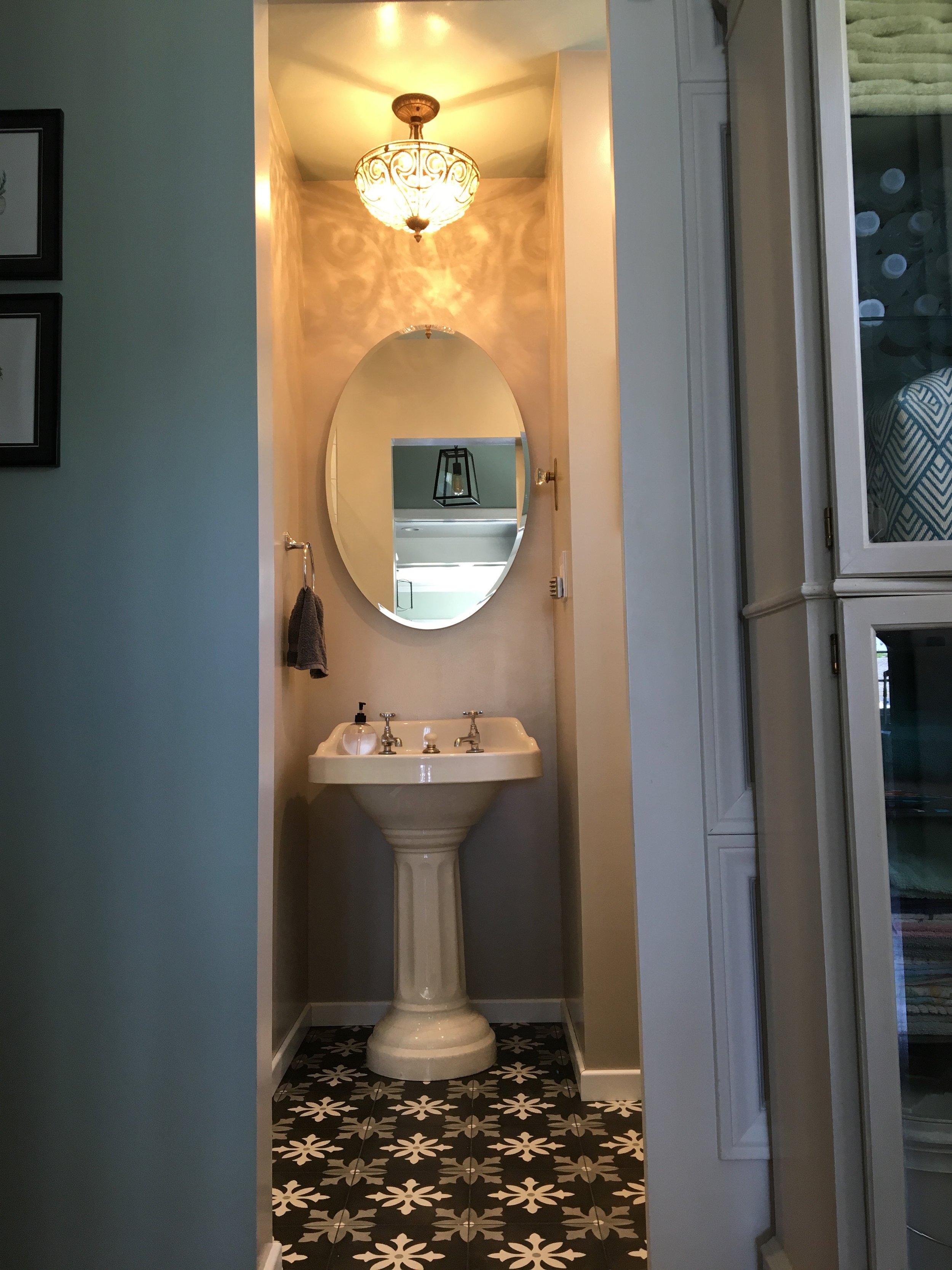
The standout in the bathroom would be the vintage pedestal sink, the decorative floor tile and pretty light fixture over the sink. The sink was the splurge, but it was a great size and just so pretty, I could not imagine anything else in that alcove.
To set the sink off, the floor was the next thing to catch the eye, it is a bold, black background with a white and taupe to gray snowflake like pattern. This pattern would be much too busy for my taste, if it were not limited to a small space, below eye level. You certainly notice it, but with the sink, mirror and light fixture, it is not overwhelming. The shower floor is a black pebble stone. I did not want it to have to compete with the flooring outside of the shower and did not want it to be white to draw attention to it; this way it visually expands the bathroom floor without being obvious.
You may also remember a post about the door that we installed on barn sliders, allowing more space in the tight quarters, no door swinging in to take up valuable space. We even found a clever lock for the inside of the bathroom door. The beveled glass insert in the original vintage door had to be obscured for privacy, and a piece of glass that I put an antique mirrored finish on it worked perfectly. The inside however, was a piece of plywood to hold the glass in place. I covered it with a piece of wrapping paper, that matched the color of the walls.
The room is small but adequate and we could not expand its footprint, making smart choices in the finishes was important. If you can picture a room with four refrigerator boxes set on four walls with not much space in-between, you can imagine the approximate size of the space. The shower is one box, the alcove where the sink is another, remember that is pushed into the office, the third box is the toilet space and the box left over is the floor space. A tidy space but very functional. I am not yet ready to tackle the master bath.


