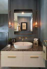
This is one of my favorite times of year because the Pasadena Showcase House Tour is running through May 17th. I have been visiting this showcase for decades and always marvel at what designers can come up with in new and inventive ideas of the designers; I do not always agree with what I see, but I usually come away inspired. This year was no different; there were some likes and some not so much.
One of my favorite rooms was the Artist’s Retreat. I nearly gasped when I saw the quiet color palette, the same palette that I planned for my new office, and some of the same materials. The designer who was responsible for this particular room, used very expensive oak planks on the walls and spaced them tightly together, while my plan is to use wide pine planks with a shiplap look instead. Cost is always an issue for me. I loved the use of cork for the floors, they actually looked like travertine. I had planned to use travertine, but I think cork is the way to go. With advances in the use of cork, you can find it in a variety colors. You can mix and match to create designs such as the harlequin pattern in this room. Cork is warm, quiet and renewable, therefore a very “green” product.
Another take away from this year’s house was the liberal use of Edison light bulbs. No doubt you have seen them in many magazines, brochures and other advertisements. One of the designers commented that the Edison lights used in the room he designed were from a local and well known lighting shop—Lamps Plus. I guess even showcase designers have to find savings where they can. Edison lights were used throughout the house in a variety of designs from industrial to elegant.
Pasadena Showcase House 2015, from Google Images
The color palette for this year’s house has some of my all time favorites and some new colors from Dunn Edward’s newest collection that I have already used—it is good to know I’m on trend. There were some pretty bold colors but they were well balanced in the private rooms upstairs where the family stayed, while the more public rooms were much more neutral but had accent colors repeating some of the bolder colors used upstairs. I found it to be a good exercise in the use of the color palette keeping it unified without creating a rainbow effect.
Pasadena Showcase House 2015, from Google Imagaes
As I mentioned, there were some “misses” for me. I felt some of the bathrooms were a bit overdone with the use of stone, and I love stone in a bathroom; but I felt there was too much pattern conflict. There certainly were a lot of bathrooms to choose from, something for every taste, and I had some favorites there too.
You can go online and see some of the photos from the Showcase House, this year and past years; but if you have a chance you should go and see it for yourself this year’s Tudor style house designed by Fernand Parmentier in 1910. There is always something gained, besides the benefit to children’s music programs throughout the community that the Showcase House funds.


