Bathroom Remodel:

When the Open Concept is Taken Too Far

IMG_8321.JPG

We started the hall bathroom remodel several weeks ago, a bit backwards perhaps— with a door.  Years ago, I bought an antique leaded glass door with the hopes to use it as the door for the hall bathroom, since it was so pretty and the bathroom was not.  My main objection to the hall bath was that whomever added it on, placed the toilet smack in the middle of the doorway, with the door open, it was not a pretty sight, especially since you see it from the kitchen.

My handy hubby, the engineer did another stretching job to the door, it was wide enough, but not long enough to cover the opening and hang from the sliding mechanism.  Then, there was the task of filling holes from door knobs and dead bolts.  And finally, hours of filling, sanding, priming and painting!  A substantial header needed to be put in place to hold the heavy duty sliding mechanism to allow us to hang the door.

Next up was what to do with the leaded glass that offered lots of beauty, but little privacy needed for a bathroom.  I thought an antique mirror behind the leaded glass would offer the necessary privacy, and thought it would be interesting from the kitchen/hall side.  As for the bathroom side, I am planning on a sheet of wallpaper that will compliment the bathroom, or maybe blackboard paint.

The actual tear down of the bathroom or demo to the studs was next.  The house was built in 1938, when a 2X4 was exactly that, not today’s shaved down version.  When the bath was added, this factor was not taken into consideration, hence uneven walls with odd bulges and waviness.  My engineer decided the only way to fix it was to strip it down to the studs.  Besides, the reason for the remodel was to move the toilet from, “front and center”, to under the window and move the sink to where the toilet had been for a more pleasing view.

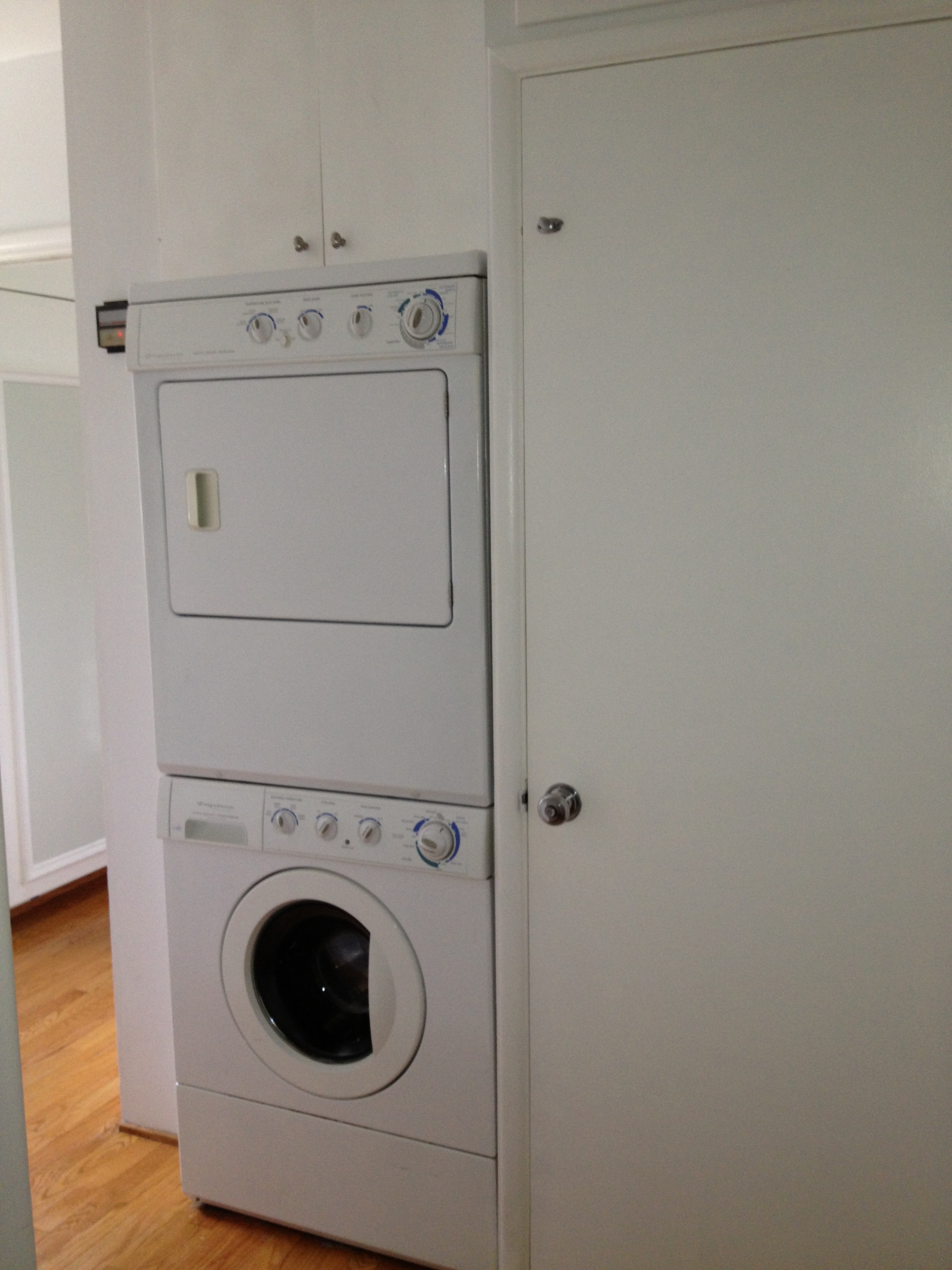
This bathroom was “carved” out of what we expect was a “laundry area” and stolen bedroom closet space on the common wall behind where the toilet was placed.  We decided to take more out of the closet area, by removing some of the upper storage, that had been left with the previous remodel.  We wanted the new sink area to have full ceiling height, rather than the lowered ceiling that was from the previous remodel.  This would allow for a nicer lighting fixture and a more spacious feeling in this tiny three quarter hall bath.

The demolition of the surrounding walls, left the toilet standing in my husband’s office; pretty convenient for him, but lacking privacy all around!  He is wasting no time getting the remainder of the closet walls reframed, thus closing in the bathroom from the office side, at least.

Next up will be further demolition of the shower tile and floor tiles.  Floor tiles have been ordered along with a mirror/medicine cabinet. Stay tuned.

IMG_1104 copy.JPG
IMG_1106 copy.JPG
IMG_3622 copy.jpg
IMG_8325.JPG

Design and Function—The Beauty Within

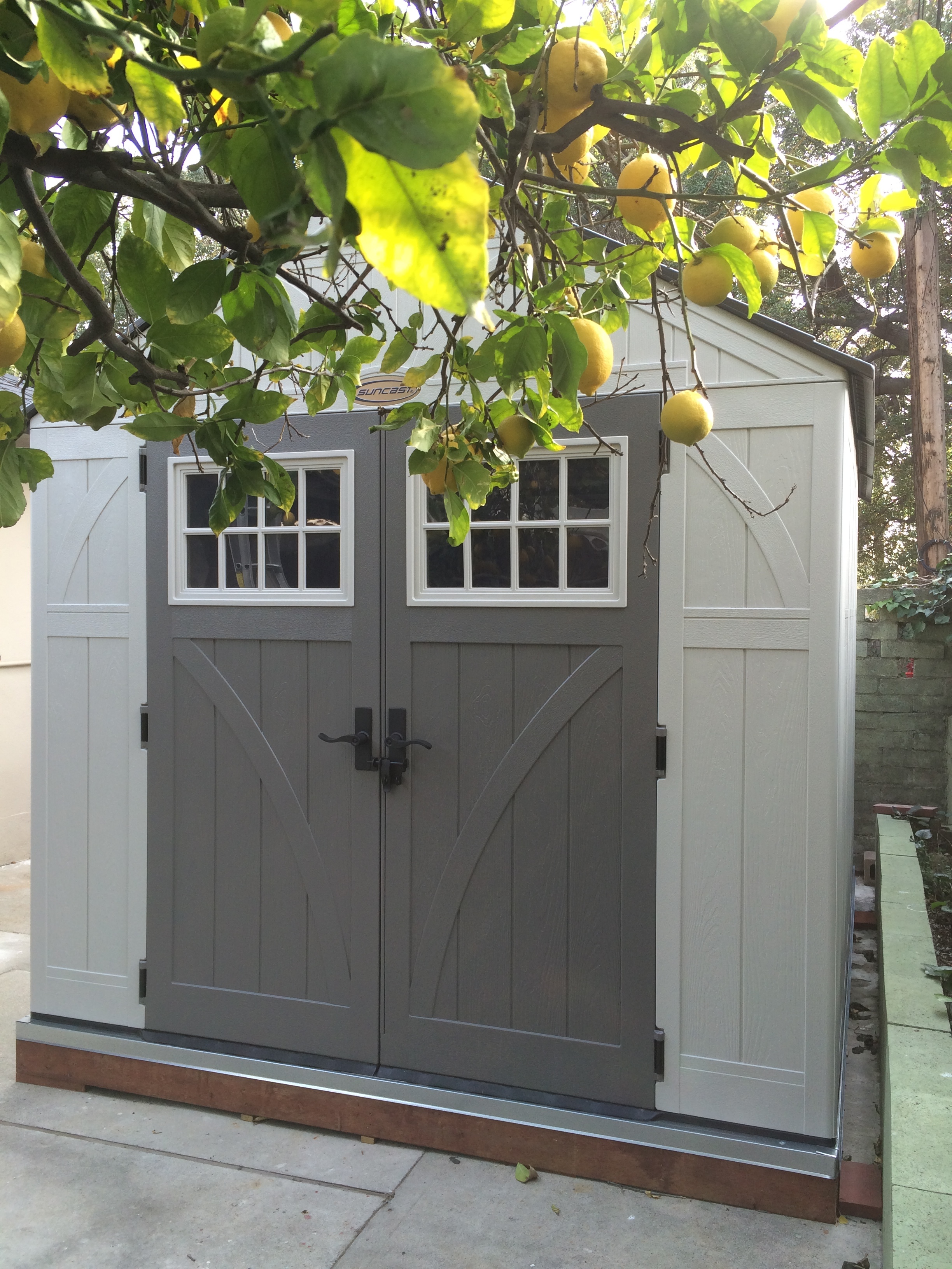
Not everyone will agree on what beauty is, but it is one’s perception that counts; however function is a bit more concrete.  As a designer and decorator, I strive for both, it is in my DNA.  I know that not nearly as many people will find a storage shed a thing of beauty as will find a pretty fabric or the lines of a lovely chair; but to me, the shed illustrated here is a thing of beauty.

I do a great many painting and refinishing projects that add to the aesthetic quality of my life and the lives of my clients; so having a place to work on these projects is particularly important to me.  I wholeheartedly subscribe to the designer mantra that form follows function.

I purchased an eight-by-ten foot shed last fall, and my handy husband spent a couple of weekends getting it set up; first he built a frame for the foundation so the shed to sit level on the back patio that was sloping for drainage.  Suffice to say that he built the shed and foundation with his usual precision.  There are still some additions to install, such as lighting and a box fan for exhausting paint spray and fumes.

Fitting the interior with a tall, wire-frame shelving unit was key to storing the many cans of paint and other necessary supplies.  I thought it would be a good idea to wrap the wire-frame shelves with an insulation blanket meant for a water heater.  My hope it to help preserve the paint, which degrades in extreme temperatures— since the shed is not as well insulated as the garage.  Investment:  Insulation, $22, shelving unit was a donation from my daughter, $0. 

I bought a set of adjustable saw horses to hold a discarded, standard interior door; this serves as my work table. Investment:  Saw-Horses, $59, Interior Door, $0, Lighting, $140 and the Box Fan, $25.  The shed was certainly the most expensive, but I did get it on sale.  I do not remember what the pressure treated wood and flashing cost, but probably somewhere around $100+/-, and the labor was based on pure love which is priceless.

Without the lighting or the fan installed yet, the room has been a valuable addition.   My husband was the first to use it.  I insisted that he spray paint some auto parts for the restoration of our 1930 Model A, which has not seen any attention in 50 years!  Next up was the painting of a cabinet my daughter uses to conceal the litter box in a bathroom.  The shed, which we have nick named "The Dexter Room", has been deemed a great asset and in my mind, a thing of beauty. 

A word about the decision to purchase a pre-made shed; we looked into many less expensive options of which there are many.  First, was the least expensive, was inspired by the popular TV series Dexter but, involved assembly and take down after each use.  PVC pipe fitted to make a frame, and heavy sheet plastic sheeting attached to the PVC constituted the “room”, and would cost about $50.  I liked that, but from a realistic stand point, I didn’t think I could do the assembly by myself, and weather might be an issue.  The next idea was a simple pop-up tent, a bit more expensive, and certainly easy enough for me to assemble; but it would limit the size of the projects.  The ability to use the Dexter Room shed in just about any weather for large and small projects drove the decision to acquirea more formidable structure.  My daughter and I have plans to spray paint some custom doors for the newly installed cabinets in her laundry room; a couple of the doors are quite tall and require a fairly large area to work on them and allow a place for them to dry without interference.

From the outside, the shed is a pleasant enough looking piece, with a cottage look, but the interior is pure function.

Something Old Is New Again


After the excitement of Christmas and the clean-up aftermath, I set a new goal for myself:  to rid the living room of boxes of books that thus far have had nowhere to go. I had wanted to get a bookcase for the area the boxes occupied, but it would have to be low enough to allow in the lovely light from the window above.  A low bookcase would not be sufficient for the many boxes of books.  

The space where the boxes were stacked for the past six months is right beside the fireplace—a pretty prominent feature in the room— and the boxes were not at all attractive.  I have selected a place for tall bookcases— which will solve the book problem—but that is another story.

For more than four decades, I have had a cabinet always used just to fill space in our home.  It is an old Magnavox Hi-Fi cabinet that I gutted years ago to make it easier for me to move around.  It is a very traditional mahogany piece and has seen better days since it first came to us.  After our move, I decided it might be more appealing if it were painted.  It certainly was not valuable as an original cabinet with its insides removed.  It had some battle scars from early use as a stand for a small portable TV. Paint seemed to be in order.

I had considered a black and gray combination, or a turquoise; turquoise won.  At first, it seemed too bright and lacking in depth, so I added some antique glazing; that was better.  Still not sure before Christmas what to do with it, I first put it in the spare room and let the holidays occupy me.

Come the new year, my daughter suggested I try using the old, painted the cabinet in the space beside the fireplace until I found something better; it certainly would fit.   I decided that the cabinetwould allow “Sophie” the cat, a more stable place in the sun to view the dogs next door; the boxes of books were sinking under her weight!  It also would add a bit of color in a room that already has a lot of wood furnishings.

I was not thrilled with the cabinet even after the paint; it just was not something I thought I would use again, but using it under the window was a good idea, so why not give it a chance.  Just when I thought I would kick it to the curb and see who might pick it up, it was spared that humiliation and has a place in our home once again.

The moral of this story is not to give up on a piece just because it is old and worn.  Paint can revive just about anything and bring new life to an old piece.  Who knows? It looks good enough to stand the test of time for another few decades.


Mail Delivery

I remember mail slots in the wall from my earliest years.  Oh how I longed for a modern mail box.  Now, I find the nostalgia comforting and quaint.  This little mail slot in our wall is one of the reasons I fell in love with this house— several years ago.  As I waited for the chance to move into the little house on the other side of the mountain, I envisioned different pieces of furniture I had to catch the mail, but after I moved in, I realized that most were not right for the space; I have had to make many similar adjustments.  

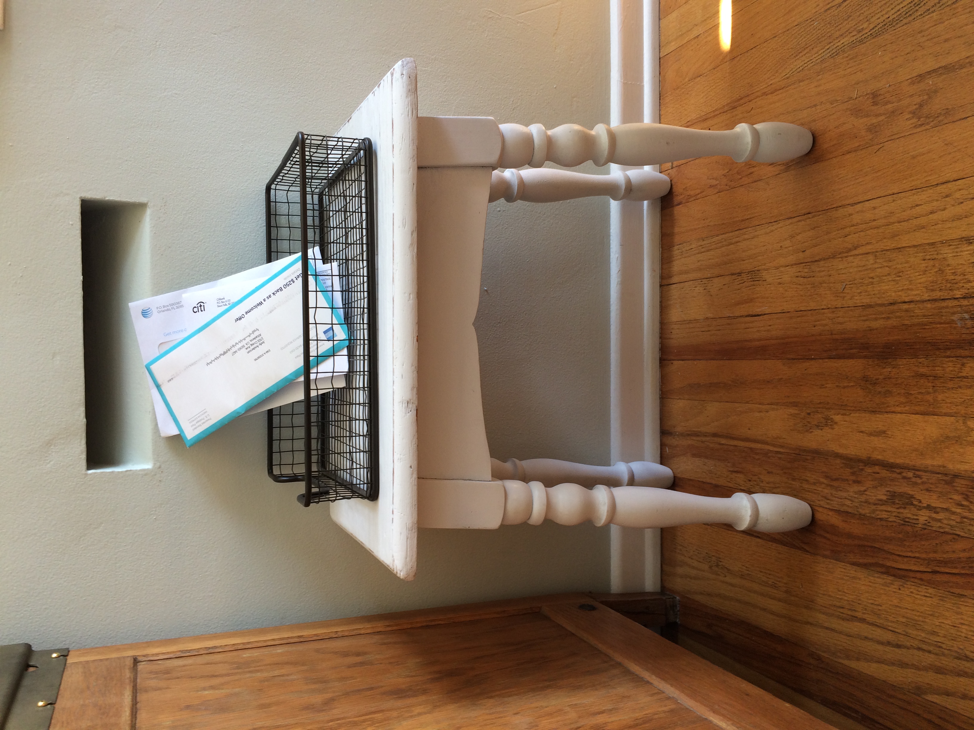
Not to be deterred, my first solution was simply an unpacked box sitting under the mail slot, with a basket to catch the mail.  Soon after the boxes were unpacked and out of the house, I moved a small, square table I had into position and replaced the box.  However, it was a bit bulky and interfered with one of the chairs at the table.  

With a bit more time on my hands now, I decided a small stool or short bench would probably suffice.  My daughter and I took off exploring shops around town.  I was in no hurry, so I could be choosy.  I knew I did not want anything fancy, and something more in keeping with the period was what I had in mind.  With a lot of wood used in this room— with the hardwood floors, round oak table and chairs and the hoosier cabinet— I was feeling like something painted would be my best option.

I found a small white stool with turned legs. The stool is not too fussy, and it is the perfect size.  The price was right, too, less than twenty bucks; now that was a bargain.  I liked it right away, and the size suited the space, as I predicted; but the white color was a bit too sweet for my taste.  I painted it a bright apple green; and for now, it is just right.  However, I have a feeling that very soon, it will be painted black and be more in keeping with a long bench I have in the room, and the black china cabinet. 

The black keeps the soft blue-green walls with white trim from being too cottage like. While I like the cottage look, I need a little black to keep it more grounded.

We enjoy having this little bit of nostalgia as a reminder of times gone by.  Another discovery, is a little post office inside a local pharmacy; it will never take the place of our beloved Acton Post Office and all the wonderful people that we got to know over the years, but it is as close to a community post office as we will see again, I think.

From Dark to Bright and Light

Spooky Beginnings

Spooky Beginnings

The china cabinet I have been working on for what seems like months is finally finished.  The reason it took so long is that I had to paint it on site, which required finding accommodating times for both my client and me.  If I can work on a piece at home, I can work on it anytime.  Painting a cabinet requires many steps: washing away oils and grease, priming, two coats of paint and finally playing the antique glaze.  I took all the hardware off and painted it a warm brown to blend with the counter top.

That Awkward In Between Stage

That Awkward In Between Stage

My client is so pleased and happy I suggested painting it to give it a lighter, brighter feeling.  The cabinet shares space with the kitchen and the TV room.  While the kitchen has white cabinets, the TV room has lots of darker furniture, fortunately blue is a reoccurring color in this clients home.

Painting the cabinet has given it a visual lift and shows off the pretty items my client has to display.  I left the top surface of the bottom cabinet (the counter) its natural wood color as I did the crown molding.  I felt that the wood would wear best, since my client would use the counter area for serving; and a painted surface is not always the most durable surface.  The rest of the cabinet would show best with the white paint and an antique glaze.  There are carved details that now show up subtly without being too bright.  The combination of the original natural wood color marries nicely the darker wood tones in the TV room and the white kitchen cabinets do not feel quite as foreign now with the antique glazed cabinet.

For a cohesive look,I painted the interior of the upper cabinet the same blue that we have used in other areas of the home.  The rug in the family/TV room has the same blue in it as does several upholstered pieces.

While the style of the cabinet is in the same French Country style as much of the home, the TV room has a more comfortable lounge sofa and reclining chair.   The china cabinet is a nice fusion of the two, in style and color.  There is no jarring feeling when you look from one room to another.  Before, the dark cabinet seemed too heavy for the space and oddly out of place; now there is a nice blend of old and new.

Ready For Its Close-up

Ready For Its Close-up

With the kitchen cabinets so white, my client worried that the “off white” of the paint-glaze combination would look out of place.  Once it was finished, she was pleased with the blend of the two.  Clearly the china cabinet is a more old fashioned style piece than the more modern shaker style kitchen cabinets, but together they work well.  A shaker style cabinet lends itself nicely to many different styles, hence its popularity today.  

A Good Candidate For Painting

My most recent painting project is nearly finished, and I will share it with you once it is completed.  It is looking quite nice, and the client is thrilled.   Sharing my projects with my business group instilled some interest in several members.   I haven’t found the perfect cabinet for one particular client yet; but in my first voyage into the unknown, I found several interesting pieces—one I wish I had someone in mind for, as it is the perfect piece for painting.

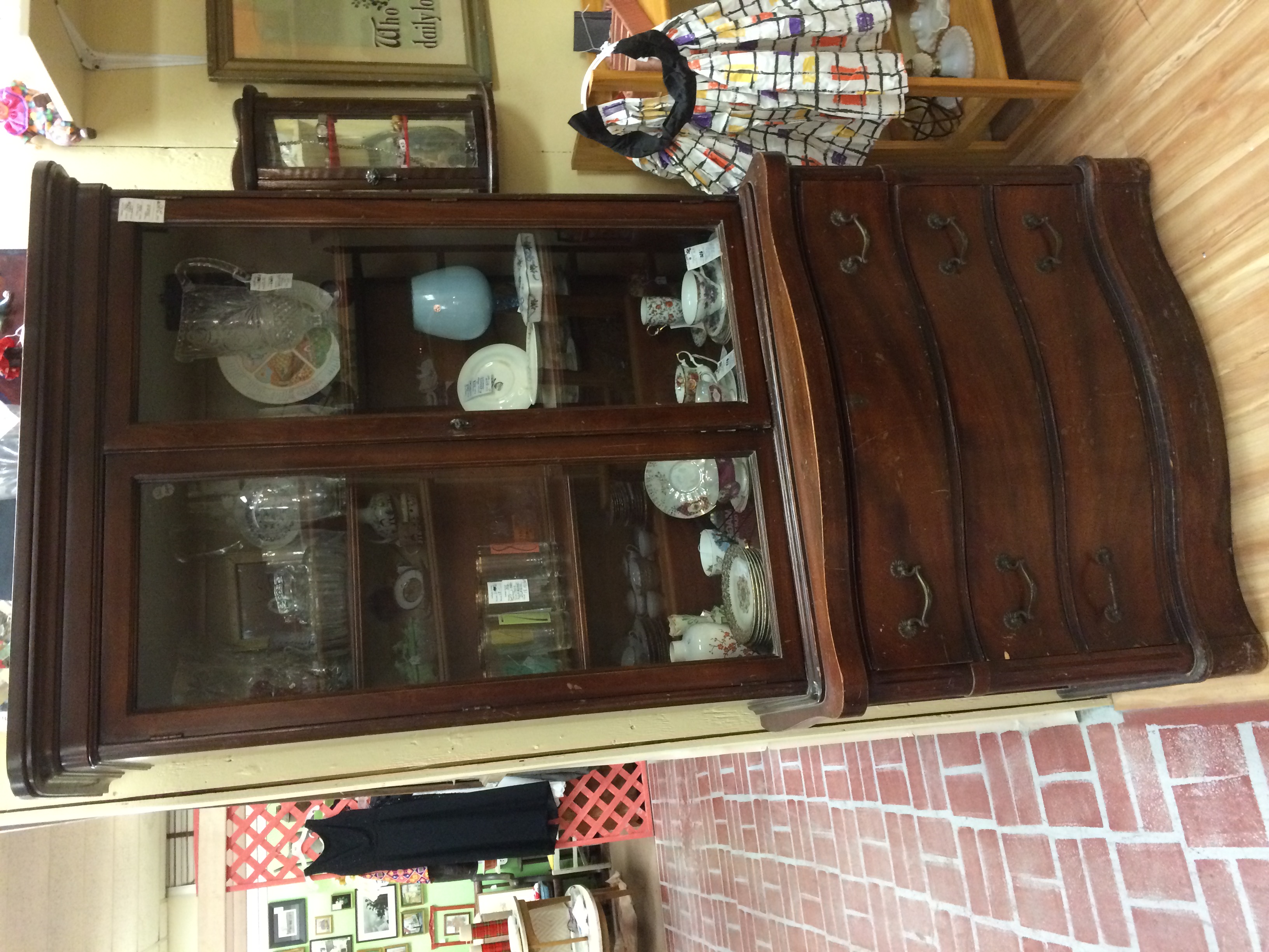
There are pieces I would not paint because they are in perfect shape and of a high quality and value.  I found such a piece the other day; but in the same shop, I did find a great project piece.  It has seen a lot of wear and tear, and the wood is not special.  This piece is in good enough shape to continue to be useful and pretty, but it needs to be painted.  I realize that painted furniture doesn’t appeal to everyone, but if you can imagine it, it can be fantastic and even playful.  Sometimes an old piece just looks dowdy and people cannot see the possibilities beyond its present condition.  I have heard more times than I can count, someone saying, “That piece is just ugly; my grandmother had one in her dining room, it’s so dark.”

The piece that I would paint would make a great cabinet in a kitchen, dining room, even a bedroom, bath or study-family room.  As you can see from the picture, the upper cabinet has glass doors, making it ideal as a display cabinet in a little girl’s room for her treasures, while the lower drawers are perfect for storing clothes, sheets or blankets, even toys.  Painting it a lively color would make it a great focal point and useful for many years to come.

As a kitchen piece, you can store everyday dishes in the upper portion or special occasion pieces.  The drawers are always useful for flatware, serving pieces, platters and little used pieces that can be stored close by until needed.

In a bath, this cabinet would prove to be useful for storing pretty bath accessories and some colorful towels.  In a guest room, the cabinet would provide your guests some niceties for their overnight stay, including fresh towels, pretty soaps and bath salts, an interesting book and a scented candle, as  well as a place to unpack if they are staying more than one night. 

The obvious place for this piece is in the dining room, but painted a soft gray with a background color to compliment the rest of the room, it would show off favorite china, crystal or silver pieces.  Linen and silverware storage would make this a valuable piece to hang onto in a dining room.  Freshened up hardware would complete this piece.

In a study or family room, favorite tomes would be on display and kept dust free.  Lower drawers make hiding everyday necessities—like the remotes, a lap blanket and important papers being reviewed— which the family may not want exposed all the time.  Also, as family room furniture, this piece would make a nice display cabinet for small antique toys and games can be stored in the drawers.  Just think of the possibilities; they are nearly endless.

Patio Furniture

With the summer-like temperatures we have been experiencing, people are beginning to think of outside activities.  The big box stores haul out the patio furniture in January to coordinate with retail department stores displaying bathing suits, preempting spring altogether.  While I am still holding out for a bit of winter and the possibility of some much needed rain, I’m considering washing my windows to bring the rainy season.

My latest project has to do with patio furniture and yet another “great find”, for my client in Burbank.  She has a pair of decorative metal chairs and a matching settee.  I have found some pretty outdoor fabric for cushions to compliment the newly painted seating set.  I suspected the pieces were aluminum because they were so light, but the cross pieces or stretcher bars were pretty rusted, indicating they must be a steel or alloy of some kind.  The chairs have been painted several colors, over the years, so a good clean up was necessary.  

I started with sandblasting off the worst of the paint; I was sure it would take ten years off my face, since I didn’t have a full face shield, only goggles, but alas, no such luck.  After getting the worst of the old paint off, I took them to the patio to be pressured washed and sun dried.  

The next day, I began the spray painting, which is a big improvement, since the coverage is consistent and the previous painting was not; the previous coverage consisted of several sloppy hand painted attempts.

People often ask me what is the best choice for outdoor furniture and most cost effective.  Those questions that have no easy answer, since budgets vary and use considerably different.  In general, teak is a good product with little or no maintenance, if you do not mind the natural aging of teak to a silver gray color.  All you need to do is a light sanding and enjoy.  

If you would prefer the look of new teak, you can use a teak oil to maintain the look of new teak.  You can add colorful cushions if you like.  Teak is a fairly heavy wood, which is good if you are using it in a windy area; it is not likely going to be tossed about your space in a hearty wind.

Powder coated aluminum is a good choice for a lasting finish, but like any metal, the arms and seat will be hot if left in the sun.  Heavier metals will be more stable in any kind of weather, but heavy to move for repositioning.  Again, colorful cushions add to the beauty of these pieces.

There are pros and cons to any choice, expense is usually a deciding factor—which brings me to the second-hand choice.  You may not get exactly what you envision for your patio space, but if cost is an issue, you should take a look at used pieces, wood or metal.  A little sanding and paint could net you a very satisfactory seating arrangement.

Upholstery for outdoor furniture, is usually a fairly costly expense, since outdoor fabrics rate a premium price, due to their durability.  Check to see what the fade expectations are when considering upholstery.  You might find ready made aftermarket pieces that will fit your furniture and satisfy your needs.  Custom is expensive because it is custom, that never changes.  Of course if you are handy with a sewing machine, you can make your own and save about one half the cost; the fabric cost will be about the same as the labor cost, which can make re-upholstery an expensive choice.

If you are considering second hand furniture— a big cost savings, and re-upholstery or ready-made cushions, you might come out ahead.  Your decision should be based in a similar manor to furnishings inside; how much will you use it, will you store it in the off season or purchase covers to extend its life, how long do you expect to have the furniture?  All questions you should consider when making your purchase.


Some Criteria I Use for Painting Furniture

Tea Table - After.001.jpg


Many people find it difficult to paint wood furniture, and I completely understand the dilemma. To paint or not to paint can be a difficult decision, so here are a few guidelines I use when making that decision.


Number one is usually the quality of the piece. For example is it in good to excellent condition? Is it a fine piece, an old piece? Is it a family heirloom? All of these questions should be asked and evaluated honestly. I do not posses fine museum quality antiques, but I have plenty of pieces considered to be antique. For the most part, I would prefer to restore them, or if in acceptable condition leave them as they are; but that is not to say I would not paint some of them under certain circumstances. Answering no to any of the above questions would eliminate my concerns about painting or not painting a piece.


When decorating a room, I look to see how “heavy” the feel is in the room. Usually, when there is a lot of wood, a room can appear to be dark and heavy, which is fine if you are looking for a cosy reading room or library like room. Too much wood can have the appearance of a cave; think of the wood paneled rooms of the 1960s and 70s, just add plaid upholstery and you can transform a room back in time. If you wish to add a lightness to a room, consider painting some of the wood pieces. Even painting the frame of an upholstered chair can lift the room, especially with new upholstery in an updated pattern or color.


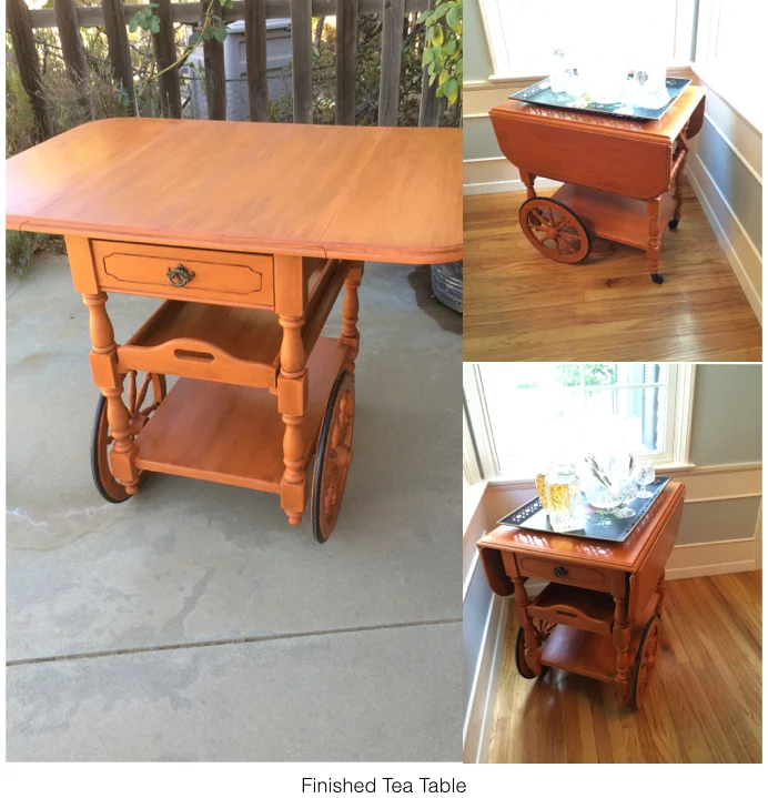
The tea cart shown here required such a decision. My client has had it for probably 40+ years. It is solid oak, and it is in excellent condition; however, she felt it was too granny now and wanted a change. She is an artist with an eclectic style, which I love. Color is very important to her; with her dining room walls painted a pale blue, with lots of bright sunlight entering the room, she thought she would like to bring in some orange, the complimentary color to blue. I fully agreed, and we decided on Annie Sloan’s Chalk paint in Barcelona Orange, with a dark wax finish. It turned out beautifully and she loves it. She says it makes her happy instead of bringing her down, as it did before. It looks fantastic in the room, and no one would call this room a “granny room”.


I have painted, stripped, refinished and antiqued lots of furniture in my time; and I am always happy to see the change. A couple of years ago, I found an old, round, oak table in an antiques store. The base had been partially stripped and I could see that it was quarter sawn white oak, but had been painted white. There was another table, a reproduction, priced more than a hundred dollars higher than the table I was considering. When I returned to purchase the table, the reproduction was sold, lucky for me. Whoever bought it was either not aware of the quality of the older table or didn’t want to have to strip and refinish it. The round oak table comes in very handy when we have large sit down gatherings. It came with two leaves, and seats six to eight people, all for under $200— now that’s a bargain.


If you are faced with a painting decision, I recommend you get an estimate on both painting and restoring the piece. Cost can be a factor that helps you decide which to do. With respect to family heirlooms, I would check with family members outside of your immediate family to find a new home if it does not suit you or any immediate family member any longer. The age of a piece of furniture does not necessarily make it a valuable antique, so painting such a piece would not devalue it; besides, once a piece is painted, it can always be stripped and the natural wood restored.

Make an Entrance

I have been house shopping with a friend and have become aware of how many houses, old and new-er, open directly into the living space-- be it a dining room, kitchen or living room.  I find it much more pleasing to open a front door without exposing the living space to whomever is on the other side of the door.  

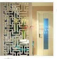
It is simple enough to create a “foyer” feeling from the front door, especially when the front door is off set from the center of the room into which it opens;  the homeowner thus has a bit of space in which to put up a screen or something to distract the eye, which protects the privacy of the home.  A simple piece of furniture can do the trick, creating a bit of a barrier between your living space and the person outside your door.  You can set up a hall tree or a table or a screen to add to the privacy. 

If you want to create such a screen, there are so many materials you can use, and you may have them around the house already.  Shutters that are no longer in service can be adapted into a useful screen by joining two or more together with reversible hinges; you can connect shutters that are the same width to make them taller as well.

There are plenty of uses for decorative screens, not just at the front door to make an entrance more private.  Screens can make a serve more than one purpose without the benefit of floor-to ceiling walls. A large room can be divided easily into multiple service areas with the clever use of furniture, screens or even sliding panels that attach to the ceiling.

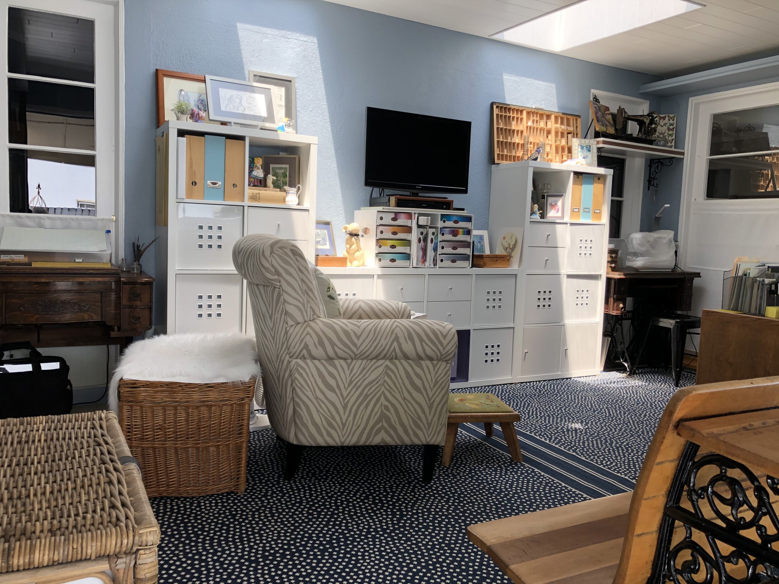
Large sized cube-type book or storage units make great room dividers, and the open cubbies can be filled with useful baskets or containers for last minute items you need before heading out the door, like gloves, hats or scarves.  You also can fill the cubbies with decorative items that suit your decor, an especially good way to display collections you may have as long as the scale is in keeping with the size of the cubby; remember tiny objects can become lost in large spaces.

IMG_3798.JPG

Hanging a long fabric “screen” from a rod in a ceiling of a loft is an excellent way to create rooms within a large space.  This division can be achieved with a long drape, with a beautiful colorful piece of fabric, or a great textured piece, as simple as bamboo.  Lofts offer you lots of ways to create clever separations while allowing your space to remain open and airy, which after all is one of the great appealing factors in loft living.

A strategic chest, table or area rug can give a room a boundary, thus making the room feel more comfortable and oddly enough more spacious.  It is a misconception that placing furniture around the perimeter of a room will make the room feel larger; actually the opposite is true.  Floating a table, chest or folding screen will allow you some privacy at your entrance and actually might make your space feel a bit larger.

Contrast Adds Drama

While it is true that high contrast will add drama to a room, it is wise to consider how you use contrast.  A painted accent wall is fairly easy to change should you decide you cannot live with the drama the color created, but a floor or a tiled backsplash or shower enclosure is a bit more complicated in terms of expense and time invested.

When you are considering changing something more permanent in your home, like flooring and counter surfaces as well as backsplashes and tub/shower enclosures, try less contrast.  You will be living with these changes for a long time and a classic surface in these areas will serve you better.

Think of all the homes built in the early to mid-20th Century; for the most part, these homes were built with hardwood flooring.  Over the years, as wall to wall carpet became popular, these floors were covered with soft, colorful carpet.   Today, that carpet is considered undesirable and old fashioned.  Carpets in older homes are routinely being  pulled up, exposing those now treasured hardwood floors.  If the wood is in good condition, a simple sanding, staining and fresh coat of polyurethane to preserve its beauty for another half century or more.

Choosing a new color for the floor will be important and fairly permanent.  While it may be tempting to add or stain a border or pattern, think in terms of long term use and how you will feel about such a contrast as a wide, light or dark border verses a solid-colored floor.  An exception to this rule, would be if the floors cannot be successfully refinished, but can be painted instead; then I’d say, go ahead and paint a fun harlequin pattern or boarder.  While the traditional black and white pattern is always popular, you can use softer colors for less contrast, like shades of grey or spa colors like blues and greens; even shades of beige would be a calm and peaceful color combination. 

Tile and natural stone is an expensive and fairly permanent surface for kitchens and baths.  Tempting are the bright colors and fun patterns, but again, consider how long it will be in style, staying classic is wiser.

Unless your home is clearly in a particular style like a Spanish Revival or Spanish Colonial, the use of colorfully patterned tiles might be a bit risky.  Adding cute “accent tiles” to a kitchen backsplash will date your renovation very quickly and reduce its value at resale time.

If using these colorful and playful tiles is something you have your heart set on, use them in less permanent ways.  For instance you can make tile trivets and hang them on the backsplash to add some personality without risking the need to tear it out once you tire of it.

When considering high contrast, think about how long you will live in this home and consider the home’s style.  High contrast will give you high drama, but you can enjoy soft contrast too and it is often easier to live with in the long term.