Office Update: Part 2 Flooring


IMG_3530.jpeg

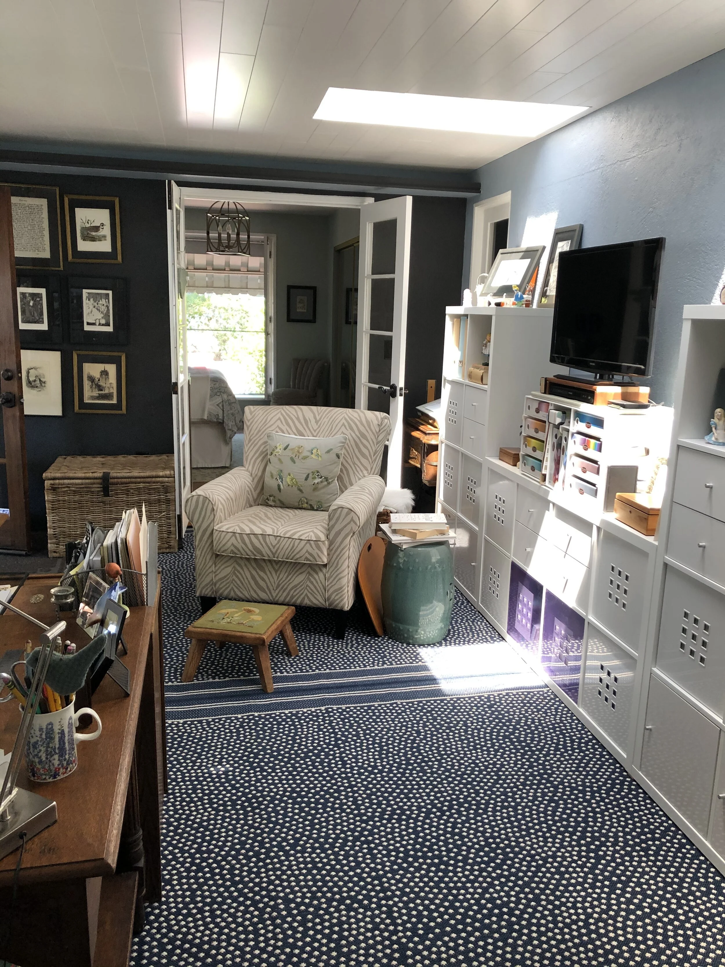
The floor.  Now that is a special problem unto itself.  Originally the room we call my office was an outdoor patio.  It was probably enclosed in the 60’s and done fairly well, except for the wiring, I mentioned in Part 1.  The skylights were a wonderful addition as well as a beautiful large window, looking out onto a small private patio.  The problem was the fountain that had been installed in the floor under the large window; a questionable addition at best.  UGH.  Wiring, again, and plumbing, not to mention the recess in the tile floor.

IMG_1200 copy.JPG

When we had tenants, the fountain had to be covered for safety reasons.  When we moved in, I wanted the raised tile covered curb knocked down, so the floor would be somewhat flat, giving me more useable floor space.  I put a large area rug over the floor and moved in.  All fine, until we were ready to deal with that room, and all of its various elements.

IMG_4127 copy.JPG

Well, as the Walrus said, The Time Had Come, to talk of many things: not shoes and ships and sealing wax—- primarily, that floor.  Having been in the flooring business for many years, I knew what would work and what wouldn’t and, what I wanted verses what would work.  I had thought of several options, but many of my brilliant ideas were more money and work than I wanted to deal with.  

IMG_3375.HEIC-1 copy.jpeg

First things first, that fountain had to be filled in.  It took several hundred pounds of gravel, brick, cement and finished off with a smooth concrete surface.  Having been an outside room, and sitting on a cement slab, it would be unwise to continue the solid hardwood floors that exist in the rest of the house.  An engineered floor would be ideal, except that today’s engineered floors are all much wider and more “modern” than what we currently have.  I wanted to continue the look of the narrow strip flooring, but did not want to use solid flooring (unwise on a slab foundation) and have to stain and finish it to match.  Laminate floors, don’t offer the more narrow boards either.  Luxury Vinyl Tiles, nope, what it boils down to is I am out of fashion!  Too traditional.  Nothing new here, move on.

IMG_0388 copy.jpeg

In the final analysis I chose to cover the now flat tiled floor with two 8X11 area rugs.  I decided on indoor/outdoor rugs made of polypropylene, certainly not my first fiber choice, but under certain conditions, it is best.  I had a beautiful wool rug that faded terribly from skylight exposure and somehow a moth infestation.  I’m guessing it was moths, but fortunately they stayed with this one rug, and none of the other wool rugs.  Polypropylene is a manmade fiber that does not fade and insects are not interested in it; although our cat might enjoy it for sharpening her claws!  The rugs all but cover the entire floor and add a bright and interesting pattern.  While the rugs are not necessarily a permanent solution, they are a happy solution for now, and much less expensive than flooring I did not love.  But I do love the room now.  Problem solved. 

IMG_3534.jpeg

Fractured Beauty

A year or so ago, a tiny pebble struck the French door at my daughter’s house.  Sadly, the pebble was thrown by a weeder the gardener was using— he was devastated. Naturally, my daughter was equally devastated, but for different reasons.  She knew what getting a new door would entail; the gardener knew it was a costly accident for which he was ultimately responsible.  

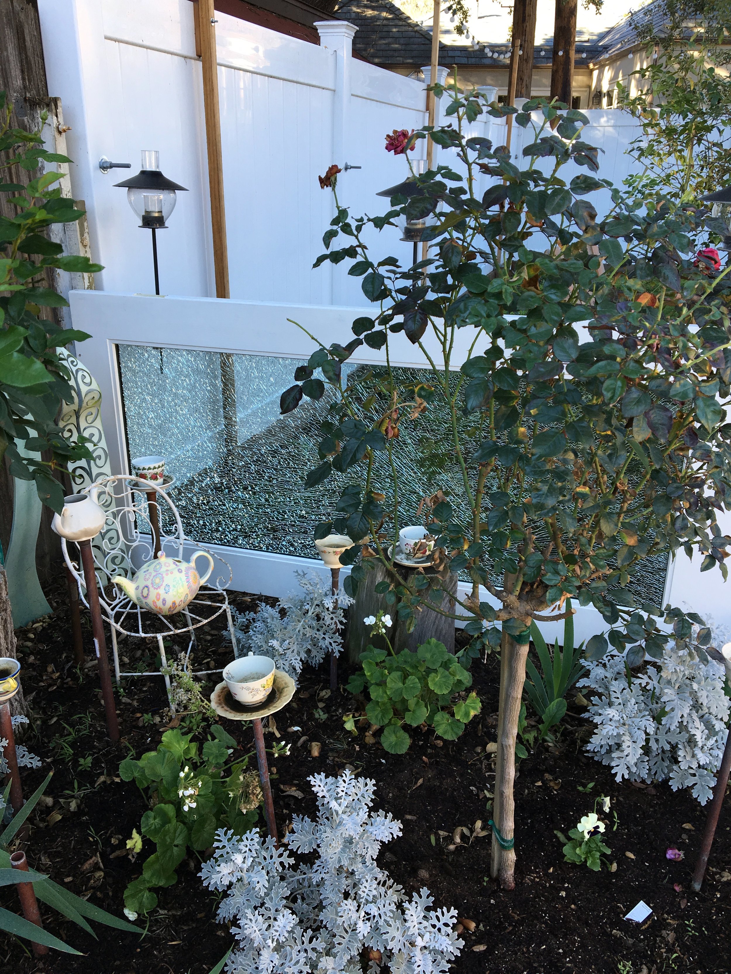
When I saw the door, I couldn’t get over how beautiful it was, the sun was glinting through it, refracting light like a prism.  “We can use this”, was my first comment. After her initial shock, my daughter could see it too, but we were far from being able to implement the idea into the backyard design at her house.  

Once the door was replaced, the fractured door was stored.  I knew the door was still “somewhere”, but out of sight out of mind.  When my daughter suggested we use it in my Alice in Wonderland Garden, I thought it was a brilliant idea.  Yes, we could lay it on its side and it would act as a barrier between Alice’s garden and the grassy area behind the patio; effectively cutting off a short cut for the dogs between the two spaces.  Since the door was a standard six foot eight inches, the space between the posts that separate the two outdoor areas was perfect.  Transporting the heavy door would fall to the men in the family; they got it loaded onto the rack on top of my husband’s SUV and they unloaded it at our house.  My husband got it screwed into the posts and it was secure.  

During one of my daughter’s “scavenging for doors” trips, on a tip from a friend, she managed to pick up a four windows painted a funky yellow-green color, knowing they would be useful.  Two of the windows are a great backdrop on the fence in Alice’s garden, and the other two fit side by side by the French door, in the second eight foot section of the space separating the two outdoor areas.

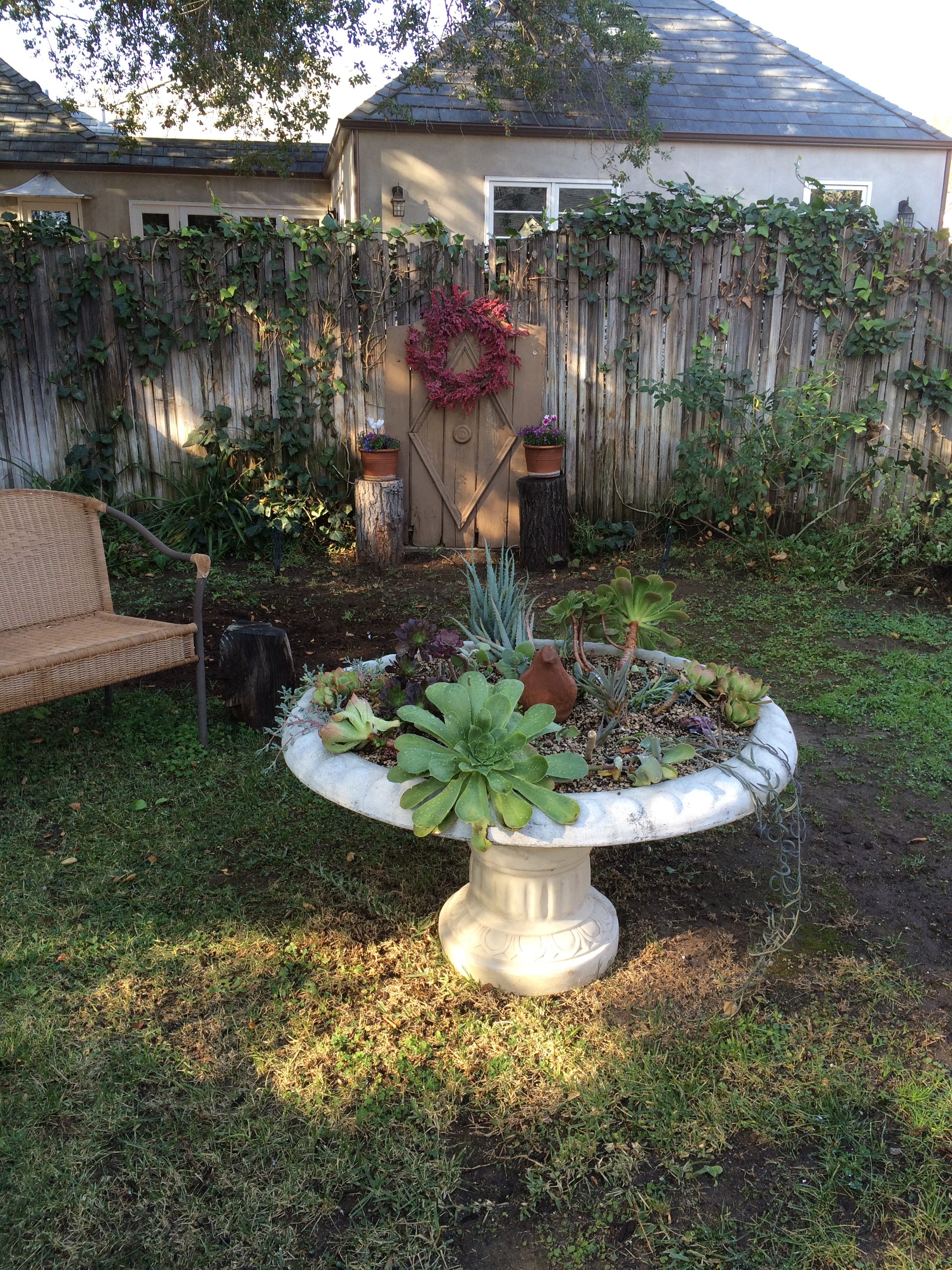
Alice’s garden is finally coming together.  Once I got a pair of white tree roses and a shorter pair of red roses, Alice’s garden was beginning to take shape.  The Queen of Hearts was the beginning of the Alice Garden, a gift from my brother-in-law and sister-in-law, and grew from there.  The gate I was planning to use against the back fence— when I thought I would link old doors to create a solid barrier against the snarling dogs living behind us— is now in Alice’s garden.  We had to put up a solid fence between the yards to save our sanity and do it in a weekend, so the gate was free to be reused…again.  I love finding new uses for old things, but I fear it is the bane of my husband’s existence; thankfully he continues to tolerate my crazy ideas.

This exercise proves that we can make good use of seemingly “broken” items.  Finding new uses, is my gift.  I remember suggesting to people who lost all their crystal in the 1994 earthquake, to save the shards and pieces, fill a glass cylinder and make a lamp out of the glass and cylinder.  The light shining down through the glass would allow the beautiful fine crystal to sparkle and shine again, just in a different capacity.  There are so many possibilities!

Window Grate Reinvented

Some weeks ago, I went to a salvage store and found an old, exterior, decorative window grate that I thought would make a good interior dog gate.  I did not want to have a typical dog or baby gate because I did not want to store it or have an unsightly gate permanently attached to the door jam; besides the wall could use a little dressing up, I thought.

I knew my handy husband would not be thrilled with another kooky idea of mine and then have to adapt it, so before I even decided to buy the grate, I made a plan.  That plan would not involve my husband initially, only later to attach it to the wall.  The grate was a little too large for the door opening, and would require cutting down the iron material.  I knew just where I was going to start for that project.  Unfortunately, the first guy sent me up the street a few doors, and those guys sent me next door to a fellow who would do the cutting and welding of the hinges, but wanted a detailed plan;  he then offered had a cousin would could make me a gate.  I was not deterred!  I had yet another source; however, my husband took the grate out of my car, thinking he was doing me a favor.  I told him my plan, and he decided he’d do the project—exactly what I did not want to have happen; he has many projects on his list and this is not one I wanted to have him tackle at this time.  Apparently, it was one he wanted to do.

Once he cut the grate down to fit the doorway, he used a metal epoxy to fix the hinges to the grate, let it dry and set, then he screwed it to a wood slat he screwed to the wall, perfect.  Now the dogs cannot get to cats who prefer not to socialize with the canine kind.  

This gate was a good solution to the problem of having to keep pet species separated and wanting to keep the area easily accessed by the humans who tend to them.  Someday, I hope to have cats that accept the dogs, but I do not think that will happen with these cats; they were not raised with the dogs, and the cats were here first.

Imagine all the places this window grate could be incorporated easily— certainly outside for a similar solution to keep pets out of a garden area or kids for that matter.  The grate was inexpensive and that was appealing; besides, it was close to the right size and had at the look I wanted.

Stay tuned for what my plans are for the unsightly area behind the washer and dryer, a work in progress.

Design and Function—The Beauty Within

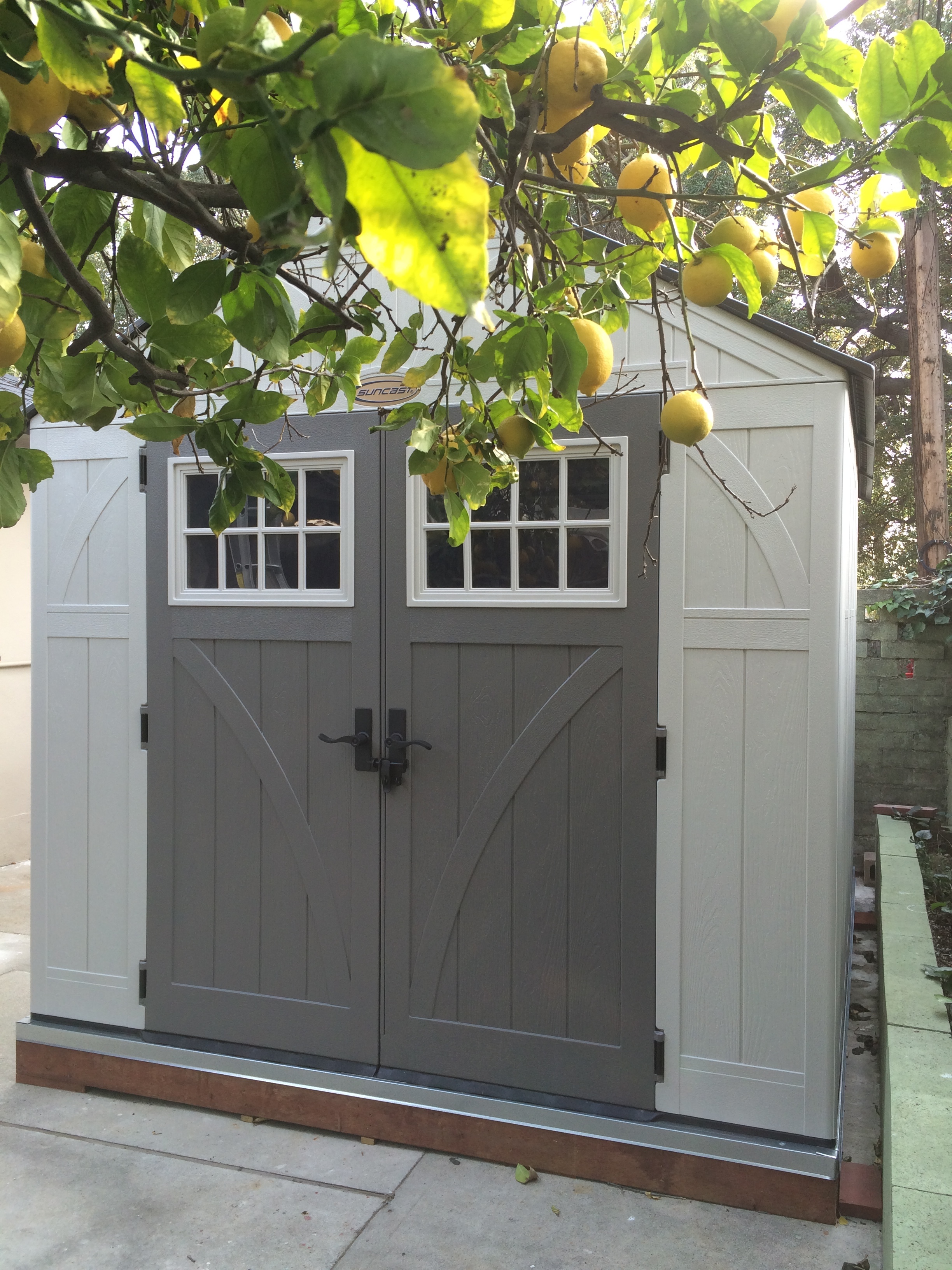
Not everyone will agree on what beauty is, but it is one’s perception that counts; however function is a bit more concrete.  As a designer and decorator, I strive for both, it is in my DNA.  I know that not nearly as many people will find a storage shed a thing of beauty as will find a pretty fabric or the lines of a lovely chair; but to me, the shed illustrated here is a thing of beauty.

I do a great many painting and refinishing projects that add to the aesthetic quality of my life and the lives of my clients; so having a place to work on these projects is particularly important to me.  I wholeheartedly subscribe to the designer mantra that form follows function.

I purchased an eight-by-ten foot shed last fall, and my handy husband spent a couple of weekends getting it set up; first he built a frame for the foundation so the shed to sit level on the back patio that was sloping for drainage.  Suffice to say that he built the shed and foundation with his usual precision.  There are still some additions to install, such as lighting and a box fan for exhausting paint spray and fumes.

Fitting the interior with a tall, wire-frame shelving unit was key to storing the many cans of paint and other necessary supplies.  I thought it would be a good idea to wrap the wire-frame shelves with an insulation blanket meant for a water heater.  My hope it to help preserve the paint, which degrades in extreme temperatures— since the shed is not as well insulated as the garage.  Investment:  Insulation, $22, shelving unit was a donation from my daughter, $0. 

I bought a set of adjustable saw horses to hold a discarded, standard interior door; this serves as my work table. Investment:  Saw-Horses, $59, Interior Door, $0, Lighting, $140 and the Box Fan, $25.  The shed was certainly the most expensive, but I did get it on sale.  I do not remember what the pressure treated wood and flashing cost, but probably somewhere around $100+/-, and the labor was based on pure love which is priceless.

Without the lighting or the fan installed yet, the room has been a valuable addition.   My husband was the first to use it.  I insisted that he spray paint some auto parts for the restoration of our 1930 Model A, which has not seen any attention in 50 years!  Next up was the painting of a cabinet my daughter uses to conceal the litter box in a bathroom.  The shed, which we have nick named "The Dexter Room", has been deemed a great asset and in my mind, a thing of beauty. 

A word about the decision to purchase a pre-made shed; we looked into many less expensive options of which there are many.  First, was the least expensive, was inspired by the popular TV series Dexter but, involved assembly and take down after each use.  PVC pipe fitted to make a frame, and heavy sheet plastic sheeting attached to the PVC constituted the “room”, and would cost about $50.  I liked that, but from a realistic stand point, I didn’t think I could do the assembly by myself, and weather might be an issue.  The next idea was a simple pop-up tent, a bit more expensive, and certainly easy enough for me to assemble; but it would limit the size of the projects.  The ability to use the Dexter Room shed in just about any weather for large and small projects drove the decision to acquirea more formidable structure.  My daughter and I have plans to spray paint some custom doors for the newly installed cabinets in her laundry room; a couple of the doors are quite tall and require a fairly large area to work on them and allow a place for them to dry without interference.

From the outside, the shed is a pleasant enough looking piece, with a cottage look, but the interior is pure function.

Patio Furniture

With the summer-like temperatures we have been experiencing, people are beginning to think of outside activities.  The big box stores haul out the patio furniture in January to coordinate with retail department stores displaying bathing suits, preempting spring altogether.  While I am still holding out for a bit of winter and the possibility of some much needed rain, I’m considering washing my windows to bring the rainy season.

My latest project has to do with patio furniture and yet another “great find”, for my client in Burbank.  She has a pair of decorative metal chairs and a matching settee.  I have found some pretty outdoor fabric for cushions to compliment the newly painted seating set.  I suspected the pieces were aluminum because they were so light, but the cross pieces or stretcher bars were pretty rusted, indicating they must be a steel or alloy of some kind.  The chairs have been painted several colors, over the years, so a good clean up was necessary.  

I started with sandblasting off the worst of the paint; I was sure it would take ten years off my face, since I didn’t have a full face shield, only goggles, but alas, no such luck.  After getting the worst of the old paint off, I took them to the patio to be pressured washed and sun dried.  

The next day, I began the spray painting, which is a big improvement, since the coverage is consistent and the previous painting was not; the previous coverage consisted of several sloppy hand painted attempts.

People often ask me what is the best choice for outdoor furniture and most cost effective.  Those questions that have no easy answer, since budgets vary and use considerably different.  In general, teak is a good product with little or no maintenance, if you do not mind the natural aging of teak to a silver gray color.  All you need to do is a light sanding and enjoy.  

If you would prefer the look of new teak, you can use a teak oil to maintain the look of new teak.  You can add colorful cushions if you like.  Teak is a fairly heavy wood, which is good if you are using it in a windy area; it is not likely going to be tossed about your space in a hearty wind.

Powder coated aluminum is a good choice for a lasting finish, but like any metal, the arms and seat will be hot if left in the sun.  Heavier metals will be more stable in any kind of weather, but heavy to move for repositioning.  Again, colorful cushions add to the beauty of these pieces.

There are pros and cons to any choice, expense is usually a deciding factor—which brings me to the second-hand choice.  You may not get exactly what you envision for your patio space, but if cost is an issue, you should take a look at used pieces, wood or metal.  A little sanding and paint could net you a very satisfactory seating arrangement.

Upholstery for outdoor furniture, is usually a fairly costly expense, since outdoor fabrics rate a premium price, due to their durability.  Check to see what the fade expectations are when considering upholstery.  You might find ready made aftermarket pieces that will fit your furniture and satisfy your needs.  Custom is expensive because it is custom, that never changes.  Of course if you are handy with a sewing machine, you can make your own and save about one half the cost; the fabric cost will be about the same as the labor cost, which can make re-upholstery an expensive choice.

If you are considering second hand furniture— a big cost savings, and re-upholstery or ready-made cushions, you might come out ahead.  Your decision should be based in a similar manor to furnishings inside; how much will you use it, will you store it in the off season or purchase covers to extend its life, how long do you expect to have the furniture?  All questions you should consider when making your purchase.


Accessories as Necessities

A Copper Classic

A Copper Classic

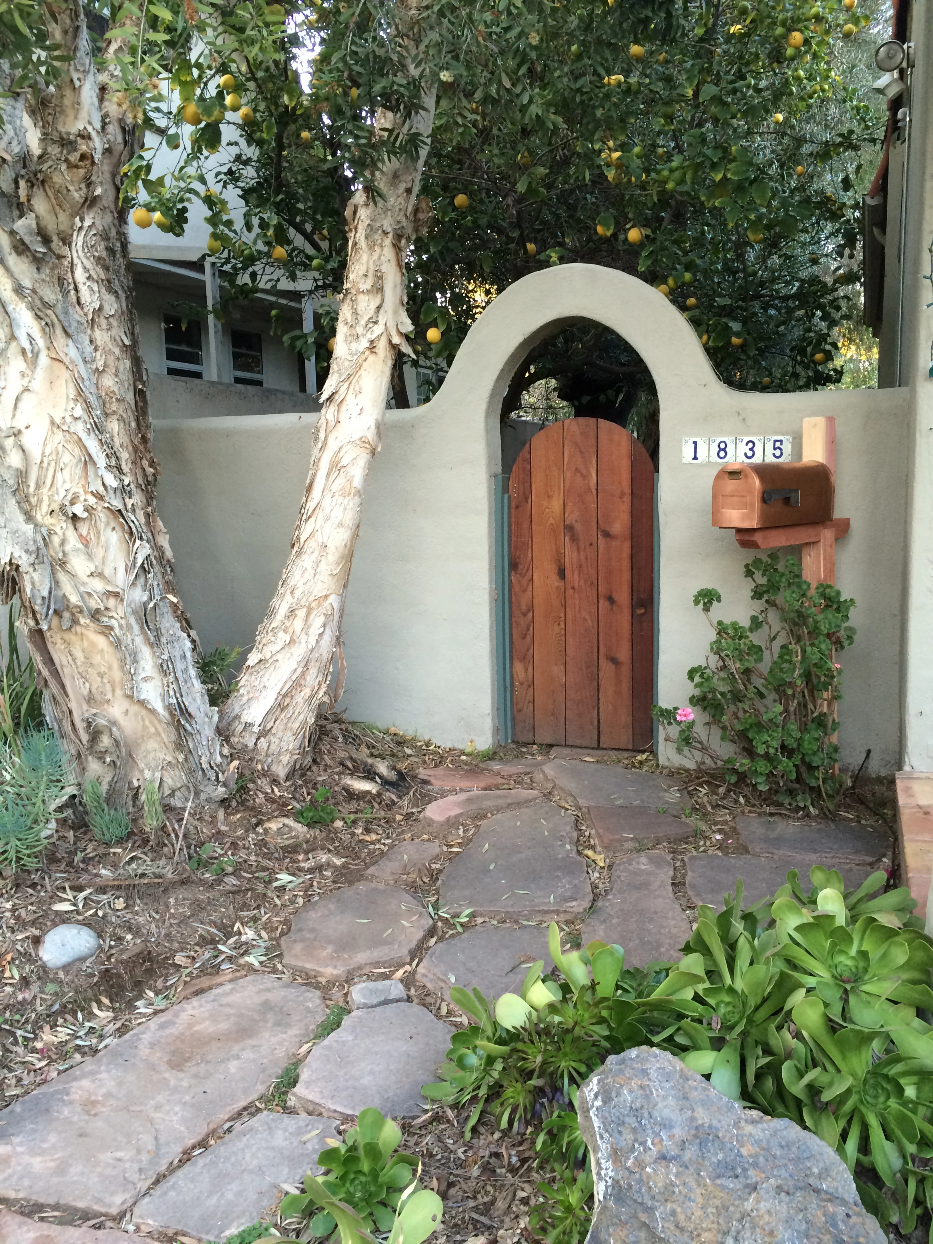
In decorating, form should always follow function, and it is a happy circumstance when form follows function and form is made beautiful. We achieved this goal with the addition of the new copper mail box that arrived Christmas morning. The house had an inefficient mail slot in the wall of the entry, and the slot probably served its purpose well enough in the 1930s, but with all the unwanted mail, catalogs and magazine subscriptions, not to mention the bills and cards still making it to our household, the slot in the wall was insufficient to say the least.

Sometime in the past, the slot in the wall was covered, and a flip-top mail box hung it its place, but it played havoc on the hands as the flip-top inevitably dropped on the hand of the person trying to retrieve the mail. Bruised and frustrated, we removed the offending mailbox, leaving, once again the slot in the wall—not very attractive and hardly serviceable since larger pieces of mail were dropped on the door step.

Once the house had been painted a a soft gray green, an old fashioned, copper rural box to be the prettiest solution. The next concern was whether the mail carrier would notice and use the new box; the answer came on its first day on the job—yes, indeed. The placement of the box saves the mail carrier, several steps up to the house and back again; the carrier had delivered the mail and was gone as quickly as Santa had delivered presents, like a wisp of smoke, he was gone.

I always like to embellish the exterior of a home as well as the interior; after all, its presentation should make a good first impression. Little by little, we are bringing the little house up to a higher standard. Now, I’m thinking that perhaps a bit of lettering above the arch might be in order to add to the charm of the little side yard, maybe to off set the ferocious barking of the big red dog who resides there.

Whatever style your home, there are attractive embellishments to add to its charm. Consider your first impression walking up to your front door. A freshly painted door, attractive bell or knocker, handsome door hardware, lighting and of course a mailbox if you have home delivery. If you have the space, a bench is always nice. Add some potted plants that will thrive in the kind of light your front door affords, and you will have an inviting entrance to welcome your family and guests.

All Season Outdoor Lighting

IMG_0813.JPG

One of Southern California’s best assets is the weather, allowing homeowners to enjoy many months of outdoor living.  Add an outdoor fire pit, and you can have smores nearly all year long.  While lighting is an essential necessity inside, it is an added benefit outside to increase the ambience of your outdoor space.

Having mood lighting installed is often an expensive endeavor, especially if you have a large area to cover;  but you can select a small social area and create your own lighting, if only around a small fire pit with some comfortable seating.

If you have an established patio area with covering, you are nine-tenths of the way there already.  All you need is a little mood lighting to finish the space.  A pergola can be fitted with a simple string of clear lights.   If set on a dimmer, they are especially useful for different activities; board games require more light than enjoying a glass of wine on a summer’s eve.  

Add some pendant lighting above a table, and you can add additional light and opportunities for capturing the right mood.  The example I have here is one that you can make on your own with a little skill and some caution while handling the sharp edges of the pressed metal.

Sheets of pressed metal can be easily obtained at your local home center, and you will find a variety of patterns from which to choose.  Again, I caution you to wear gloves when you are handling at these sheets as they are extremely sharp and cut like a knife with unless your hands are protected.

It is best to have a professional install an exterior socket unless you are experienced in working with electricity.  Once the electrical box is in place, it is fairly simple for a homeowner to purchase a pendant kit from the home center and hang them from the roof or ceiling of your pergola.

IMG_0809 copy.JPG

Creating a metal shade requires cutting the metal sheets with an angle grinder or similar tool.  A rigid, 90-degree edge is necessary for the shade.  We created a shade using a piece of one-eighth inch thick, right-angle aluminum stock as a bending edge and anchoring it on the edge of a workbench with clamps. to form a sharp angle for the edges of the shade.  Then we gently hammered the material into a right angle bend.  Next, we determined the size of the shade.  We used three different sizes for aesthetic reasons.  Once you have formed three of the bends, we brought the two remaining edges together and clamped them.  We applied epoxy glue to  hold the edges together.  For the top where the socket goes, we used the metal frame from an off-the-shelf paper lantern from IKEA.  We discarded the paper part of the lantern and simply epoxied the metal shade to the lamp frame.  We used one-hour epoxy, and the shades have been in service outside for more than a year, with no problems.

Hanging or pendant lighting can be an asset outside in many places.  Think of highlighting an area under a tree--which might require some clever electrical work, and add a bench for seating.   A lantern overhead in an arched trellis at an entry to a garden would be particularly inviting to guests arriving or leaving your home.

All you need to do is take a walk around your property and see where you could imagine having a special seating area and add some light.

Got Tile?

Do-it-yourself or DIY folks are rarely at a loss with what to do with left-overs from a recent, or not so recent, remodel project.  For example, there are so many uses for a piece or two or three left over tile, and the following ideas are suitable for the most basic skills for nearly all ages.

Clearly the easiest of all to do is place a 12”X12” tile on top of a simple garden pot stand you will find at the local home center.  Easy, nothing to it, and this little side table will serve you well for an afternoon cup of tea or an evening glass of wine while enjoying a lovely summer evening.

Another use for a tile is a simple trivet that requires a little cutting of 1/4-inch plywood, some molding, four wooden drawer pulls for feet, and a bit of wood glue.  A trivet is a great way to showcase a special tile you may have collected on a vacation or while prowling through a salvage yard or second hand store.  You may want to use a left over piece of tile or stone from a counter top or floor job.

If you do not have any tiles at hand, simply go to a home center and purchase one or more pieces to make as many trivets as you wish.  You can create a large trivet using four tiles and placing them on a larger piece of plywood.  Tiles that make a pattern when placed with the four pieces intersecting to make a pattern and will make an especially great trivet for larger casserole dishes.

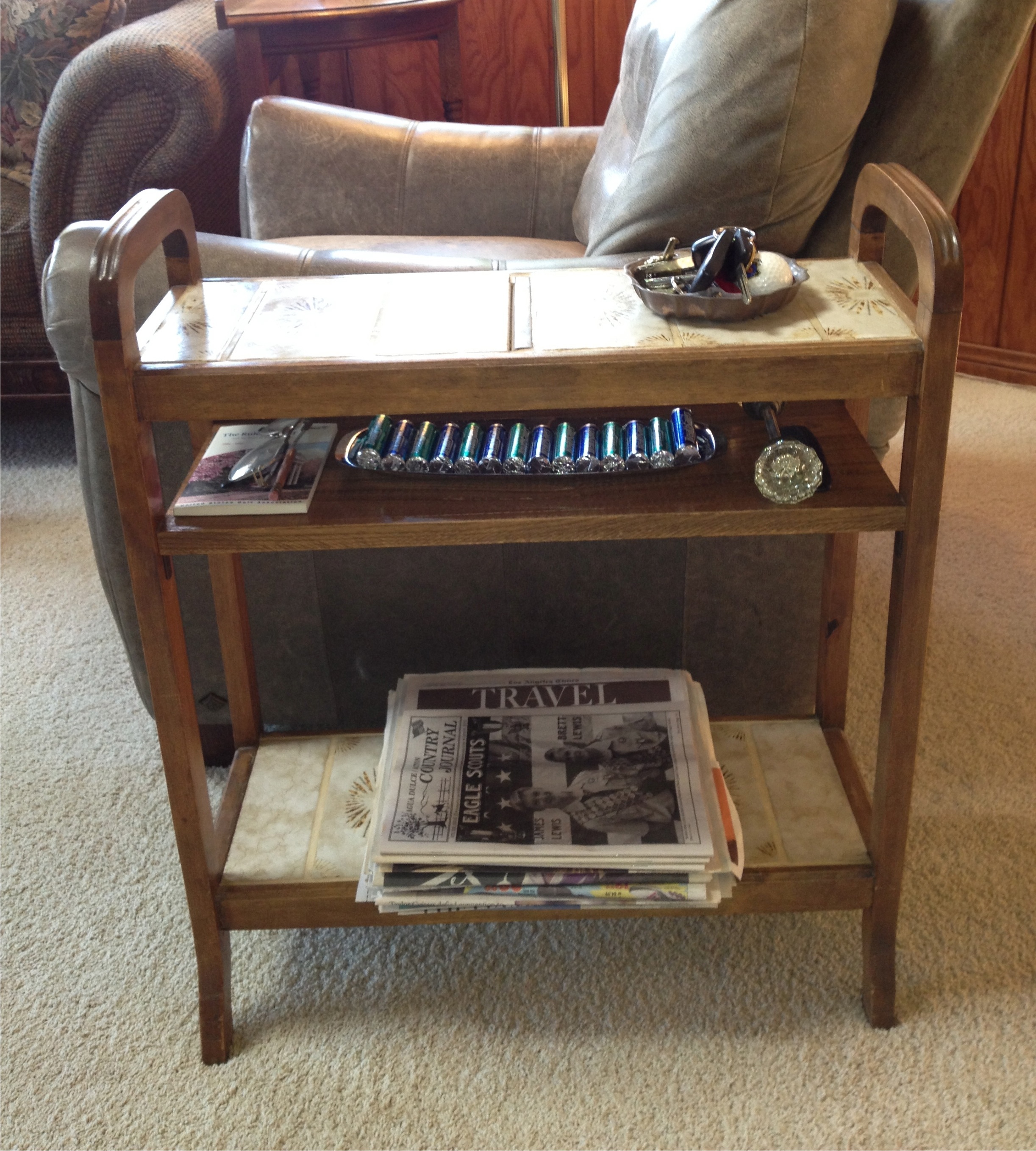
The following idea is a bit more complicated.  I used an old umbrella stand with very rusted tin plates on which the end of the umbrellas once rested; it was important for its size.  This piece became an end table for my crocheting many decades ago; my basket of yarn sat on the bottom shelf created by covering the openings where the tin plates were with a thin piece of plywood and covered with tiles.  The mid-shelf was created by using a couple of L-brackets and a cabinet grade piece of oak finished to match the rest of the wood frame; this shelf held any number of needed items.

The top shelf was created by placing a plywood base over the original holes for the umbrellas and affixing matching tiles to form a top shelf for glasses and a beverage.  Today this same end table sits beside a chair in the family room and is the dropping off place for my husband’s keys and other things he needs to pick up on his way out of the house.

The bottom shelf is a good place to store newspapers until they get recycled or used for painting projects in our household.  Again, that mid-shelf can hold just about anything that might be needed on the way out the door.

 A friend of ours tiled the top of some inexpensive bedside tables for the guest room,making them nearly damage proof; guests can leave a glass of water and not worry about leaving a ring on the surface.  These are just a few ideas; there are a many more just waiting for you to think of them.

Contrast Adds Drama

While it is true that high contrast will add drama to a room, it is wise to consider how you use contrast.  A painted accent wall is fairly easy to change should you decide you cannot live with the drama the color created, but a floor or a tiled backsplash or shower enclosure is a bit more complicated in terms of expense and time invested.

When you are considering changing something more permanent in your home, like flooring and counter surfaces as well as backsplashes and tub/shower enclosures, try less contrast.  You will be living with these changes for a long time and a classic surface in these areas will serve you better.

Think of all the homes built in the early to mid-20th Century; for the most part, these homes were built with hardwood flooring.  Over the years, as wall to wall carpet became popular, these floors were covered with soft, colorful carpet.   Today, that carpet is considered undesirable and old fashioned.  Carpets in older homes are routinely being  pulled up, exposing those now treasured hardwood floors.  If the wood is in good condition, a simple sanding, staining and fresh coat of polyurethane to preserve its beauty for another half century or more.

Choosing a new color for the floor will be important and fairly permanent.  While it may be tempting to add or stain a border or pattern, think in terms of long term use and how you will feel about such a contrast as a wide, light or dark border verses a solid-colored floor.  An exception to this rule, would be if the floors cannot be successfully refinished, but can be painted instead; then I’d say, go ahead and paint a fun harlequin pattern or boarder.  While the traditional black and white pattern is always popular, you can use softer colors for less contrast, like shades of grey or spa colors like blues and greens; even shades of beige would be a calm and peaceful color combination. 

Tile and natural stone is an expensive and fairly permanent surface for kitchens and baths.  Tempting are the bright colors and fun patterns, but again, consider how long it will be in style, staying classic is wiser.

Unless your home is clearly in a particular style like a Spanish Revival or Spanish Colonial, the use of colorfully patterned tiles might be a bit risky.  Adding cute “accent tiles” to a kitchen backsplash will date your renovation very quickly and reduce its value at resale time.

If using these colorful and playful tiles is something you have your heart set on, use them in less permanent ways.  For instance you can make tile trivets and hang them on the backsplash to add some personality without risking the need to tear it out once you tire of it.

When considering high contrast, think about how long you will live in this home and consider the home’s style.  High contrast will give you high drama, but you can enjoy soft contrast too and it is often easier to live with in the long term.

Destination Breezeway

If you are have a detached garage and it is connected to the house with a roof, or pergola you probably don’t think of it as anything except a utility; a pathway between the house and garage.  When in fact it might make a great destination point.

Take a careful look at your space; determine what possibilities lay ahead with a little creative thought.  For instance, how it connects to your landscaping can become a good space for a bench or plantings to enhance the area.

Stucco, wood siding or smooth plaster can all be great canvasses for art expression.  If you have a budding artist in the family or neighborhood, consider letting them paint a design, mural or even just add some metal sculpture to one side of the breezeway.

Depending on how wide your breezeway is, you can use both sides of the space for art, think Trompe l’ oeil, or to fool the eye.  Using a perspective drawing, you can add depth to the space, imagine sitting on a bench on one side of the breezeway and looking at a wall mural that shows a window with a view or a path to a favorite place in your travels, or somewhere you’d like to be.  You could have a field of flowers, mountain, sea or desert scape.

This technique is used in many places you may visit on a daily basis, and you only need to think of how you can use it in your home.  The sides of garages tend to be fairly boring spaces, and if your view out of a  kitchen or bedroom window is just that, think of what you’d like to see and imagine it as a destination.

Breezeways that are narrow may not allow you to have seating, but they need not to be boring, you can get creative with paint.  Think geometric shapes and colors, or stripes, bold or subtile, vertical or horizontal, even a wide zig zag with subtile color variation would be more interesting than plain beige.

By making your breezeway a destination point, it can give your existing landscape a boost too.  By incorporating your landscape design into your home structure, including your breezeway, you create a connection that is seamless and cohesive.  Choose colors from your landscape to enhance your breezeway.

The space between a home and a garage that isn’t covered, creating a breezeway, can still be more interesting, by employing some of these ideas.  Add a more decorative path, with paving stones and plantings and even seating.  In the future, you can add a covered structure to connect the two spaces.  

This space may be something you have not given any thought to before, but it might be a lost opportunity too.  Take a look at restaurants, theaters, bookstores for inspiration and imagine something similar to perk up your otherwise untapped space.


Dormer Windows Offer Interior Opportunities

The charms of an exterior ornament can be a decorating challenge for the interior, but the ornament also can also be a true asset when viewed with an open and imaginative mind.  For instance, dormer windows or slanted windows in some architectures will add interest to the outside of the home and welcome light on the interior.  While these attributes are welcome, many find the decorating or furniture arrangement more than a little challenging.

Take the customary trio of dormers in many homes—lovely to look at, but what do they offer on the inside?  Depending on the spacing between the dormers, there are lots of options.  One of the first things that comes to mind are comfortable window seats.   If the windows open, you have the additional benefit of good air circulation in an attic space that has been converted to a bedroom.  Window seats can afford great storage containment that can be left open or closed--an excellent use of space.

Another option would be a writing or computer desk for.  Usually on the second or third floor, these spaces may offer great views for inspiration or just a great place to read for your own enjoyment.

If your dormer or slanted walls are generous you might consider adding an alcove bed--an easy way to add extra sleeping space without taking away from the room’s intended use, be it a TV room, office space or a well-organized storage room or craft/hobby room.  The possibilities are endless.  To find a bed to fit your alcove is not difficult and custom is not always out of your price range.  You simply order a bed from a sleep shop--one size larger than your opening--and give the shop measurements you need your bed to become.  It takes about two weeks and your custom-sized mattress is ready for pick-up or delivery.  If you build a low box below to serve as the boxed spring, you can use it for storage.  Build the box a little higher and you can have more useful storage with full extension pull-out shelves for linens, pillows and extra blankets.  This will have a captain’s bed, look, which is fun for children and teens.

Making the best use of your space is always an asset to your home’s value and your enjoyment.

Spring Decorating

Living out West, you are used to enjoying the out of doors most of the year, but probably you most appreciate being out in the Spring.  The temperate climate lends itself to outdoor living, and the ability to bring in the outdoors is something that folks across the nation often envy.  How to best make use of the outdoors is a matter of personal preference.

I have seen many beautiful gardens, and I am often surprised how little these gardens are used; they can be an easy focal point for many homeowners who are missing a great opportunity.   On some level, folks love their interiors and their exterior grounds, but they do not see the connection or realize how easily the two areas can be integrated to a fuller extent.

Your windows are key to that integration.  It is one thing to use window coverings for privacy, to protect your furnishings from the sun, to maintain a comfortable interior temperature during the cool months; but to miss the beauty of a garden or the vistas provided by nature is truly unfortunate. 

Look at your windows as portals to the outside for your enjoyment-- unless you have a neighbor only a few yards away. Each window with a view that made you fall in love with your home in the first place should be exploited.  Try removing heavy drapes and layers of curtains to expose your views; doing so is like a breath of fresh air after months of being closed up inside.

Many potential homebuyers will put a view above many other practical necessities of home ownership, because locations and views are nearly as important to them as kitchens and baths and in some cases more important.

There are many clever ways to protect privacy while still enjoying the outdoors; semi-sheer drapes and window shades are just two.  However, consider nothing at all on those windows that afford you the prettiest views when privacy is not a factor. Another option is to use a pleated shade hidden under a cornice box or valance for those times of the day when either privacy or protection from the sun is important.

If you have to replace windows in your home, another way to enjoy your view is to keep the glass plain, that is, panes without grids, common to homes built in the 1980’s.  When there is no view, these grids may add charm; but where there is a view, they are distracting and further complicate your design if your window treatments have horizontal lines, like shutters or wood blinds.  The idea is to open up and love your view.

If you do not have a pretty view, create one!  Use props like a trellis to frame a view outside your formerly uninteresting window.   Use colorful pots with hardy perennials for structure and annuals for color.  Add a simple water feature and feed it with a drip tube attached to your watering system.  You will attract birds and butterflies so your newly created view is vibrant with color and song.