All Season Outdoor Lighting

IMG_0813.JPG

One of Southern California’s best assets is the weather, allowing homeowners to enjoy many months of outdoor living.  Add an outdoor fire pit, and you can have smores nearly all year long.  While lighting is an essential necessity inside, it is an added benefit outside to increase the ambience of your outdoor space.

Having mood lighting installed is often an expensive endeavor, especially if you have a large area to cover;  but you can select a small social area and create your own lighting, if only around a small fire pit with some comfortable seating.

If you have an established patio area with covering, you are nine-tenths of the way there already.  All you need is a little mood lighting to finish the space.  A pergola can be fitted with a simple string of clear lights.   If set on a dimmer, they are especially useful for different activities; board games require more light than enjoying a glass of wine on a summer’s eve.  

Add some pendant lighting above a table, and you can add additional light and opportunities for capturing the right mood.  The example I have here is one that you can make on your own with a little skill and some caution while handling the sharp edges of the pressed metal.

Sheets of pressed metal can be easily obtained at your local home center, and you will find a variety of patterns from which to choose.  Again, I caution you to wear gloves when you are handling at these sheets as they are extremely sharp and cut like a knife with unless your hands are protected.

It is best to have a professional install an exterior socket unless you are experienced in working with electricity.  Once the electrical box is in place, it is fairly simple for a homeowner to purchase a pendant kit from the home center and hang them from the roof or ceiling of your pergola.

IMG_0809 copy.JPG

Creating a metal shade requires cutting the metal sheets with an angle grinder or similar tool.  A rigid, 90-degree edge is necessary for the shade.  We created a shade using a piece of one-eighth inch thick, right-angle aluminum stock as a bending edge and anchoring it on the edge of a workbench with clamps. to form a sharp angle for the edges of the shade.  Then we gently hammered the material into a right angle bend.  Next, we determined the size of the shade.  We used three different sizes for aesthetic reasons.  Once you have formed three of the bends, we brought the two remaining edges together and clamped them.  We applied epoxy glue to  hold the edges together.  For the top where the socket goes, we used the metal frame from an off-the-shelf paper lantern from IKEA.  We discarded the paper part of the lantern and simply epoxied the metal shade to the lamp frame.  We used one-hour epoxy, and the shades have been in service outside for more than a year, with no problems.

Hanging or pendant lighting can be an asset outside in many places.  Think of highlighting an area under a tree--which might require some clever electrical work, and add a bench for seating.   A lantern overhead in an arched trellis at an entry to a garden would be particularly inviting to guests arriving or leaving your home.

All you need to do is take a walk around your property and see where you could imagine having a special seating area and add some light.

Stripes Add Interest


 I find that stripes add interest in many different mediums throughout the home, from pillows to upholstery and carpet-- I don’t mean just area rugs, but broadloom carpets as well.  Stripes can be bold, or soft and subtle by using neutral colors, and still add interest and energy to your living space.  Not only will they add to your decor, but they tend to hide a myriad of traffic wear and just about anything else an active family can inflict.

The infusion of stripes to a decor of either plain or printed fabrics helps break up the predictability of solids and patterns--adding a bit of a surprise, if you will.  Keeping color as the unifying element will give your room the cohesive look that you need for good design.

Stairs lend themselves to stripes in a most interesting way.  Take a plain, straight staircase, mostly hidden from the public rooms, usually closed in with walls on either side, essentiality a hall straight up to the upper living quarters. Carpeted stairs are always more quiet, and should be considered with an active family.  By adding striped carpet to just the staircase, you can easily be coordinate two disparate carpet styles or colors, if the stairs connect to carpet on both upper and lower levels.  Of course, if you have hardwood, tile or laminate in the room at either end of the stairs adding, carpet of any sort will not be much of a design issue.

Adding a striped carpet will give your room an energetic boost while keeping the appearance of stairway wear and tear to a minimum.  Keep in mind that carpet warranties do not cover hallways and stairs; so adding striped carpet will disguise the wear and tear an active family imposes on such such a highly used traffic area.

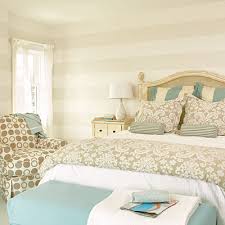
Subtle stripes on walls is another easy decor addition that can be achieved with either wallpaper or paint.  Painting wide vertical or horizontal stripes using the same paint color or similar but changing the finish to one set of the stripes will give a room a touch of interest without overpowering the rest of your design.  Of course if bold is what you are after, that too is easily achieved.

Striped bedding, drapes, shades and upholstered pieces can  give a room the same energy as flooring and wall color.  Always vary your scale when mixing prints, and stripes and remember to keep your colors related in some way for a cohesive look.

Make an Entrance

I have been house shopping with a friend and have become aware of how many houses, old and new-er, open directly into the living space-- be it a dining room, kitchen or living room.  I find it much more pleasing to open a front door without exposing the living space to whomever is on the other side of the door.  

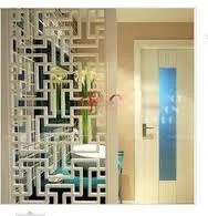
It is simple enough to create a “foyer” feeling from the front door, especially when the front door is off set from the center of the room into which it opens;  the homeowner thus has a bit of space in which to put up a screen or something to distract the eye, which protects the privacy of the home.  A simple piece of furniture can do the trick, creating a bit of a barrier between your living space and the person outside your door.  You can set up a hall tree or a table or a screen to add to the privacy. 

If you want to create such a screen, there are so many materials you can use, and you may have them around the house already.  Shutters that are no longer in service can be adapted into a useful screen by joining two or more together with reversible hinges; you can connect shutters that are the same width to make them taller as well.

There are plenty of uses for decorative screens, not just at the front door to make an entrance more private.  Screens can make a serve more than one purpose without the benefit of floor-to ceiling walls. A large room can be divided easily into multiple service areas with the clever use of furniture, screens or even sliding panels that attach to the ceiling.

Large sized cube-type book or storage units make great room dividers, and the open cubbies can be filled with useful baskets or containers for last minute items you need before heading out the door, like gloves, hats or scarves.  You also can fill the cubbies with decorative items that suit your decor, an especially good way to display collections you may have as long as the scale is in keeping with the size of the cubby; remember tiny objects can become lost in large spaces.

IMG_3798.JPG

Hanging a long fabric “screen” from a rod in a ceiling of a loft is an excellent way to create rooms within a large space.  This division can be achieved with a long drape, with a beautiful colorful piece of fabric, or a great textured piece, as simple as bamboo.  Lofts offer you lots of ways to create clever separations while allowing your space to remain open and airy, which after all is one of the great appealing factors in loft living.

A strategic chest, table or area rug can give a room a boundary, thus making the room feel more comfortable and oddly enough more spacious.  It is a misconception that placing furniture around the perimeter of a room will make the room feel larger; actually the opposite is true.  Floating a table, chest or folding screen will allow you some privacy at your entrance and actually might make your space feel a bit larger.

Privacy, Light and Etched Glass Windows

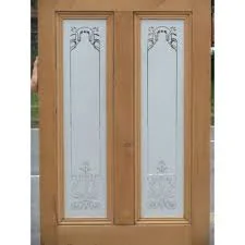
The desire for both privacy and light often work at cross purposes to one another, but sometimes you can have both.  If you treasure the beauty of light in your home but need a little privacy, etched glass or etched glass film might be a good solution.  Keep in mind that etched glass is permanent while etched glass film is not.

While many folks in the country do not live as close to their neighbors as do city dwellers, privacy can still be an issue.  If you have a great view, why not take advantage of it as much as possible, with a bit of a twist to conventional window treatments?

Privacy can be achieved in many ways, and most homeowners go straight to window blinds or draperies.  Both covers can be great insulators of heat and cold; but if you prefer a more minimalist approach, etched glass might be just the thing for you.  Etched glass is not new, and it is not difficult for the average person to obtain.  Most craft stores carry etching compounds; and, with adult supervision there are plenty of child-safe craft ideas out there, but I digress.  

If you have sidelights to your front door that are clear glass and you feel a bit too exposed, or even the lower portion of a double or single hung window, consider adding an etched film, you can purchase at your local home center.  If you are more creative, you can create a design yourself and make your own stencil, but there are plenty of film designs available.  Simple designs will give you a more modern feel, while something botanical will give you a more cottage feeling.

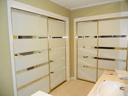
Another good use of etching compounds is to change the look of mirrored closet doors.  While these doors are common in many households, they are not always a favorite of homeowners, and are usually merely tolerated.  While they do reflect light and that is a good thing, you might not want a total reflection of the room.  One idea is to run bands or stripes of etching across the bottom third or two thirds of the closet doors, giving the doors a more designer look.  Or also can defuse just half of a full length mirror on both sides of a double closet or only one side of the double closet door. 

Windows that are difficult to reach are equally difficult to treat, this is an ideal application for an etched glass or film.  Expensive fan shaped wood blinds or pleated shades are usually the only option, while a simple and fairly inexpensive etched film might be a better idea, even if privacy isn’t an issue.

French doors that separate private rooms from more public rooms is another good use of etching without the heaviness of blinds or drapes, while still allowing the light to come through day or night.


If one of your windows has a less desirable view, the window becomes another good candidate for either etching or film on the window without sacrificing valuable light.  Think of the possibilities.  

Got Tile?

Do-it-yourself or DIY folks are rarely at a loss with what to do with left-overs from a recent, or not so recent, remodel project.  For example, there are so many uses for a piece or two or three left over tile, and the following ideas are suitable for the most basic skills for nearly all ages.

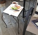
Clearly the easiest of all to do is place a 12”X12” tile on top of a simple garden pot stand you will find at the local home center.  Easy, nothing to it, and this little side table will serve you well for an afternoon cup of tea or an evening glass of wine while enjoying a lovely summer evening.

Another use for a tile is a simple trivet that requires a little cutting of 1/4-inch plywood, some molding, four wooden drawer pulls for feet, and a bit of wood glue.  A trivet is a great way to showcase a special tile you may have collected on a vacation or while prowling through a salvage yard or second hand store.  You may want to use a left over piece of tile or stone from a counter top or floor job.

If you do not have any tiles at hand, simply go to a home center and purchase one or more pieces to make as many trivets as you wish.  You can create a large trivet using four tiles and placing them on a larger piece of plywood.  Tiles that make a pattern when placed with the four pieces intersecting to make a pattern and will make an especially great trivet for larger casserole dishes.

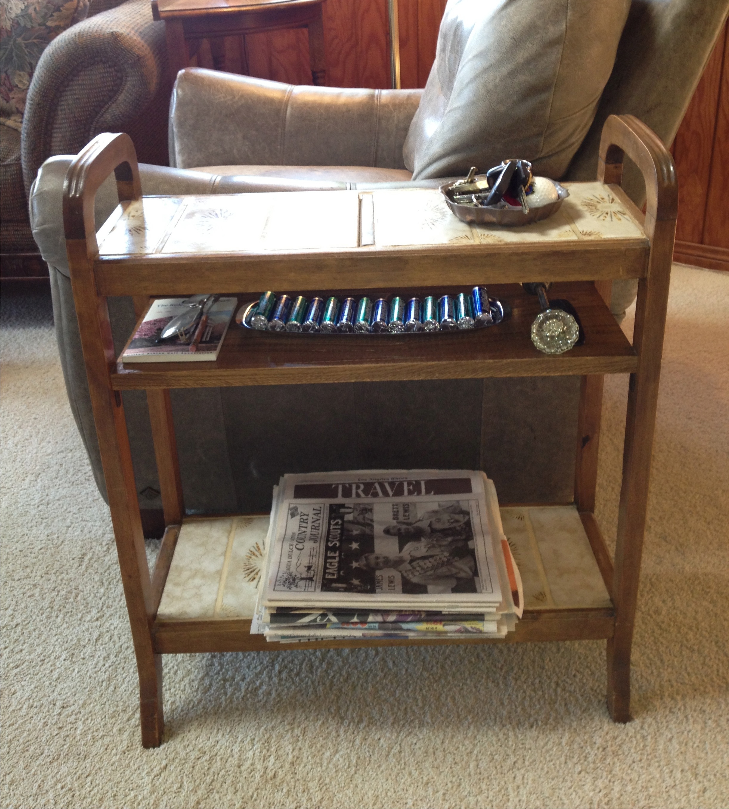
The following idea is a bit more complicated.  I used an old umbrella stand with very rusted tin plates on which the end of the umbrellas once rested; it was important for its size.  This piece became an end table for my crocheting many decades ago; my basket of yarn sat on the bottom shelf created by covering the openings where the tin plates were with a thin piece of plywood and covered with tiles.  The mid-shelf was created by using a couple of L-brackets and a cabinet grade piece of oak finished to match the rest of the wood frame; this shelf held any number of needed items.

The top shelf was created by placing a plywood base over the original holes for the umbrellas and affixing matching tiles to form a top shelf for glasses and a beverage.  Today this same end table sits beside a chair in the family room and is the dropping off place for my husband’s keys and other things he needs to pick up on his way out of the house.

The bottom shelf is a good place to store newspapers until they get recycled or used for painting projects in our household.  Again, that mid-shelf can hold just about anything that might be needed on the way out the door.

 A friend of ours tiled the top of some inexpensive bedside tables for the guest room,making them nearly damage proof; guests can leave a glass of water and not worry about leaving a ring on the surface.  These are just a few ideas; there are a many more just waiting for you to think of them.

Contrast Adds Drama

While it is true that high contrast will add drama to a room, it is wise to consider how you use contrast.  A painted accent wall is fairly easy to change should you decide you cannot live with the drama the color created, but a floor or a tiled backsplash or shower enclosure is a bit more complicated in terms of expense and time invested.

When you are considering changing something more permanent in your home, like flooring and counter surfaces as well as backsplashes and tub/shower enclosures, try less contrast.  You will be living with these changes for a long time and a classic surface in these areas will serve you better.

Think of all the homes built in the early to mid-20th Century; for the most part, these homes were built with hardwood flooring.  Over the years, as wall to wall carpet became popular, these floors were covered with soft, colorful carpet.   Today, that carpet is considered undesirable and old fashioned.  Carpets in older homes are routinely being  pulled up, exposing those now treasured hardwood floors.  If the wood is in good condition, a simple sanding, staining and fresh coat of polyurethane to preserve its beauty for another half century or more.

Choosing a new color for the floor will be important and fairly permanent.  While it may be tempting to add or stain a border or pattern, think in terms of long term use and how you will feel about such a contrast as a wide, light or dark border verses a solid-colored floor.  An exception to this rule, would be if the floors cannot be successfully refinished, but can be painted instead; then I’d say, go ahead and paint a fun harlequin pattern or boarder.  While the traditional black and white pattern is always popular, you can use softer colors for less contrast, like shades of grey or spa colors like blues and greens; even shades of beige would be a calm and peaceful color combination. 

Tile and natural stone is an expensive and fairly permanent surface for kitchens and baths.  Tempting are the bright colors and fun patterns, but again, consider how long it will be in style, staying classic is wiser.

Unless your home is clearly in a particular style like a Spanish Revival or Spanish Colonial, the use of colorfully patterned tiles might be a bit risky.  Adding cute “accent tiles” to a kitchen backsplash will date your renovation very quickly and reduce its value at resale time.

If using these colorful and playful tiles is something you have your heart set on, use them in less permanent ways.  For instance you can make tile trivets and hang them on the backsplash to add some personality without risking the need to tear it out once you tire of it.

When considering high contrast, think about how long you will live in this home and consider the home’s style.  High contrast will give you high drama, but you can enjoy soft contrast too and it is often easier to live with in the long term.

Destination Breezeway

If you are have a detached garage and it is connected to the house with a roof, or pergola you probably don’t think of it as anything except a utility; a pathway between the house and garage.  When in fact it might make a great destination point.

Take a careful look at your space; determine what possibilities lay ahead with a little creative thought.  For instance, how it connects to your landscaping can become a good space for a bench or plantings to enhance the area.

Stucco, wood siding or smooth plaster can all be great canvasses for art expression.  If you have a budding artist in the family or neighborhood, consider letting them paint a design, mural or even just add some metal sculpture to one side of the breezeway.

Depending on how wide your breezeway is, you can use both sides of the space for art, think Trompe l’ oeil, or to fool the eye.  Using a perspective drawing, you can add depth to the space, imagine sitting on a bench on one side of the breezeway and looking at a wall mural that shows a window with a view or a path to a favorite place in your travels, or somewhere you’d like to be.  You could have a field of flowers, mountain, sea or desert scape.

This technique is used in many places you may visit on a daily basis, and you only need to think of how you can use it in your home.  The sides of garages tend to be fairly boring spaces, and if your view out of a  kitchen or bedroom window is just that, think of what you’d like to see and imagine it as a destination.

Breezeways that are narrow may not allow you to have seating, but they need not to be boring, you can get creative with paint.  Think geometric shapes and colors, or stripes, bold or subtile, vertical or horizontal, even a wide zig zag with subtile color variation would be more interesting than plain beige.

By making your breezeway a destination point, it can give your existing landscape a boost too.  By incorporating your landscape design into your home structure, including your breezeway, you create a connection that is seamless and cohesive.  Choose colors from your landscape to enhance your breezeway.

The space between a home and a garage that isn’t covered, creating a breezeway, can still be more interesting, by employing some of these ideas.  Add a more decorative path, with paving stones and plantings and even seating.  In the future, you can add a covered structure to connect the two spaces.  

This space may be something you have not given any thought to before, but it might be a lost opportunity too.  Take a look at restaurants, theaters, bookstores for inspiration and imagine something similar to perk up your otherwise untapped space.


Dormer Windows Offer Interior Opportunities

The charms of an exterior ornament can be a decorating challenge for the interior, but the ornament also can also be a true asset when viewed with an open and imaginative mind.  For instance, dormer windows or slanted windows in some architectures will add interest to the outside of the home and welcome light on the interior.  While these attributes are welcome, many find the decorating or furniture arrangement more than a little challenging.

Take the customary trio of dormers in many homes—lovely to look at, but what do they offer on the inside?  Depending on the spacing between the dormers, there are lots of options.  One of the first things that comes to mind are comfortable window seats.   If the windows open, you have the additional benefit of good air circulation in an attic space that has been converted to a bedroom.  Window seats can afford great storage containment that can be left open or closed--an excellent use of space.

Another option would be a writing or computer desk for.  Usually on the second or third floor, these spaces may offer great views for inspiration or just a great place to read for your own enjoyment.

If your dormer or slanted walls are generous you might consider adding an alcove bed--an easy way to add extra sleeping space without taking away from the room’s intended use, be it a TV room, office space or a well-organized storage room or craft/hobby room.  The possibilities are endless.  To find a bed to fit your alcove is not difficult and custom is not always out of your price range.  You simply order a bed from a sleep shop--one size larger than your opening--and give the shop measurements you need your bed to become.  It takes about two weeks and your custom-sized mattress is ready for pick-up or delivery.  If you build a low box below to serve as the boxed spring, you can use it for storage.  Build the box a little higher and you can have more useful storage with full extension pull-out shelves for linens, pillows and extra blankets.  This will have a captain’s bed, look, which is fun for children and teens.

Making the best use of your space is always an asset to your home’s value and your enjoyment.

Spring Decorating

Living out West, you are used to enjoying the out of doors most of the year, but probably you most appreciate being out in the Spring.  The temperate climate lends itself to outdoor living, and the ability to bring in the outdoors is something that folks across the nation often envy.  How to best make use of the outdoors is a matter of personal preference.

I have seen many beautiful gardens, and I am often surprised how little these gardens are used; they can be an easy focal point for many homeowners who are missing a great opportunity.   On some level, folks love their interiors and their exterior grounds, but they do not see the connection or realize how easily the two areas can be integrated to a fuller extent.

Your windows are key to that integration.  It is one thing to use window coverings for privacy, to protect your furnishings from the sun, to maintain a comfortable interior temperature during the cool months; but to miss the beauty of a garden or the vistas provided by nature is truly unfortunate. 

Look at your windows as portals to the outside for your enjoyment-- unless you have a neighbor only a few yards away. Each window with a view that made you fall in love with your home in the first place should be exploited.  Try removing heavy drapes and layers of curtains to expose your views; doing so is like a breath of fresh air after months of being closed up inside.

Many potential homebuyers will put a view above many other practical necessities of home ownership, because locations and views are nearly as important to them as kitchens and baths and in some cases more important.

There are many clever ways to protect privacy while still enjoying the outdoors; semi-sheer drapes and window shades are just two.  However, consider nothing at all on those windows that afford you the prettiest views when privacy is not a factor. Another option is to use a pleated shade hidden under a cornice box or valance for those times of the day when either privacy or protection from the sun is important.

If you have to replace windows in your home, another way to enjoy your view is to keep the glass plain, that is, panes without grids, common to homes built in the 1980’s.  When there is no view, these grids may add charm; but where there is a view, they are distracting and further complicate your design if your window treatments have horizontal lines, like shutters or wood blinds.  The idea is to open up and love your view.

If you do not have a pretty view, create one!  Use props like a trellis to frame a view outside your formerly uninteresting window.   Use colorful pots with hardy perennials for structure and annuals for color.  Add a simple water feature and feed it with a drip tube attached to your watering system.  You will attract birds and butterflies so your newly created view is vibrant with color and song.


A Little Molding Can Go a Long Way

Homeowners with a yen for a little more interest in a plain room may find that molding can be a great solution.  It does not take great skill to cut molding with today’s materials and tools plus a steady hand and a little patience.

Today you can find deep crown moldings that are light as a feather, being constructed of sturdy foam with a light plaster coating.  Crown molding will add architectural interest to any room.  You can find many moldings in different styles and great tutorials on-line to help you install it.

If crown molding seems a bit too formal for your country home, but you still want a little interest in a plain room, consider a slim molding framed out long rectangles along a wall.  Painting them the same color as the wall will give it subtle interest without appearing to be too traditional.  Painting the molding a contrasting color, say white or even beige over a colored wall, will give a room a soft traditional look.  Adding a bright contrasting accent color can add just the punch a quiet room needs.

Casing your windows with molding is an investment that will pay off immediately with your enjoyment and later when you sell your home as molding will be an added feature that not all homes can boast.

A long, uninteresting wall can be upgraded with a simple chair rail plus molding to represent panels below the rail.  Panels can be painted or wall papered for additional charm.  Using a rail and panels in a room that lacks personality is a good way to add color and pattern without a big expense.

Panels would be an excellent way to add a color punch in a child’s bedroom.  Also, consider painting a single panel with chalkboard paint; this paint comes in a variety of colors now, not just black.

Molding that is painted the same color as the wall can stand alone nicely as architectural element; later, if you decide to change the look of the room you can do it simply by painting moldings or the walls.

Changing out your baseboards is another way to give a room a fresh update.  Doing one room at a time is a budget wise way to increase your enjoyment and the value of your home.

Making the Most of Your Pantry and Under Counter Cabinets

Most of us can benefit from more storage in every room, but the kitchen, being the heart of the home, deserves special consideration.  Once, storage for food, cooking utensils, and large and small appliances, were all that a kitchen afforded the one cook in the house.  Counter space was important, too, but not as much so as it is today.  Now kitchens serve as entertainment areas as well as the food preparation and eating room.  Now, too, there may be multiple cooks in the kitchen.

Great storage, therefore, is even more important to today’s homeowner.  Old-style kitchen cabinets for food storage are more outdated now than ever, and have been replaced by pantries and pull-out shelves, which are far more practical.

What do you do, if your current kitchen doesn’t have these amenities?  Start with what you have, basic cabinets; lower cabinets will be far more efficient with pull-out shelves.   Most homeowners can retrofit the cabinets without having to break the bank.  The nice thing about pull-out shelves is you can buy them one or two at a time as your budget affords.  Having pull-out shelves allows you to utilize the entire 24 inch depth of your lower cabinets, without having to call in acrobatics to reach whatever might have slipped to the back.

Once your lower cabinets are in order, concentrate on the upper cabinets; for many of us, they are too tall to utilize more than one or two shelves effectively, so make the most of what you do have.  Using the hard-to-reach upper shelves for little-used items or large serving pieces makes the most sense.  For the shelves you can reach, try clear, vacuum sealed canisters; they come in a great variety of sizes for all your dry storage needs.  These are great for cereals, rice, crackers, and pasta; and you can easily see how much you have on hand, thus making quick work of your grocery shopping list when it’s time to restock.

You may want to keep your baking materials in one place; vacuum sealed canisters are a must here too, either clear or stainless or ceramic work nicely.  The smaller items like baking soda and powder are fine in their commercial containers and fit well into the space.  Since you likely use salt frequently, you may want to keep it in an easy-to-scoop apothecary jar for convenience.

Adding stackable wire racks to cabinets or a pantry shelf helps with cans and jars like soups and tomato products.  Once these items are faced-forward and in order, it will be simple to see and access them and record what is needed for the next stop at the grocery store.

If you are fortunate enough to have an actual pantry, keeping the above-mentioned ideas in mind will help keep your pantry well ordered.  If you happen to have a closet near-by--and I mean right near the kitchen--you can easily outfit it with some of these ideas.  Relegating a make-shift pantry to an entry hall closet is less than ideal; but remember that a retrofitted closet is going to be about 24 inches deep, so the same rules would apply regarding shelves that re too deep to access the items at the rear of the closet.  Having pull-out shelves would be most beneficial.  Having shelves custom cut to fit, measuring about 12 inches deep also works.  Lower shelves in a make-shift closet-turned-pantry can be deeper for storage of little-used large appliances, like a crock-pot, 40-cup coffee maker, or small appliances. 

All of these ideas are all simple enough for most homeowners to achieve a high level of success and a more orderly and efficient kitchen space.

Even Organizers Need a Tune Up

Sometimes décor means being better organized.  After all, if you aren’t organized, you waste time and cannot enjoy your lovely décor because you are busy searching for that thing you know you have, but cannot find.

This condition is a problem for everyone except the compulsively organized, which, by the way doesn’t apply to me and probably doesn’t apply to you.

I recently gave a talk about organizing the spaces we live in; even I was surprised at what I found in my own home.  The space under my kitchen sink was still organized, and everything that I use daily was in its place and easy to reach.  Lesser used items were relegated to the rear of the cabinet, but were easily accessed with the pull out container in which they sat.  The only improvement was a light cleaning; after the cleanser dust settles it just stays on everything until it is wiped away.  Boy I could use an app for that!

One area that was recently improved upon was my spice storage.  When we had our kitchen island replaced, I had one of those slick, narrow pull out spice cabinets installed.  While I loved it in theory, I found it to be less than idea in practice.  Small spice jars took up as much space as their taller ones, and I could not read the labels unless the top of the container was marked.  I found myself having to lift each one out to see if it was the spice I needed, which was a huge waste of time.

I found a pantry door system that is fantastic for me.  I counted the items I have stored on the back of my pantry door and discovered they numbered 73-- many more than I could store either in a drawer or in the pull-out cabinet.  Not all the 73 items are spices, but they are pantry related items and free up valuable pantry real estate.

The one area the group I spoke with, was most impressed with was the ever-present “junk drawer”.  Yes, mine was organized and does not deserve such a pejorative title; maybe it should be called the “odds and ends” drawer, but we all know every kitchen needs a junk drawer.  Organizing it makes it far less frustrating and quite a time saver in the bargain.  The key to avoiding this potential kitchen disaster is using small compartments that you can fit wall to wall and front-to-back, so there is no shifting about within the drawer.  Empty space begs to be filled, and hurried people tend to drop an item in the empty space rather than find its designated spot, thus creating the junk drawer syndrome.

The pantry door hanging system took my husband only minutes to install, and I took over fitting the baskets to suit my height.  From there it only took me less than an hour to complete.  It is not a weekend long project; actually, it took under 2 hours including the pantry shifting.

Next time: Making the Most of Your Pantry and Under the Counter Cabinets